Journal
Cleaning up the cobwebs
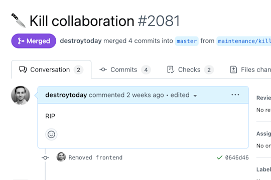
After years of side-eyeing an unreleased feature that has been nagging me while slowing down the app, I finally take the time to remove it from the app.

After years of side-eyeing an unreleased feature that has been nagging me while slowing down the app, I finally take the time to remove it from the app.
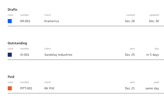
Following up on the initial post about building a table in Cushion, I actually detail my approach this time.
I spent way too long trying to find out how to set up e2e testing with Vercel preview deploys, so I wrote a quick post to save others.

Now that I have data to wire up, I set out to build a table component, but first I revisit past attempts.
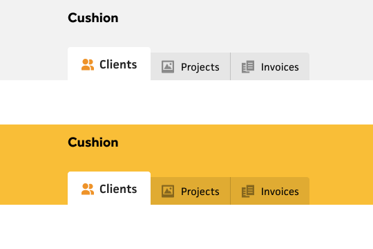
With a focus on navigation, I return to the early days when Cushion had a simple tabbed nav.
With the stack picked out, I set up end-to-end testing from the start, so I can get in the habit of testing user flows without any excuses.
As I rethink Cushion in the modern age, I detail my choices for platform, stack, and database.
With Cushion’s 10-year anniversary approaching, a theory leads to an attempt at a modern upgrade, but with 2016’s feature set.
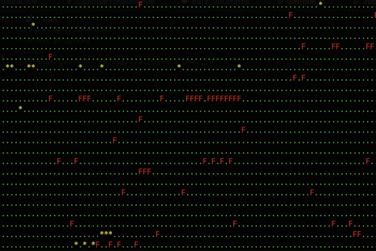
I spent a weekend upgrading Cushion’s Heroku stack and Ruby version, which sent me down a path of fixing hundreds of failing tests and removing a feature.
I hit a roadblock designing a UI that didn’t excite me, so I decide to take a step back and rethink a more personalized design.
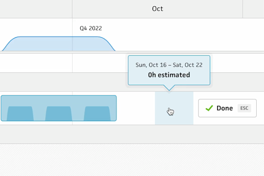
After taking a short break to collect myself, I eased back into work with a low-priority feature that I’ve been itching to add for a while.
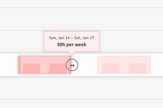
While building the drag & drop interaction for workloads, I accidentally created the coolest interaction I’ve ever made.
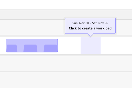
After taking a couple weeks off to move into our new home, I’m back in the saddle with creating and editing workloads.
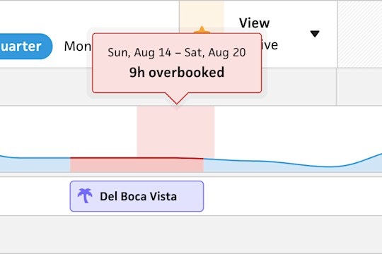
To continue reaching feature parity with the existing schedule view, I added vacations to the new timeline.
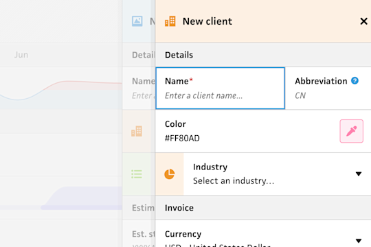
Over the weekend, I ate the broccoli and built a nested drawer system, but ended up with a delightful parallax effect.
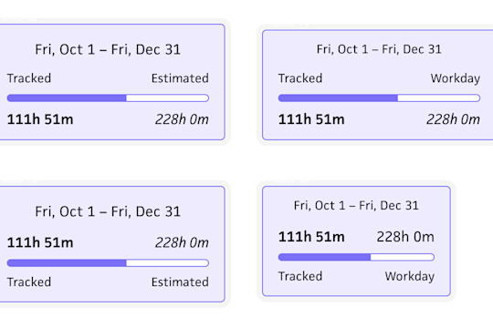
The full circle journey of designing a tooltip that’s both simple and useful.
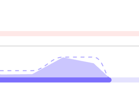
After visualizing tracked time, I jumped from the past and into the future to visualize estimated workloads.
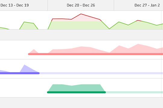
Now that Cushion can visualize tracked time, the next step is to combine tracked time and highlight when you overworked yourself.
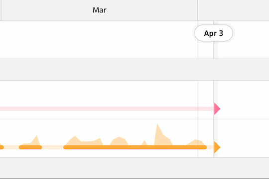
After being close to launching tracked time in the schedule timeline beta, I decide to spend an extra week adding lazy loading.
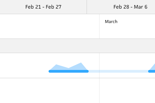
Straying from the plan to bring the timeline to 1:1 feature parity with the existing timeline, I visualize tracked time.
I take a short break from the timeline beta to launch the ability to duplicate an invoice. No big deal.
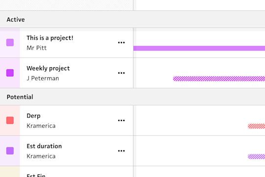
On the new path of pursuing a list-based layout, I group the projects by list and add an archive filter.
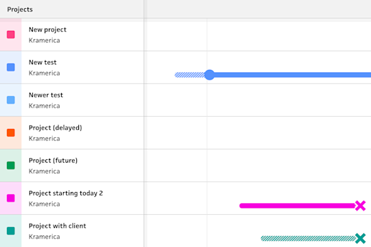
Foreseeing a problematic future with the stacking layout, I rethink the direction and end up down a better path.
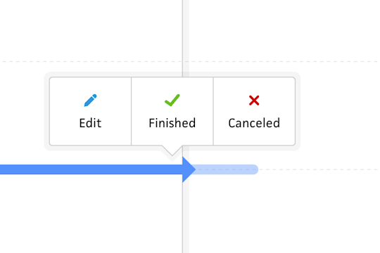
After adding the ability to add and edit projects in the Schedule timeline, I implement more detailed interactions with project actions.
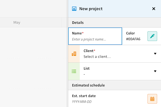
Back to working on the app, I take the leap into creating projects, but via form first instead of click & drag.
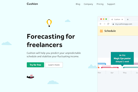
I spend my holiday break bringing more fun to the Cushion homepage with a new design, full of illustrations and animations.
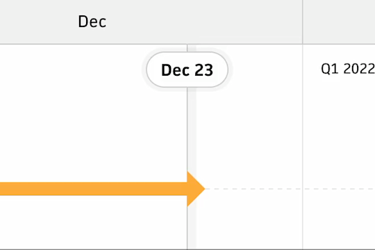
After launching the Schedule timeline beta, I’m able to easily launch a handful of smaller releases to keep progress going.
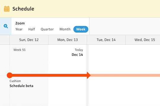
To get folks to start testing the new Schedule timeline early, I released the initial beta this weekend.
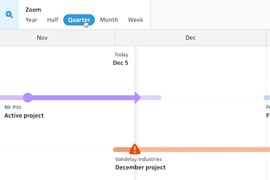
With the schedule timeline nearing a beta launch, I take a couple more weeks to sneak zooming into the feature set.
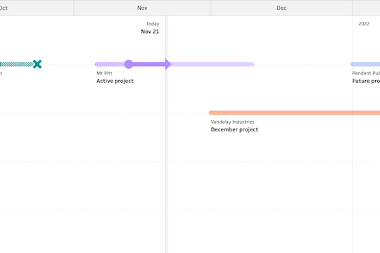
In an unexpected moment, I decide to try vertically flipping the new schedule timeline, so projects stack from the top.
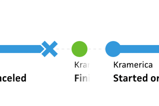
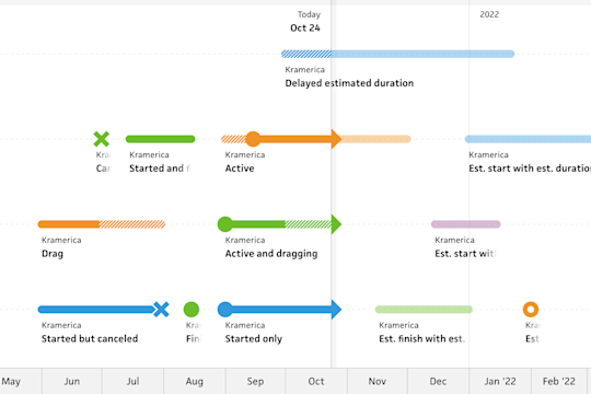
Determined to always display labels on the new schedule timeline, I detail all the edge cases I’ve gotten myself into.
Now that I have a canvas for the new schedule timeline, I need to fill it with projects.
After thinking through a modern schedule timeline, I start by enlarging the timeline to full-page and adding freeform scrolling.
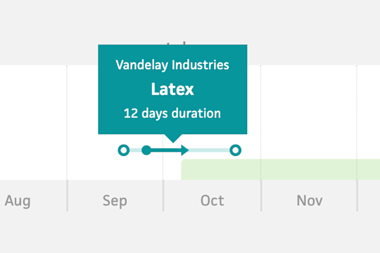
Taking a break from the Clients section, I get a burst of inspiration thinking about scheduling.
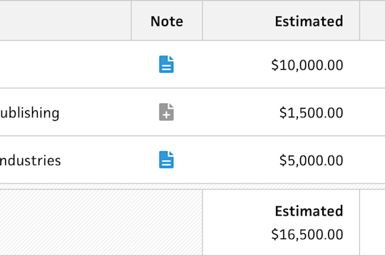
Continuing work on the new Clients section, I revisit client notes, but with a few UX improvements.
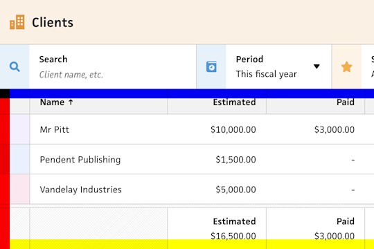
Improving a upon the overflow shadows in Cushion, I replace scroll events with the Intersection Observer API.
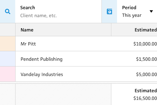
After rolling out the new Client section to a few dozen beta users, I start applying their feedback.
While making forward progress with the new Clients section, I take a break to upgrade the new codebase to Vue 3.
An already stressful time is made even more stressful by a Safari performance issue with nested grids.
With the Clients section beta up and running, I launch my first incremental update.
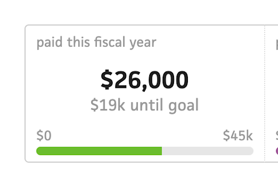
A video call with a friend provides some interesting insight into a potential direction for restructuring the app.
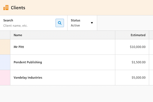
After a heads-down week, I managed to reach the first milestone in releasing the new Clients section—private beta.
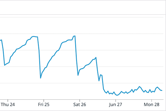
In an update of the database memory saga, I discover pgbouncer, which puts a stop to the constantly climbing memory woes.
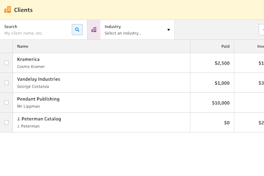
With the sidebar navigation ready to deploy this weekend, I get an early start on the top-level “Clients” section.
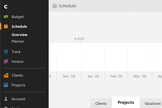
After regretting, but living with, the skinny sidebar nav of obscure icons, I finally set a course to improve its UX.

Following up on the initial proof of concept, I build the complete system to send journal posts as emails.
In an effort to grow readership, while also prototyping an idea, I start building a system to email my posts.
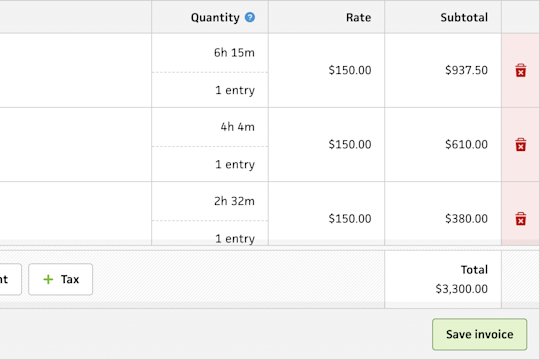
Putting the final touches on the invoice form, I apply a sticky behavior to the line item totals.
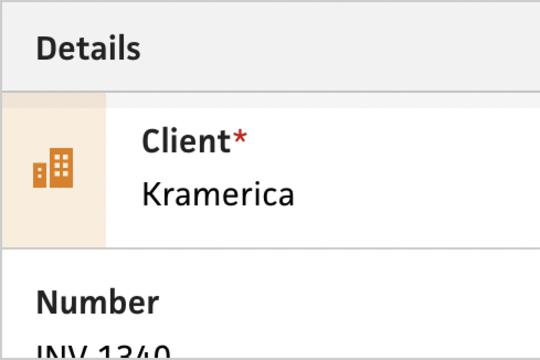
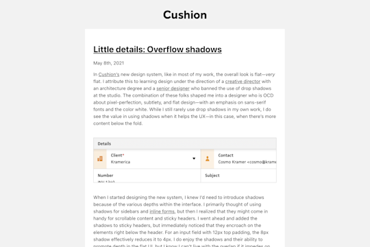
I spend extra time getting a little detail right by tying shadows to whether the underlying content has overflow.
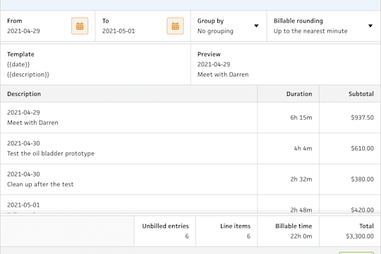
With the last remaining to-do on my list for the new invoice form, I tackle the flow for importing tracked time.
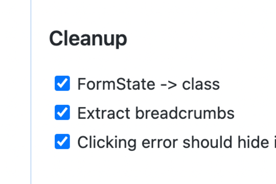
With the inline forms behind me, I spend a week cleaning up the codebase with a focus on Cushion’s form states.
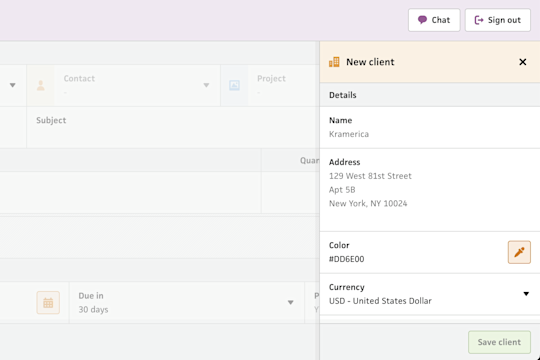
After detailing how I planned to build inline forms in Cushion, I went ahead and built the first one for creating clients inline.
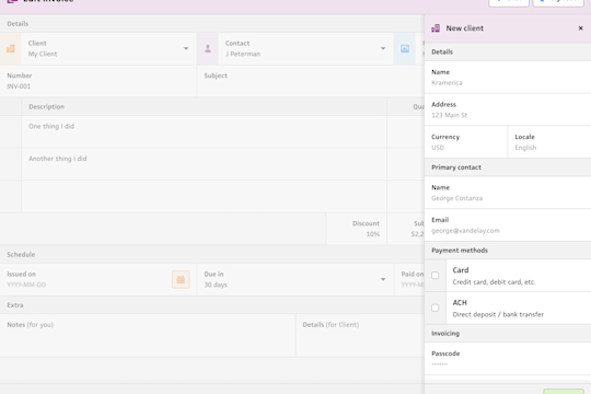
In between big tasks, I distract myself with smaller tasks until I’m ready to finally face it—inline forms.
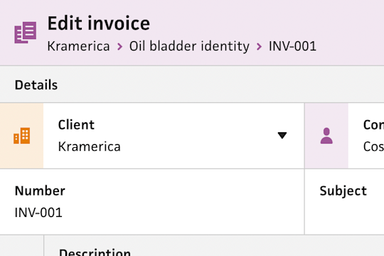
Chopping away at the new invoice form, I designed and built a new component for breadcrumbs.
Aggravated by people signing up with no real intention to use Cushion leads me to consider a “test mode” where they can try the app without signing up.
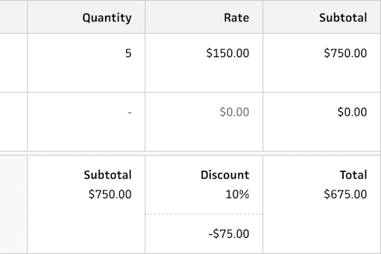
While redesigning the invoice form, I share the decision-making behind the design of the new line item footer.
Frustrated with Heroku, I start migrating away from it, beginning with continuous integration.
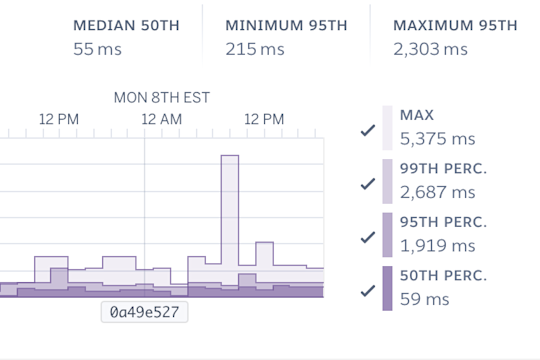
Upgrading Cushion’s database leads to a week of troubleshooting performance issues.
After receiving an email from Heroku to upgrade Cushion’s database, I upgrade Cushion’s database.
With Cushion reaching the 7-year mark, I reflect on its life and plot a course for its future.
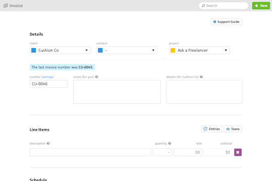
At the fork in the road, I choose the invoice form as the next step in renovating Cushion, including a long-awaited list of improvements.
With a couple big launches behind me, I think about what to tackle next or whether I need to pick a direction just yet.
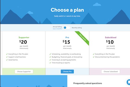
After launching Cushion’s new invoice page last week, I launch the new account page this week with a ton of other goodies.
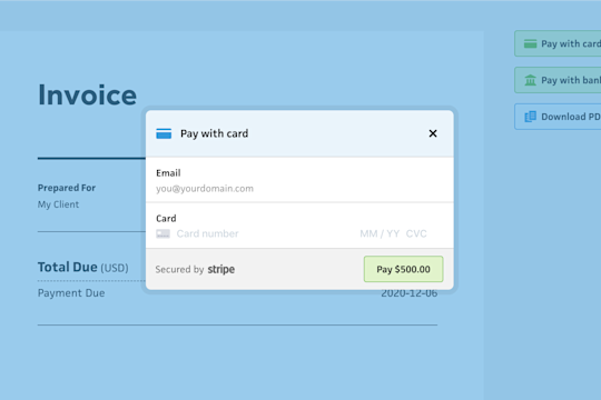
With only days before the SCA deadline, I launch the new invoice page with to be SCA-ready while also paving the way for more improvements.
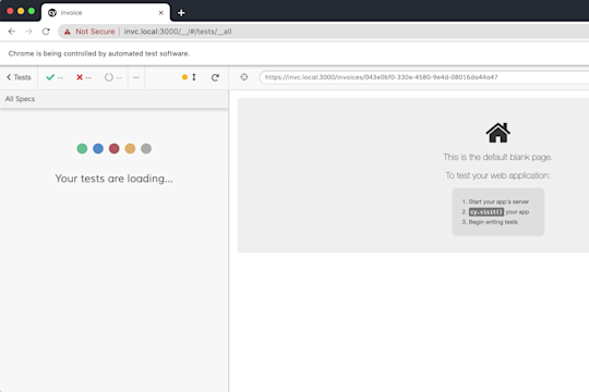
Wrapping up my work on the invoice page, I set up integration testing using Cypress to make sure that everything continues to work end-to-end.
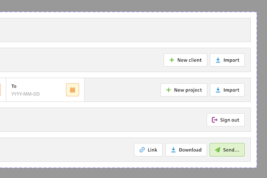
Continuing to make progress on the invoice page, I talk about some of the ways I’m improving the codebase along the way.
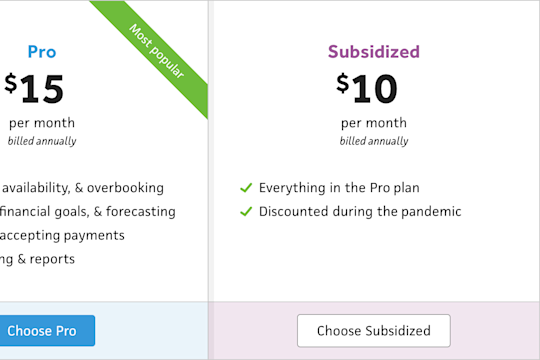
A chat with a user leads me to consider a subsidized plan for the New Year to help folks through the pandemic.

I pause work on the account page to make sure Cushion’s invoice payment integration is ready for the SCA deadline.
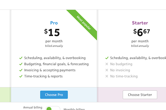
In needing to redesign the pricing page for the new account section, I decide to rethink the structure of Cushion’s existing plans.
An innocent bug report unfolds into a roller coaster ride of a troubleshooting journey.
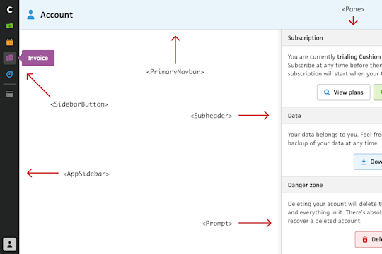
As I begin building Cushion’s new account page, I start by scaffolding a static version of it and building the components it requires.
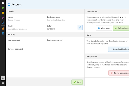
With SCA regulation going into effect at the end of the year, I prioritize migrating to the Stripe customer portal, which means redesigning the account section.
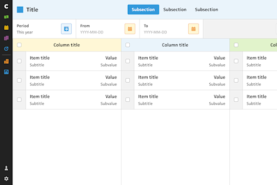
After years and years of incrementally tweaking the design of Cushion, I take a holistic look at the layout system.
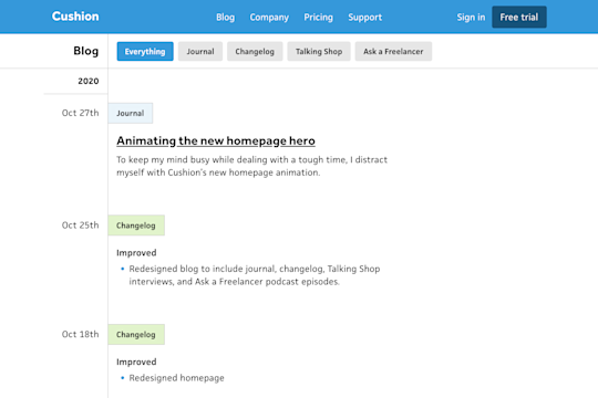
After redesigning Cushion’s homepage, I take the next step in migrating to Contentful by rethinking the blog.
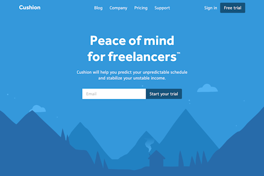
To keep my mind busy while dealing with a tough time, I distract myself with Cushion’s new homepage animation.
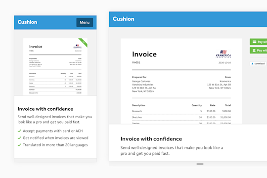
While building Cushion’s new homepage, I go the extra mile to swap out better-fitting images for different breakpoints.
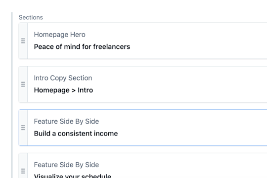
After migrating Cushion’s changelog to Contentful, I move onto the homepage, where I narrow in on an approach to compose pages entirely in the CMS.
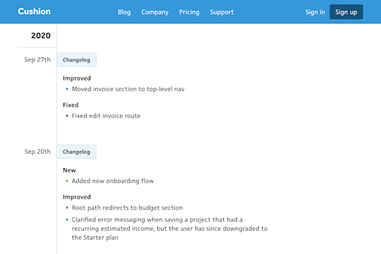
In my initial step towards migrating Cushion’s marketing site to Contentful, I start with the changelog.
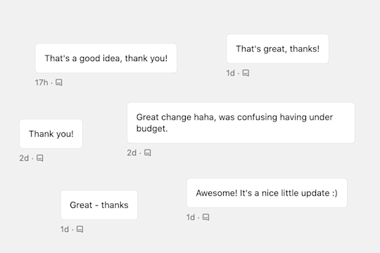
I reworked the main nav to include invoicing, which was met with a wave of thanks from users.
After launching Cushion’s new onboarding, I detail the next few items on my to-do list, which for once are not new features.
A weekend turned into a month, but Cushion’s new onboarding is finally live. Instead of focusing on the launch itself, I talk through my favorite part.
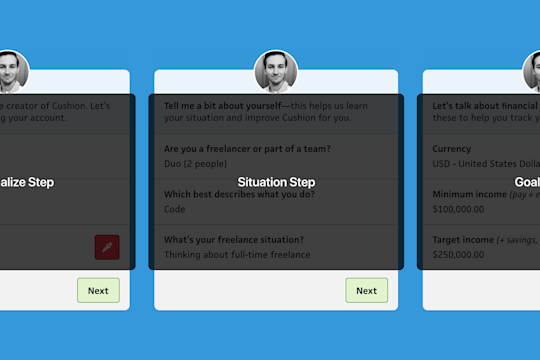
To provide a more pleasant codebase for Future Jonnie to inherit, I restructure the onboarding to be composable and easily testable.
I decide to write a few utility methods myself, rather than relying on 3rd party library, and I’m glad I do.
Torn between adding a dependency for a utility method or writing it myself, I talk through the pros and cons of both approaches.
Determined to launch thew onboarding flow, I forgot to write for a week and it shows.
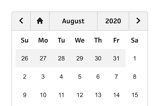
Continuing my work on Cushion’s onboarding flow, I build a new and improved date picker component.
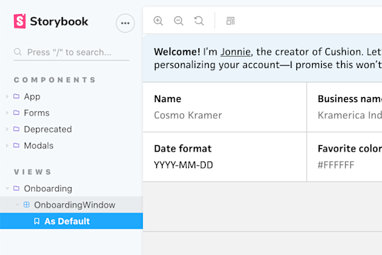
With my recent work on Cushion’s new onboarding flow, I take a meandering walk through the new components I built for it that are all typed and tested.
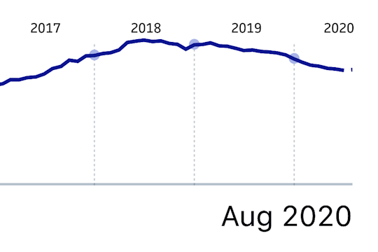
Stepping back to look at Cushion’s growth over its entire lifetime reveals a crystal clear moment when everything went south.
I start working on the new onboarding flow, but quickly realize it won’t be a weekend project.
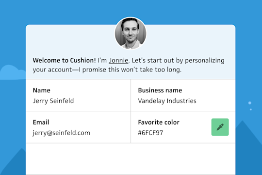
As a first stab at onboarding, I design a flow that includes myself asking questions, which hopefully provides a friendly intro to the app.
In an attempt to ease people into the app rather than pushing them out of the airplane, I decide to bring back a proper onboarding flow.
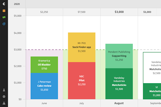
After feeling reluctant to reveal any design progress, I decide to bite the bullet and share a few rough sketches—no matter how uncomfortable it feels.
Continuing the idea of the single click, I talk through a potential path to flattening the nav from multiple layers down to one.
Browsing through Cushion, I realize something strange. As I troubleshoot the anomaly, I discover an embarrassing truth.
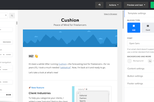
I sent my first Cushion newsletter in over a year and a half, which sounds crazy, but nonetheless, it feels great to send them again.
Before diving into analytics, I decide to spend time writing database queries that could validate some of my assumptions using existing data.
After building Cushion so far based purely on assumptions and intuition, I finally start to think about using analytics to help guide me.
A thought-provoking conversation leads me to realize that Cushion is still solid and worth iterating on, instead of restarting from scratch.
After establishing a new guiding principle to keep API requests simple, I describe how I could refactor a complex view that relies on a heavy API request.
I discuss a pain point in the current Cushion involving the number of clicks it takes to get to where you need to go. What if it only took one?