Journal
Visualizing projects in the new schedule timeline
I’ve been making a ton of progress on the new schedule view in Cushion these past couple weeks. It’s also been a ton of fun to work on—so much so that I’m lagging behind with writing about it, but I’m determined to catch up. While I’ve already reached the point of fine-tuning interactions and edge-cases, I need to rewind back to earlier progress—visualizing the projects.

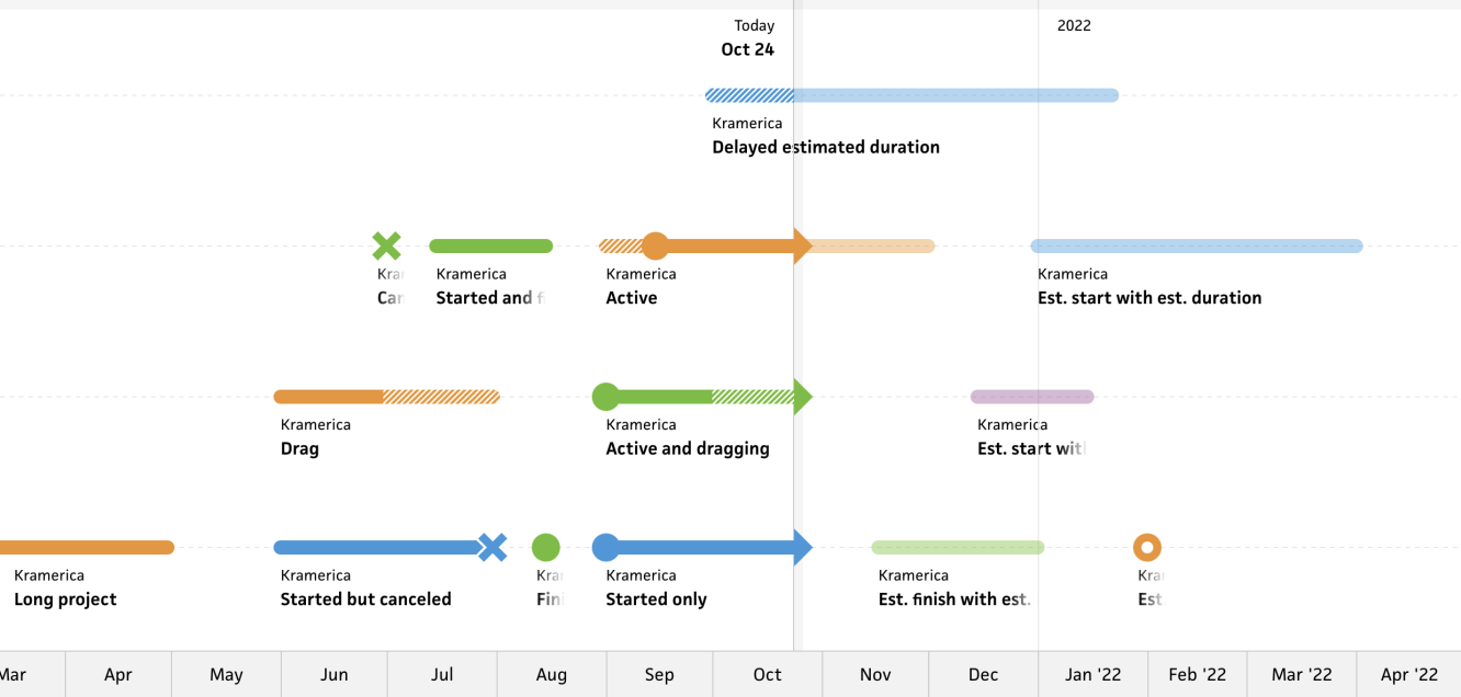
As mentioned in the previous post, the new timeline is full-window in size, so I have much more screen real estate to work with. Rather than consider this extra room to stack more projects, I’ve decided to triple the size of the shapes and include always-visible labels as well. The increase in size dramatically helps with visibility and interaction hit-areas while the labels make it easy to identify projects without needing to hover.

Also in the previous post, I wrote about the “Today” marker, which runs vertically on the timeline. This is a significant part of the new timeline as it’s the physical divider between past and future. Similar to the existing timeline, the actual dates and durations of a project are solid in opacity, but this is emphasized even more as it applies to anything to the left of the “Today” marker (i.e., in the past).
Likewise, any of the estimated durations to the right of the “Today” marker (i.e., in the future) are half opacity. This hard separation between the two makes it clear what has actually happened and what’s set in stone versus what’s still estimated or bound to change. (I have a couple ideas that will make this contrast even more apparent, but I won’t touch on those yet…)

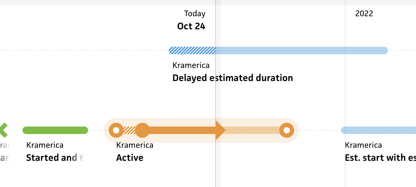
When the user hovers a project in the timeline, I now highlight the entire project to make it obvious what they’re hovering and to reveal any dates, represented by large circles. Revealing estimated dates on hover is carried over from the existing schedule timeline, but I’ve decided to apply this to actual dates as well if a project is no longer active.

Once a project is done, it feels more appropriate and less congested to downplay it by only showing its durations. If a project is active, however, I show the start date along with its arrow that represents the current date. The arrow isn’t new, but having the extra emphasis of an active project by always showing the start date is new.

For single-day projects—like a project that started and finished on the same day, a project with only an estimated start date, or a project that was simply canceled—I only show the date, and I display it at full size. This helps balance single-day projects amidst a sea of projects with durations, so folks won’t lose sight of the shorter timeframes. At first, I tried representing them with circles the same height as the duration lines, but they get lost so easily. I might reconsider this decision if single-day projects should be emphasized less than longer projects, but for now, this feels visually balanced.

The last part I’ll touch on for now is somewhat of an edge case. In Cushion, you can have a project with an estimated finish date or you can have a project with an estimated duration, which then specifies what I call a “calculated estimated finish date”—essentially, the estimated start date plus the estimated duration. In the existing schedule timeline, I treat this exactly the same as the estimated finish date, but in this new timeline, I was tempted to treat it differently. When you pinpoint a date versus a duration for a project, it’s more specific, like a deadline. I want to portray that specific feel, so for projects with an estimated duration, I no longer show a circle for the estimated finish—I simply show the end of the duration.

This also applies to projects with no estimated start date, but an estimated finish date and estimated duration. To me (at least), it makes more sense when comparing projects that fall into either camp. This distinction will also help with the ideas I have for interaction and direct manipulation… But that’s for another time.