Journal
Onboarding is live
After a month of design, dev, and fine-tuning, with unwavering determination to build everything in the most future-friendly way, Cushion’s new onboarding is officially live. I originally thought it would only take a weekend, which is beyond laughable at this point, but I’m so glad that I didn’t only give myself a weekend, and instead gave my the time that I needed to get it right. The content might’ve changed quite a bit from the original design, but the onboarding experience that I ended up launching is exactly what I had envisioned from the start.
I’ve already written plenty about all the details along the way, but with this post, I want to focus on the part that brings a giant smile to my face every time—the parallax landscape. Ever since hiring my good friend Laura Bohill to illustrate the mountains (as well as a handful of other landscapes), I’ve been dying to animate them. Every time I visit the Cushion homepage and see that the clouds aren’t moving or the mountains aren’t shifting, I’m reminded that I haven’t done it yet. I did get a chance to animate the mountains for my homepage, but that focused on vertical parallax and wasn’t specifically for Cushion users. With this new onboarding, I knew I couldn’t let myself launch it without taking the time to finally animate the landscape.
While I could’ve hastily shifted a single SVG and called a day, I decided to also build this animation the right way, too, so I could easily reuse it elsewhere if I needed to. The entire landscape is its own component that has a single prop for “traveling” the x-axis. The frontmost mountains move 1:1 with the prop while the mountains behind them move at 50%, the clouds at 10%, and the stars at 1% (yes, the stars also shift!). I also couldn’t help but subtly move the clouds when the landscape is rested to simulate wind.
To make the animation as performant as possible, I separated each layer into its own SVG, so the browser would hardware accelerate them with the GPU. Otherwise, if you transform all the paths within a single SVG, the browser will rely on the CPU and repaint the canvas with each frame. Along with performance, I wanted the landscape to feel infinite. If I ever added another step to the onboarding, I didn’t want to also need to update the animation. For this, I used a trick I keep in my back pocket where I double the background horizontally and offset the inner layer at negative half-width steps. As the landscape scrolls, the inner layer gets pushed in the opposite direction by half its width every half-width step. This is somewhat difficult to explain, so maybe the actual math would help:
const halfWidth = layerWidth * 0.5;
const offsetX = Math.floor(-scrollX / halfWidth) * halfWidth)
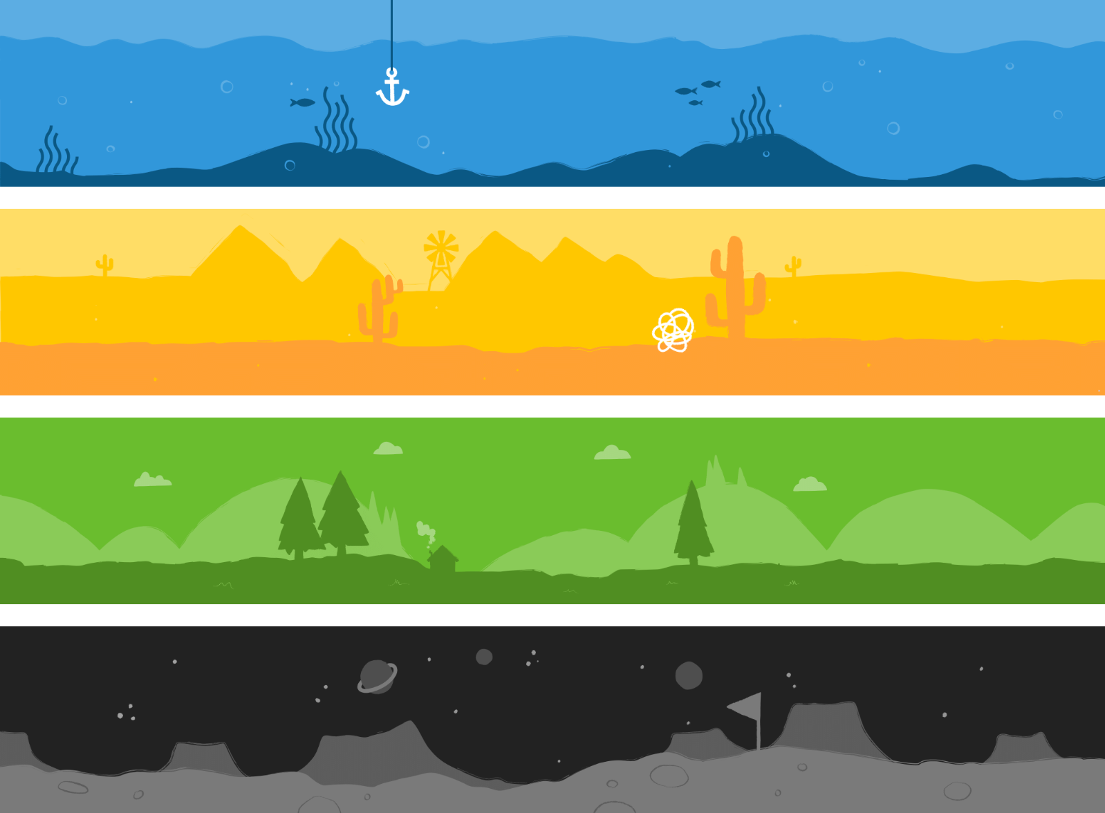
This makes the landscape feel infinite no matter how much I scroll in either direction. The final part I’ll touch on is that because this is a proper component that I can reuse, I can also swap out the landscape for any of the other illustrations Laura drew for me:

I’m so happy knowing that these illustrations continue to live on with Cushion because they’re a constant reminder of how much my friends have helped me along the way with Cushion. It’s such a relief that the onboarding is live, so I can now move onto what’s next!
If you’re a Cushion user, you can check out the onboarding by going to /onboarding. And if you’re not a Cushion user, simply sign up!—I don’t mind if you only sign up to check it out and as long as you don’t mind receiving onboarding emails. ;)