Journal
Investigating inflection points
Yesterday, I was looking at my Stripe dashboard and randomly decided to zoom all the way out to see Cushion’s entire lifetime metrics for monthly revenue, subscriber count, signups, etc. I knew it wouldn’t be great since I spent most of last year recovering from burnout, but I’ve been reluctant to actually check the numbers until now. While it is in fact “not great”, it’s also very interesting. Immediately, I was able to pinpoint a clear inflection point where everything started trending downwards. I could also see several smaller, less-noticeable points that might be tied to specific events I could learn from. Before I knew it, I felt like the Pepe Silvia meme, trying to explain why the numbers changed at these points in time.
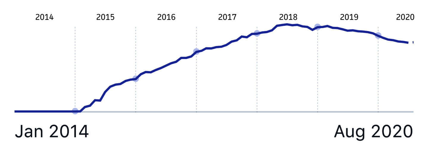
When I first started writing this post, I planned to simply write about it, but that doesn’t paint a clear picture, so I’m just going to show you—no matter how embarrassing. This graph represents Cushion’s MRR, or monthly recurring revenue. For the first few years, Cushion’s growth was great—consistently going up at a comfortable and steady pace. Around mid-2018, however, that trend changed from an incline to a plateau. Towards the end of 2018, the real decline started, followed by a consistent downward slope through 2019 and into the first half of 2020. Now that I’m 100% again, I’m actively working to get Cushion back on track. I’m proud to say that for the first time since burning out in February 2019, Cushion is seeing positive growth again. (It feels really good to say that)
Despite the recent uptick, I’m still determined to figure out where I went wrong in the past. I started making a list of all the notable events throughout Cushion’s lifetime that might explain the inflection points I noticed. Thanks to past-Jonnie, I have a detailed changelog that lists every single change to Cushion since starting it in 2014. If I made any update to the app, I’d be able to find it there along with its date.

In addition to app updates, I took a trip down memory lane with the Wayback Machine to find all the instances where I made significant changes to the marketing website, like the many redesigns I did for no reason. Looking through the previous designs, I actually believe the current website is the least effective at highlighting the real value of Cushion. Ironically, some of earliest versions of the website are the most compelling—focusing on what truly makes Cushion unique while also touching on the pain points of freelancing. I definitely foresee yet another redesign in the near future, but maybe revisiting a previous design rather than starting fresh.
While I’m still in the process of investigating smaller inflection points, the big one that led to the steady decline was obvious after I looked at the changelog. In August 2018, we put the existing app on hold and instead focused on a new version of Cushion. This version revolved around bank feeds to automatically visualize your financial “cushion”. The idea was decent, but putting a halt to the existing app to go heads-down for months on something new maybe wasn’t the best approach.
Instead, I should’ve remembered the post I wrote about working in increments. More importantly, I should’ve recognized that we already had a good thing going with the existing app. That’s easy to say, but it’s a different story when there’s payroll and a draining personal bank account. Now that I’m on my own again with the stability of a full-time salary, the intense pressure of a steep financial decline no longer weighs me down. I can do what’s right for Cushion and grow it at a steady, comfortable pace again.
I’m going to continue digging into these inflection points, but it’s promising to know that simply focusing on the existing app and sending monthly updates again is already having a positive effect. As I learn more about what drives folks to use Cushion, I’ll continue to emphasize those aspects and hopefully bring back that consistent upwards trend.