Journal
Redesigning the account section for SCA with Stripe Billing customer portal
For the past year or so, I’ve been receiving emails from Stripe, Cushion’s payment provider (and ironically my full-time employer). The emails urge me to make the necessary updates in preparation for Strong Customer Authentication (SCA), which goes into effect at the end of the year. This currently only affects European users and the deadline has been consistently pushed back, so I haven’t been in much of a rush to make the necessary changes.

The most recent email from Stripe, however, got my attention as it pointed out just how much income I’d lose if SCA isn’t in place—very effective! Now, I’m shifting gears to get it out of the way, which at first felt like yet another distraction, but then I realized I could take this opportunity to implement the new layout redesign on the account page.

As I start to migrate everything to the new layout design, I desperately want to avoid flipping the switch and hoping that everything’s perfect on day one. The account section makes a solid candidate for the first page to migrate because it’s not weird if it looks slightly different than the rest of the app. Also, with any section that I migrate, they’ll require an entire page load because the new pages will be 100% Vue.js (no longer Vue.js embedded in the legacy AngularJS codebase). Even though Cushion’s page loads are fast as-is, I wouldn’t stress as much about the account section taking slightly longer to load.

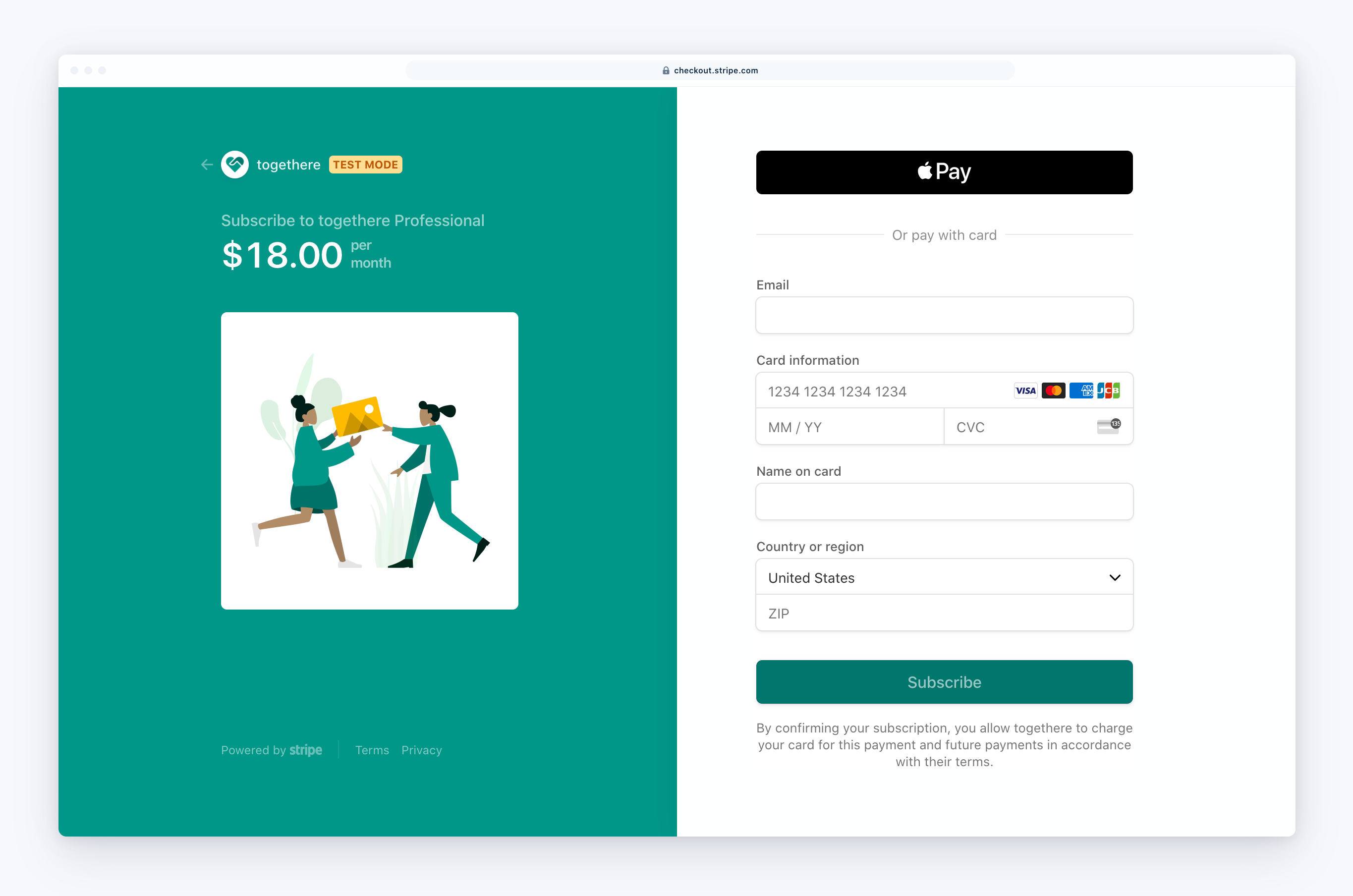
With SCA, the easiest path is to take Cushion’s custom subscription page (that I painstakingly built) and migrate it over to Stripe’s new Billing customer portal, which takes care of everything for you—including the SCA flow. Essentially, I can replace everything in Cushion’s subscription section with a direct link to the customer portal. There, users can update their payment method, switch plans, cancel their subscription, download receipts—everything. Then, whenever the user takes action, Stripe redirects back to Cushion’s account section where I can reflect the change.

There is one other significant change that goes along with this. Right now, Cushion has a “Plans” section within the app that shows Cushion’s plans along with their pricing and features. I always hated the fact that this lives on both the marketing site and within the app, so nixing one of them is a welcome change for me. That said, I’ll now need to migrate Cushion’s pricing page to the new Contentful-powered codebase. It’s a necessary change, especially since the two pages are embarrassingly out of sync, but it’s yet another thing to do.

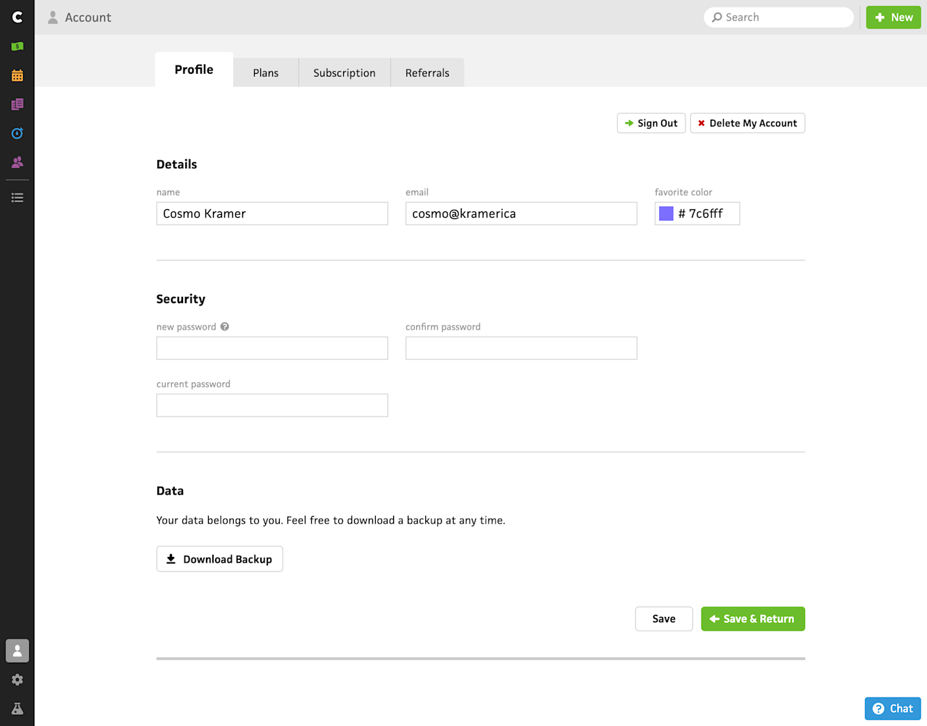
With all of this in mind, I’ll most likely house the entire account section in a single view. Users will be able to edit their account details as well as manage their account. One of the most important changes I’m making to the new design is separating the “Sign out” button from being right next to the ”Delete my account” button—I still think it’s hilarious that I thought this was a good idea. I also added the “Subscribe” button that links out to the customer portal with a secondary button linking to the pricing page.
I’ll be honest—I’m primarily considering the everything-in-one-view approach because there’s so much screen real estate to fill. I haven’t entirely figured out a layout in the new system that feels right without filling the space edge-to-edge. I could include an account summary with the other “cards”, then let folks click to edit or change their password, but for now, it’s actually less work to put everything in one pot.
At this point, I feel like I’m overthinking the design and I should’ve started coding days ago—I’ll probably notice something as I‘m coding it, like I did with onboarding, which actually helps inform the design. In any case, once I finish this migration, I can continue with the rest of the app!