Journal
Retention through useful features
I recently introduced a major new feature in Cushion—weekly summaries. On the surface, this might seem like a feature that originated like others. Maybe a user suggested it or I desperately needed it myself. Surprisingly, this wasn’t the case. Weekly summaries is the first Cushion feature that came from a behavioral need—user retention.
Cushion is nearing its 2nd birthday and appears to be doing well. I’m not ditching client work just yet or doing snow angels in money, but it’s on a consistently upwards path. Cushion should be growing faster, but something is holding it back. For every handful of new subscribers, a paying customer cancels. That “churn” word, that everyone in the SaaS world talks about, becomes the latest addition to my vocabulary.
Through conversations with users who cancel, I started to notice two patterns—1) most users don’t use Cushion on a regular basis, and 2) most people cancel their Cushion account because they don’t use it enough. When you think about these two patterns in parallel, it’s easy to see that they are directly connected.
The original intention of Cushion, however, was to fit this exact use-case. Because it visualizes a bird’s-eye view of your schedule and income, you don’t necessarily need to check it as much as you would a time-tracker or to-do app. To me, that’s a benefit—allowing users more time to spend on their actual work. Unfortunately, this doesn’t help with retaining paying customers. As people use Cushion less, they no longer equate the value with the monthly cost. Slowly, the cost of this week-to-week tool doesn’t feel as justified as an everyday app.
By designing Cushion so users don’t need to use it every day or every week, I have essentially built a churn machine. There’s nothing to pull users back in—they need to remember to come back. As a result, I need to straighten the ship and focus on user retention.
The most common way to bring users back is through email. Unfortunately, many apps abuse this approach by using marketing techniques that don’t have the user’s best interest in mind. As a user of many apps myself, I refuse to follow the playbook of assaulting email inboxes with opt-out drip marketing or other spam-like techniques. If I knew upfront that signing up for a service signed me up for a dozen unwanted emails over the next two weeks, I wouldn’t sign up. That should be an opt-in preference upon signing up, for users who need guidance.

Instead of using a marketing technique, I decided to improve retention with a new feature—weekly summaries. This way, users get a reminder to log into Cushion, but they also receive personalized insights that are useful to them—not a blind tutorial for a feature they might already know how to use. By providing users with data that’s actually useful, Cushion is starting out the relationship by being respectful rather than texting them every day and hoping they text back.
As an avid Slack user, I always look forward to their weekly summary email for the rooms I own. Most of the information is intended more for the project manager type, but I find it interesting nonetheless. I imagined what this email would look like for Cushion—what would be useful for freelancers to see after each week.

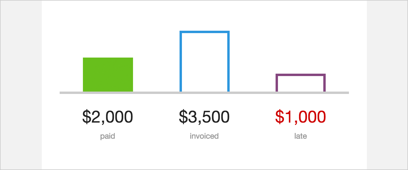
The most obvious insight is income activity. In Cushion, this means the amount you were paid that week, the amount you invoiced that week, and a sum of late invoices. All three of these are useful because they have the ability to either boost your spirits or kick you into gear. If you had a few paydays, you can pat yourself on the back. If you didn’t see a dime that week, this could serve as encouragement to either track down late payments or take on more work.

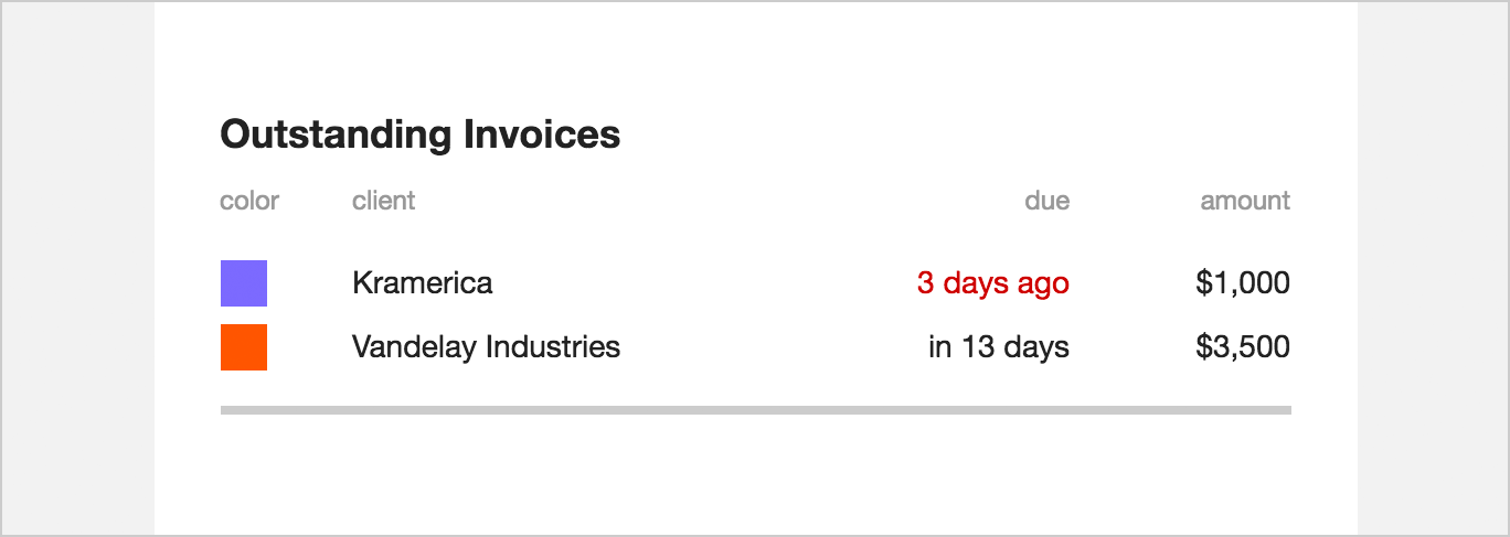
If a user has any late income, they would probably want to know which invoices are late. Under the graph, Cushion lists all of the outstanding invoices for that week. The list includes the relative due date of the invoice along with its amount. Instead of showing a MM/DD/YYYY-formatted date and forcing the user to calculate when the invoice is due in relation to the current date, Cushion will show “tomorrow” or “3 days ago”—much easier to process at a glance.

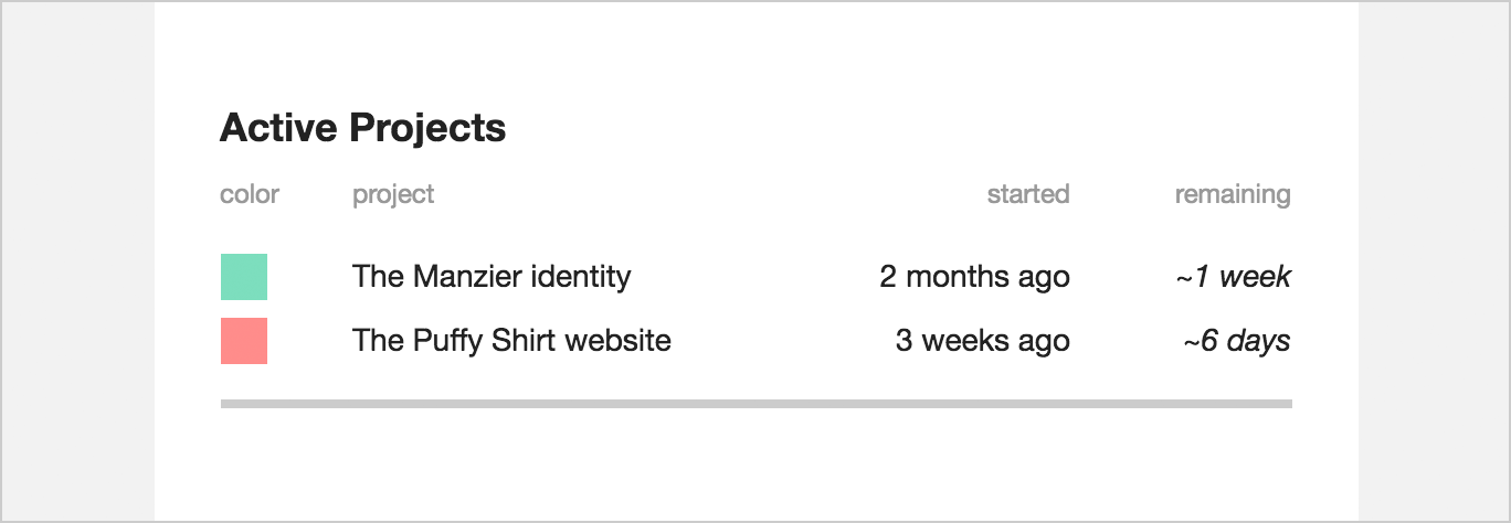
Then, below the outstanding invoices, Cushion lists the user’s currently active projects. Each one includes its relative start date and the estimated time remaining on the project. This gives the user a sense of how long it’s been and how far is left to go. If there are any listed projects that are no longer active, users can easily click the project to open Cushion and update the project’s status.
The email doesn’t seem like much, but it does a great job of keeping users informed on a recurring basis while reminding them to check in from time to time. Instead of blasting everyone with the same static email, users receive relevant data that they opted-in to receive.
I consider this Cushion’s first step towards establishing a routine for users. Every Monday morning, they can expect to receive their summary, and knowing this will prompt them to keep their account up-to-date. So far, it’s a great success. A handful of users have already let me know that they use Cushion more because of it—they feel the need to ensure everything is accurate before their weekly summary arrives. Considering my goal with this feature, that’s like music to my ears.