Journal
The new Clients section is now in private beta
Phew—what a week. My wife has been staying late at the studio for a freelance gig, so I’ve had an excuse to work late on Cushion, too. My focus has been the new top-level Clients section, which is long overdue after being buried in the Schedule and Budget sections for most of Cushion’s lifetime. Like every big task, this one snowballed—specifically with the inline client form for creating and editing clients. Luckily, I was able to separate the overarching task into several smaller milestones, so I can release it in parts, starting with a private beta for the initial Client section.

In the original design, I included all sorts of features, like importing, batch editing, and a dropdown filter for industries. Those have all been punted to my “Can wait” list in order to make progress on the basic essentials of the section, like listing clients, searching clients, and creating/editing/archiving/deleting clients. Listing clients is pretty straightforward (at first) because I’m also focusing on the basics of simply rendering a list. I couldn’t help myself from thinking about the next steps of making it a “virtual” list for performance, so it’s not actually rendering every client, but instead rendering only the visible ones, then scrolling and recycling those over and over. At this point, however, that’s getting ahead of myself and optimizing too early. I also thought about making the column headers clickable, so users can sort by different columns, but again, I’m getting ahead of myself.
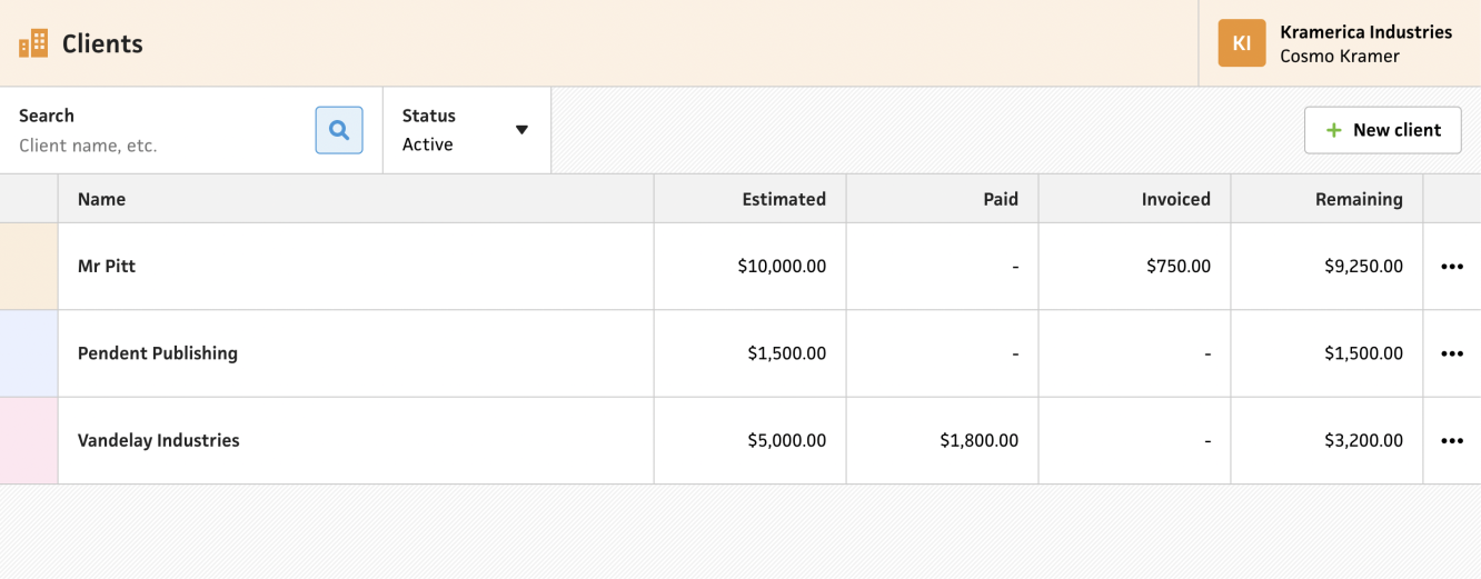
I’m starting with income as the data that the list shows for each client, which I think is a safe assumption based on what’s in the existing app. I know there are users who would want to see tracked time, but I’m not 100% sure if that belongs here versus in the Track section.
My goal for all new sections is to make them responsive from the get-go, so this list will eventually need to reflow down to mobile. Since this is the initial private beta launch, I haven’t gotten that far, but will most likely make the “name” column sticky, then scroll the other columns behind it.
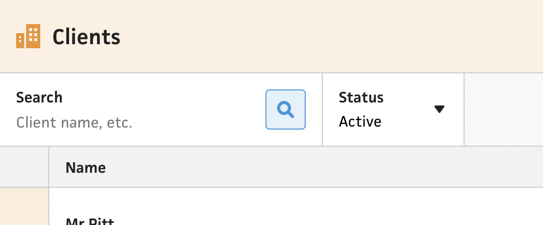
Along with the list of clients, I built the initial filtering system for quickly finding a given client. This was dead-simple as I was able to handle it client-side and search for client names. I can definitely improve this by making it a fuzzy search, but again, no need to get ahead of myself too early.
Instead of adding a dropdown filter for industries (which I don’t even know is something anyone wants) I thought about a filter that would benefit all users. If you use Cushion longterm, you’ll actively archive clients once you no longer need to reference them, so it makes more sense to have a filter for archived clients. This also helps a lot with the performance of the app, as I can default to showing the list of active clients. And by making the archived filter server-side, the request itself would only take a fraction of the time for power users, versus requesting all clients then filtering client-side.
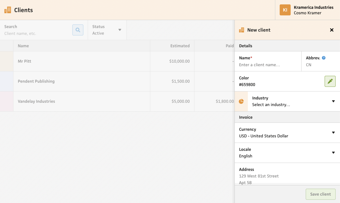
Adjacent to the filters is a designated area for buttons, like the button for creating a client. Luckily, in my work on the new invoice form (which has been temporarily shelved as I tackle these more necessary sections), I already built a basic client form for creating new clients. It takes advantage of the “stacked” modal system that I landed on for inline forms, and works perfectly in the Clients section. What I didn’t realize when I wired this up was how much of the form I still needed to build. Since I only used it for the invoice form, I only had the bare essentials for invoicing—name, currency, locale, etc. If I wanted to mirror the existing app, I’d need to build a handful of other fields to keep it 1:1 with all the client settings.
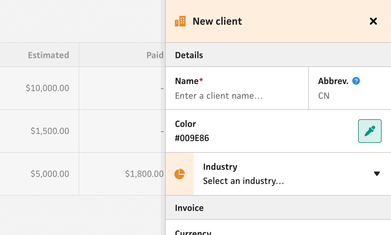
I figured it would be a good investment to build these fields now versus later, so I took a tally of what I’d need, then started building. First, I created an AbbreviationField for automatically creating the client abbreviation based on the name. Projects also have an abbreviation, so this can reused for the inevitable project form. Then, I built an IndustryField to select the client’s industry, which is still not being used anywhere, but good to have when I improve up on client insights. Next, I created a PasscodeField for passcode-protecting invoices, which also includes a button to generate a random passcode. Lastly, I assembled the “Payment methods” section, which actually deserves more than a sentence to describe—I’ll explain.
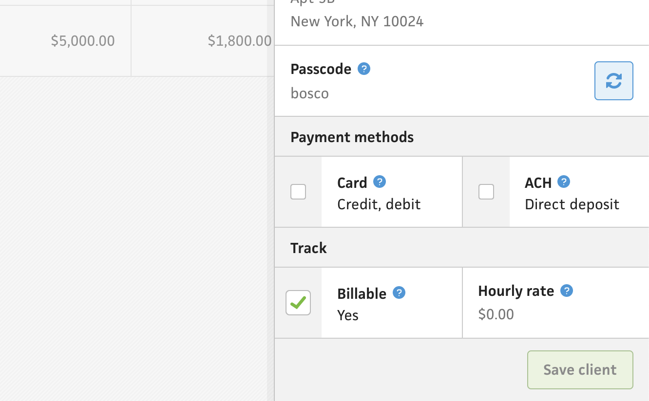
At first, I thought I’d simply add a couple checkboxes for the payment methods, then call it a day, but as soon as I remembered a crucial UX hiccup with payment methods in the existing app, I knew this part of the form would be more involved. This time, I wasn’t upset—I was actually excited to finally smooth this out.
Payment methods are only relevant to users who have integrated their Stripe account, so they can actually process payments, but in the existing app, you can check the boxes for payment methods without knowing that you also need to integrate Stripe as well. Without the integration, Cushion simply doesn’t show the payment method buttons on the invoices.
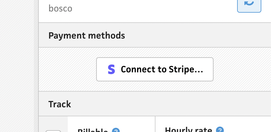
This time around, I felt determined to fix the gap. I would detect whether the user has integrated with Stripe and let them connect their Stripe account straight from there if they aren’t. I included a new boolean in my user payload that queries the existence of Stripe authorization, and if it doesn’t exist, I show a button to authorize with Stripe. If the user is authorized with Stripe, I show the payment method checkboxes as expected. There’s one last condition to account for here, though. ACH is an available payment method, but only for USD. To handle this, I hide the ACH payment method if the user selects a currency other than USD.
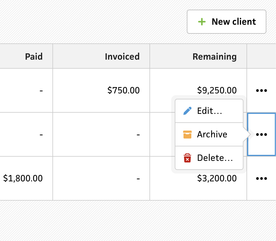
Now that I finished the ability to create new clients, I needed a way to edit/archive/delete them as well. Maintaining a similar approach to the existing app, I added context menus to the items in the list. Users can edit a client, which opens the client form and populates it with the selected client. There’s also an “Archive” option to instantly archive the client. If the user is viewing their active clients and archives a client, they’ll see the client disappear from the list as expected. Lastly, the user can delete a client from the menu. Because of the severity of this action, which also deletes the client’s projects, invoices, etc., I include a prompt to confirm deleting the client by asking the user to type the client’s name. In the past, I didn’t include this confirmation, and I can’t tell you how many times a user would delete a client without believing that it would actually delete the client.
This post ended up being way longer than I had expected, but I think this perfectly mimics the work on this Clients section. Since it’s so new and also a work-in-progress, I decided to deploy it behind a feature flag, so I can have longtime users try it out and provide feedback. If you’re a Cushion user who’s interested in kicking the tires early, let me know! I’m excited to see what everyone thinks.