Journal
Building a table for the nth time - Part 2
In the last post about tables, I revisited all the tables I built for Cushion over the past 10 years and described both the tech and approach I used. These tables relied on the tech that was available to me at the time, which resulted in tables built with jQuery, CoffeeScript, Angular, and old versions of Vue. Now that I’ve been using Vue 3’s Composition API and TypeScript for several years, I’m especially comfortable and confident in this most recent approach (which is always the way it should be).
When I first started building the table, I knew I wanted to lean on markup as much as I could. I’m a purest at heart, so I prefer writing HTML when I need HTML and CSS when I need CSS. If you read the previous post, I’ve certainly had my fair share of “clever” approaches to rendering HTML, like concatenating strings, and I’m so over that phase of my engineering life. Luckily, Vue 3 is incredibly fast when it comes to rendering, so I don’t need to worry about performance the way I did with Angular back in the day. Now, I can just write the markup, wire up the data, and expect instant rendering.
Since I knew I’d be reusing this table throughout Cushion, I decided to make a “base” table that I could use across clients, projects, and invoices, but I wanted to make sure it was specific to “items”—not an entirely generic base table. I’ll explain. There’s bound to be areas where I need a table that doesn’t look like the tables for invoices, etc., and doesn’t use the kind of data that goes into an invoice table, so instead of making a <Table> component and calling it a day, I opted for an <ItemTable> that’s more intentional in its use and infers that this is a table for “items”. (I admit “item” is an incredibly ambiguous word here, but I strangely don’t like using the word “model”, which is what I’m referring to—a model with an ID.)
From here, I was able to build all the child components for an ItemTable, which include an <ItemTableCell> (or <td>), <ItemTableHeader> (or <th>), and <ItemTableRow> (or <tr>). These components are intentionally primitive because they’re meant to be extended. Within the components themselves, however, they’re styled to the design of the item table. They also handle all the aria-role attributes, so I can maintain accessibility while ejecting from the table-based display styles. With these low-level components, I can…
extend the
<ItemTable>to make an<InvoiceTable>that takes an array of invoices and renders them as invoice rowsextend the
<ItemTableRow>to make an<InvoiceTableRow>that takes an invoice and renders the relevant cellsextend the
<ItemTableCell>to make a collection of cells to handle any formatting needs, like currency, dates, durations, etc.
All of this combined lets me easily compose tables while compartmentalizing their logic and styling. I no longer need a long config object full of callbacks to determine everything, like in past attempts. I do still have an initial config, but it’s limited—in a good way—and makes much more sense now through the use of composables (or hooks in React).
The last time I rebuilt this table, in 2017, the concept of composables didn’t even exist. Now, I’m able to configure a table with a `useTable` composable that takes an array of columns (for config), an array of rows (for data), and an optional order (column name and direction), then returns reactive arrays for the filtered columns and sorted rows.
const { columns, rows } = useTable({
  columns: [
    {name: "Color", type:"Color", sortKey: (invoice) => invoice.client?.color || "#bbb"},
    {name: "Number", type:"String", sortKey: "number"},
    {name: "Client", type:"String", sortKey: (invoice) => invoice.client?.name || "(no client)"},
    {name: "Created", type:"Date", sortKey: "created_at"},
    {name: "Updated", type:"Date", sortKey: "updated_at"},
    {name: "Sent", type:"Date", sortKey: "sent_on"},
    {name: "Due", type:"Date", sortKey: "due_on"},
    {name: "Paid", type:"Date", sortKey: "paid_on"},
    {name: "Amount", type:"Currency", sortKey: "total"},
  ],
  rows: invoices,
  order: {column: "Amount", direction: "Desc"},
});
The config for the columns includes the column name as well as its type and sort key, which is either a key on the model or a callback to dig deeper. Callbacks are handy for specific cases where the sort key isn’t the raw property value. In Cushion’s case, sorting by color—which is a thing—requires that I convert the hex colors into HSL colors and sort by hue. As for “type”, I’m especially excited about this approach because it removes so much manual work. As an example, if a column is of type “date” or “currency”, the table knows to align those columns to the right and narrow their widths. Or, for a color-typed column, I could actually pass the raw hex color as the sort key, like above, and the column could know to automatically convert it to a hue before sorting.
const { columns, rows } = useTable({
...
includedColumns: ["Color", "Number", "Client", "Amount"],
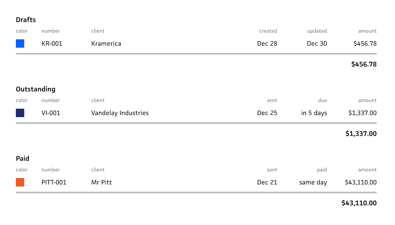
});If anyone’s especially curious, you might be wondering why this composable would need the array of columns only to return them again. This is because it also takes an includedColumns property, which is an array of the column names to show. In Cushion, there are actually three invoice tables under the “Invoices” tab—“Drafts”, “Invoiced”, and “Paid”. All of these tables render invoice rows, but each of these tables show different columns that are relevant to the invoices’ status (e.g., a due date for the “Invoiced” table and a paid date for the “Paid table”).
const { columns, rows } = useTable({
  ...
  includedColumns: ["Color", "Number", "Client", ...props.includedColumns, "Amount"],
  order: props.order,
});
In the past, these were three separate tables, which meant a lot of copy/pasting and reusing code on a column-by-column basis. This time around, however, I’m actually thrilled with the idea of using a single <InvoiceTable> component that by default includes all of the possible columns that an invoice table could have. Then, I can specify which columns to show—solely by name—as well as which column to sort by. This makes the actual implementation of each invoice table incredibly simple because the code is only several lines of markup whereas before each table had its own file with a full config. Also, now that Vue supports generically typed props, composing these tables is much easier and type-safe because the table knows which columns and specific model it supports.
<InvoicesTable
  title="Paid"
  emptyMessage="No paid invoices"
  :invoices="paidInvoices"
  :includedColumns="['Sent', 'Paid']"
  :order="{column: 'Paid', direction: 'Desc' }"
/>
While I’m really happy about this approach, I admit I’ve only dealt with rendering so far, which is the first step, but it’s the easy one. Next up, I’ll need to dive into interactions, like context menus and drag-and-drop. I’m not worried about these, but I know full well that they’re pivotal decision moments. Can I still maintain a “pure” approach that’s clean, reusable, and intuitive? I think so! And that’s my goal.