Journal
Moving & resizing workloads in the timeline
In the previous post, I wrote about my initial journey into editing workloads in Cushion’s new timeline, focusing mostly on the ability to create workloads by clicking a date range or editing them from a modal drawer. Those were the necessary UX flows that I needed to get under my belt before moving onto the fun, interactive, inline editing that I’ve been looking forward to from the start. I finally reached that point, focusing mostly on moving and resizing workloads, and I will tell you that the fun of inline editing doesn’t come without a laundry list of considerations that you just need to push through.
While I have so much planned for inline editing, I started with moving and resizing because they’re the most basic, must-have features when you see a UI like this. Anyone who uses a calendar app, like Google Calendar, would assume that they could drag a workload to move it or drag its edges to resize it. These are intuitive features, so they’re a good place to start before diving into the more complex interactions, like duplicating or splitting.
When I started working on these features, I actually found a lot enjoyment out of simply styling the interactions. When the user hovers a workload, I fade in a shadow to indicate focus; I reveal the workload’s edges as a hint towards resizing; and I replace the cursor with the appropriate style—grab for moving and ew-resize for resizing. This alone was so much fun because there’s a crystal clear list of to-dos to check off to mirror a UI like this that you would expect in a macOS or a Figma. Even though these touches feel small, they guide the user with subtle hints into what’s possible (without hitting them over the head with onboarding overlays that say “Got it”).
Once I finished the hover styles, I knew what was coming next—the fun, but daunting part. Dragging seems simple and straightforward. The user mouses down, moves the cursor, then mouses up. As soon as you start to implement it, however, you realize all the edge cases that you need to account for. In my case, once the user starts dragging a workload, I need to focus on that workload and defocus any other workloads. Then, when the user moves the cursor, I need to move it based on the timeline’s scale because 1px has a different meaning at each zoom level, but we also need snap to the nearest date. Also, while dragging, I need to maintain the cursor style that happen on hover, but since there’s latency with dragging, I can no longer use hover for the cursor style because it flickers if you’re on an edge, so I need to persist it on mouse down. Finally, when mousing up, I need to save the new size and position to the API—but only after confirming, because otherwise I need to undo the change, but that’s for another post…

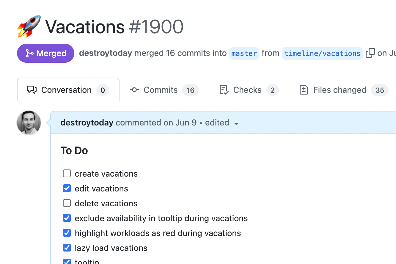
These are only a few of the basic hurdles I faced from the get-go, but there have been a dozen more along the way. It often does feel daunting, but that’s typically when I don’t have a to-do list. I find that as soon as I create a to-do list in my pull request summary, that puts a scope on my next milestone, and I get to feel little accomplishments along the way that keep me going. The closer I get to checking off all the to-dos, the more my momentum snowballs. And sometimes, if I’m lucky, I experience an unexpected surprise that catapults my excitement for the given task.
When I first wired up the interactions for moving, I forgot to do something. For moving a workload, I actually change the dates of the workload model using the x-movement translated to days and it simply renders in the new spot. Typically, you’d want to clone the workload model before interacting with it, so you’re only affecting a temporary copy. Then later, upon confirming the change, you can use this workload to overwrite the original workload, or reset it if you want to undo the change. While wiring this up, however, I forgot to clone the workload, so when I changed the dates of the workload, it actually changed the original workload, and because everything is reactive, the availability timeline updated in realtime. While this effect was 100% unintentional, it was 100% what I wanted as soon as I saw it.
This one “mistake” has given me infinite energy for the rest of this milestone. All of a sudden, there’s a massive new feature for the timeline and it’s realtime. Knowing how a change in your workload affects your overall availability is such a valuable feature, but seeing it as soon as you attempt to make the change, before confirming the change?—wow. This is going to be such an eye-opener, but it also lights the way for every other feature I build for this timeline. Now everything needs to be have that instant, reactive, realtime feeling. While this initial playbook click & drag feature once felt increasingly daunting with all its hidden edge cases coming out of nowhere, now I’m absolutely fueled by excitement. I still have a few obligatory features to check off my list, but they pale in comparison to the energy I’ve gotten from this happy accident.