Journal
Redesigning the blog
In the next step towards migrating Cushion’s marketing website to Contentful, I decided to rethink the blog. Previously, the blog consisted solely of announcement posts for new features and updates. Alongside it, I also had the Changelog that provided a detailed list of changes to the app, the Talking Shop written interview series, and the Ask a Freelancer podcast. All of these lived at their separate routes, which often became an issue when deciding what to promote in the top-level nav. Meanwhile, the blog became stagnant when I took a break from new features, so it made Cushion itself look like it was stagnant, even if there was movement in the changelog.
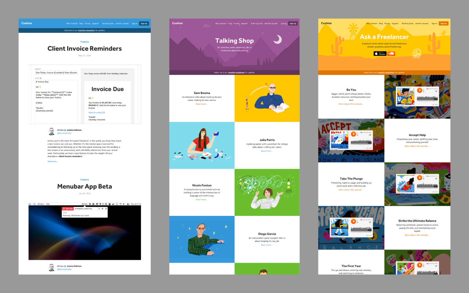
I specifically remember a good friend of mine asking me years ago, “Why don’t you just put everything in the blog?” I shrugged and didn’t think much about it, but lately I’ve been thinking about it a lot. Not only is that a good way to consolidate all of Cushion’s “content” under a single route, but it also makes the non-blog content much easier to discover.
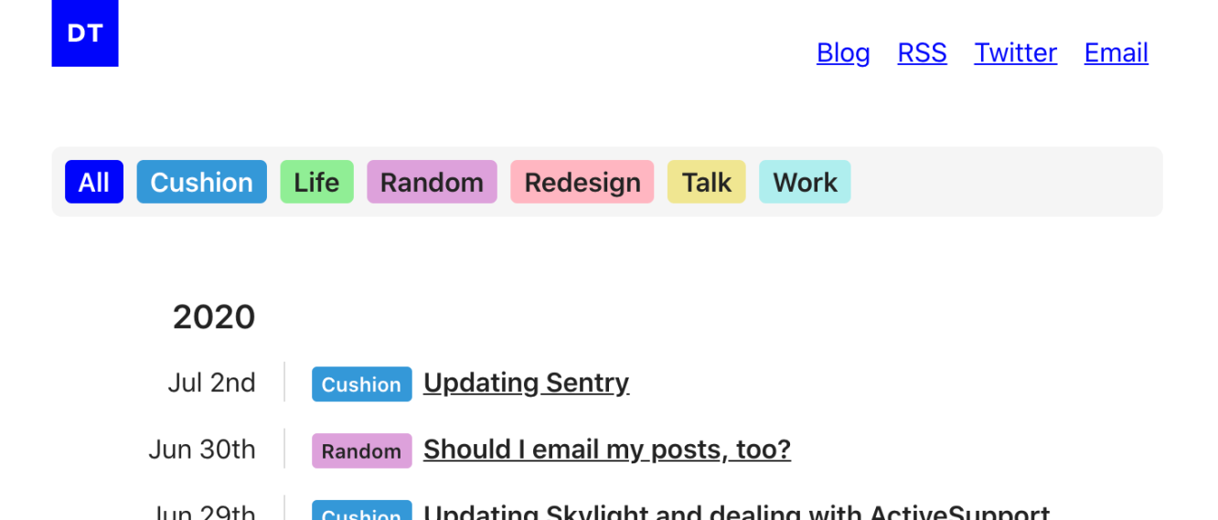
On my personal site, I created categories for blog post topics, which was originally intended to organize them, but I quickly realized their value in surfacing buried content. Blog posts written years ago are now visible with a single click simply because they pertain to a topic I don’t write much about. This gave me an ah-ha moment with Cushion’s “Talking Shop” and “Ask a Freelancer” content. I love these series, but due to budget at the time, they ended up being single-season “shows”. If I merged them into the blog, they’d immediately end up several pages deep because they ran from 2016 to 2017, but if I create categories for them, these series will be top-level in the blog nav.
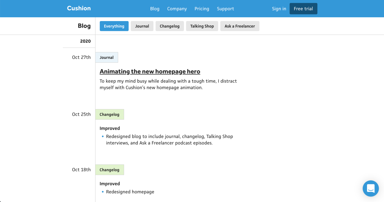
Now that I had the general structure of the new blog, I needed to design it. After considering how much thought I put into the design of my personal site, I decided to take inspiration from… myself… and use the same layout as my personal blog. I have an aside for the sticky timestamps and tag each post with their respective category. I keep the same 2-liner descriptions for journal posts and inline the changelog details, so folks can read those in the stream instead of navigating to a separate page.
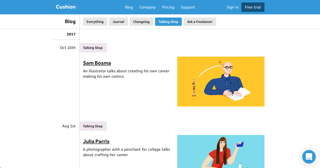
For “Talking Shop”, I kept the list of interviews the same, but merged the content into the new design of the blog—I absolutely love how clean it looks. The brief descriptions are a tad short for the space, but I think that’s okay. Seeing Ping Zhu’s illustrations with a hard colored edge on white just feels perfect to me.
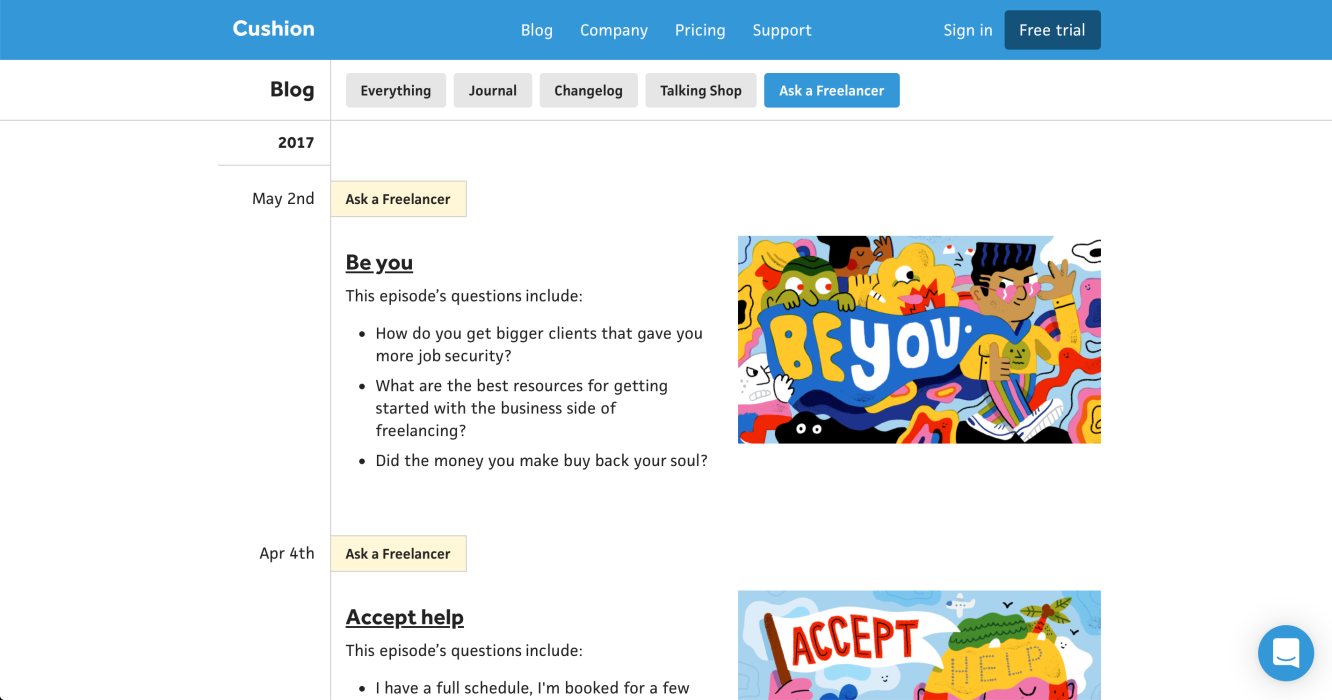
Then for “Ask a Freelancer”, I used the same layout as “Talking Shop”, but instead of only showing the 1-liner description, I realized it’d actually be more useful to see the list of questions that were asked in the episode. This makes it much easier to find what you’re looking for rather than going off a brief description. Likewise to “Talking Shop”, seeing Andy J. Pizza’s illustrations in the new design brings a big smile to my face.
Aside from the design, the elephant in the room that no one probably notices anyway is that there’s no category for the blog posts. For proper blog posts, I always felt like I had to be more precious and carefully-worded with announcements. In parallel, I much prefer the voice and depth of my journal posts. Because of this, I settled on nixing the existing blog posts and focusing on journal posts as the primary written content.
Earlier this year, I decided to move the Cushion journal to my personal blog. The main reason behind this decision was to keep all of my writing in one place while maintaining the same authoring environment in Contentful. Now that I’m migrating the Cushion website to Contentful, I could migrate the content back (which I might end up doing at some point), but in the meantime, I realized I could simply query the Contentful API with my personal site’s credentials to fetch the journal posts. Then, I merge them in with the rest of the Cushion content on the blog and link to the external journal posts. Now, whenever I write a new Cushion journal post, like this one, it’ll appear in both the Cushion blog feed and my personal blog feed. Magic.
If it weren’t obvious to you, writing is very important to me. It keeps me level-headed and lets me document my process, so I’m not only left with the end result. After years of the Cushion website playing second fiddle to my personal site, I’m thrilled about taking the time to “renovate” it. Knowing that I can quickly and easily make a change to the blog or marketing site is just *chef kiss*. With the blog in a good spot, I think it’s time to dive back into the app.