Journal
Document your features
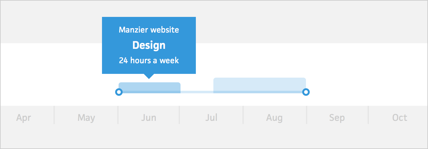
Recently, I discovered that a specific Cushion feature was causing confusion for almost everyone who used it. This feature was originally called “Blocks”, then “Project Blocks”, then “Time Blocks”, and now finally “Workloads”. Renaming the feature is another story, but I want to talk more about the support burden caused by the confusion. Any time a user had a question about the feature, they would either email me and ask to explain it, or worse—leave without caring to learn about it.

Not all features are as intuitive as ones like time-tracking or invoicing. You can mention either of those features to people and they get it. Workloads, on the other hand, are a different story. They’re a new feature that fixes a specific issue in my own freelancing life, so their not yet in the project management vocabulary. Because of this, Workloads require an explanation instead of the user learning it through context.
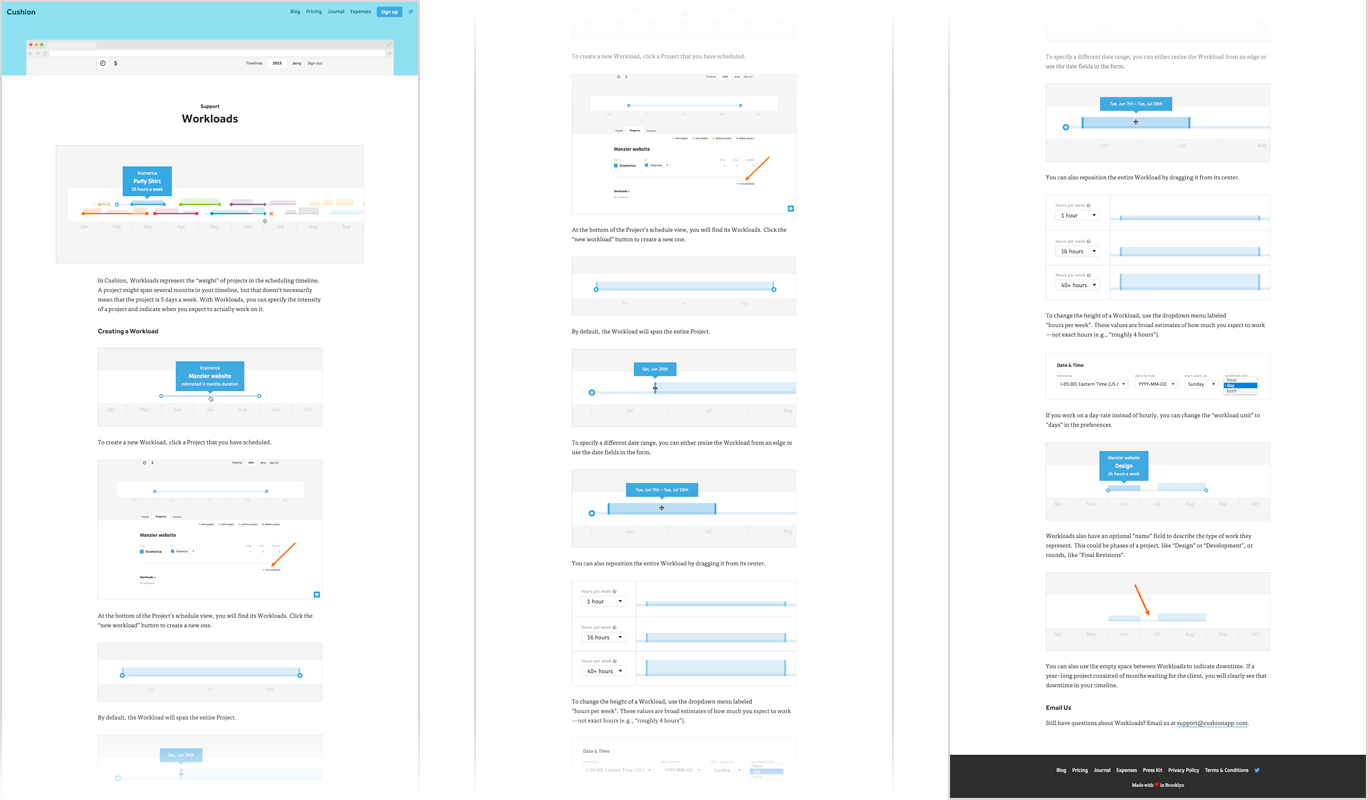
After answering enough of these support emails and realizing the core problem, I decided it was time to build a proper support page. This was long overdue, but somehow it ended up on the list of high priorities that feel like low priorities. This support page should alleviate any need for the user to contact support. It should explain the purpose of Workloads and run through the steps to create a Workload, including screenshots for each step.

After finishing the Workloads support page, announcing it to users, and reading the responses, I could clearly see that these support pages are valuable. Not everyone is a learn-through-experience type of user—most users rely on proper documentation. Because of this, I now need to go through the backlog of features that need support pages and tackle a few each week as part of my routine. Consider this another aspect of what makes an app a real app and less of a side project.

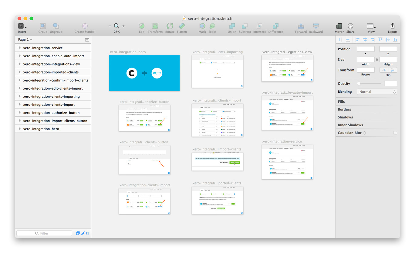
These types of pages tend to change over time, along with their images and image sizes, so I decided to save each one as a Sketch file. Each image on the page is an artboard with export settings to match the size of the website design. With this setup, I’m able to retain the hi-res screenshots along with the ability to re-export everything if the design or feature ever changes.
I actually look forward to building the rest of the support pages because they really give the website more depth. I can confidently point a user to one and know that they’ll get the answers they seek. This goes a long way towards the legitimacy of the app and shaves a few minutes off my usual support load.