Journal
Rough sketches
For the past week, I’ve been adding intentional analytics events to Cushion each night, then waking up to discover fascinating new insights about how people actually use the app. The main question I want to answer is, “What leads people to subscribe?” I have assumptions, but if I can pinpoint a commonality across users as well as a sequence of events that lead to the moment they get hooked, I can focus my energy towards that. The tricky part is knowing this will take time. Cushion doesn’t have a massive user base where a day of events could reveal an accurate sample set, so I need to be patient and find other productive things to do in the meantime, like designing!
A few months ago, I started exploring a modern Cushion, and part of that involved messing around in Figma with pie-in-the-sky UI ideas. Since then, I’ve had a few revelations that guided those out-there ideas towards a more realistic path. I’m starting to get somewhere, but it’s still early days. A few days ago, I found myself iterating on the designs, but not sharing or writing about them—this felt strange because I’ve been on such a good writing tear lately. The thought of sharing early, unfinished sketches of rough ideas actually made me uncomfortable. I’m so used to making something pixel-perfect before putting it out in the world that I was embarrassed to publish anything too early. The more I thought about it, however, the more I realized that this goes against the purpose of keeping a progress journal. And with that, I’m going to set aside any reservations holding me back and share what I have so far.
Before diving in, there are a couple points that have guided these designs. First, I’m trying to make future Cushion mobile-friendly, so you’ll notice that I utilize as much real estate as I can while also bumping the size of the graph visuals. This lets me provide a larger tap area for mobile and show graph labels without relying on tooltips. Second, I’m experimenting with separating lists from graphs, so people can focus on the graph to visually digest what’s going on at-a-glance or switch to “admin mode” to quickly get everything up-to-date.

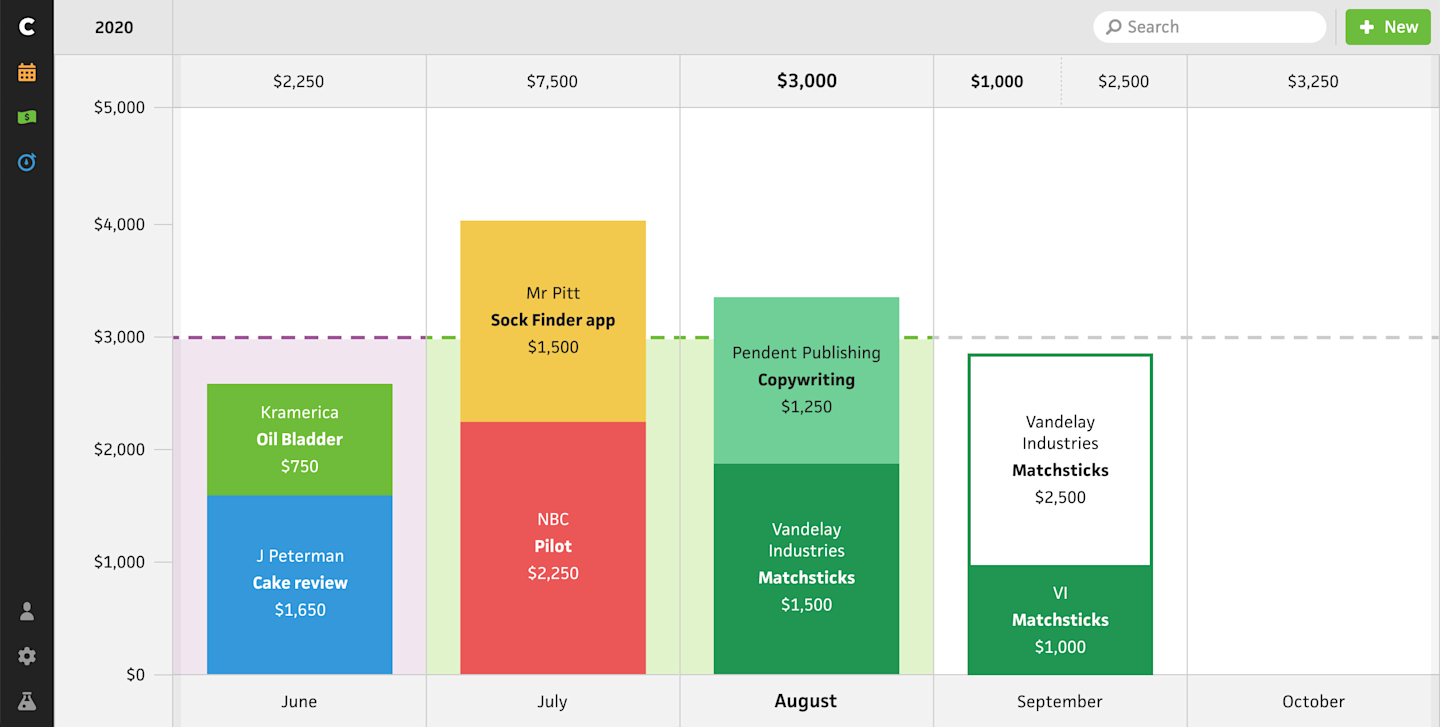
Starting with the “Budget” section, I first took a look at the monthly graph, which lets users track their income against their financial goals. Users find this incredibly valuable to make sure they’re on track month-to-month while also seeing if they need to pick up the pace or if they can afford to relax a bit. Since I want Cushion to feel natural on mobile going forward, I’m looking into swipe-able interfaces over clickable arrows to navigate the graphs. This will hopefully make it easier to quickly “walk” the timeline while also feeling infinite, like time. This change in particular would require a ton of extra considerations to make sure the data requests keep up with the swiping, but I’m up for the challenge.
While I’m currently focusing on the monthly graph, I’m toying with the concept that the “zoom level” decides the presentation of the graph. When you’re zoomed into the quarter or half, Cushion could display your income month-to-month, but if you zoomed out to the year (or decade!), Cushion would switch to a year-to-year graph, like the horizontal budget graph in the current app. I’m also considering this concept for all of the graphs in Cushion to make sure that everything is consistent, regardless of the sections you’re in.

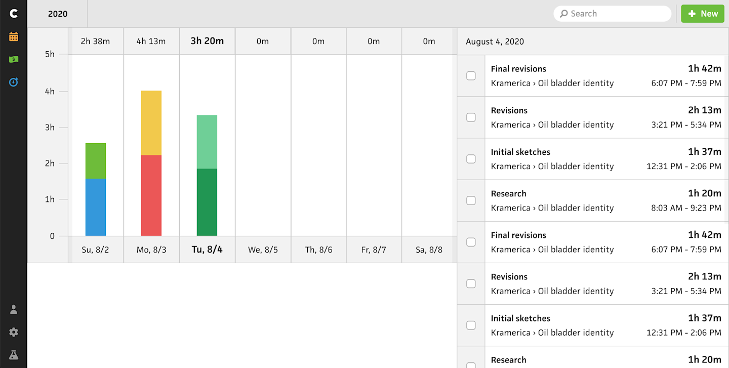
Next, I looking at the “Track” section, the graph might look like it’s derived from the budget graph because it is—I simply squished the budget graph in Figma. It’s also a much rougher sketch than budgeting, evident by the giant blank space. I think the summary stats could go there, but I haven’t mocked it up yet.
With time-tracking, I feel like Cushion needs to show a list of entries instead of only the graph. Using analytics, I was able to back up this claim after learning that many folks continue timers from the existing list of entries. I also think there’s a great opportunity to connect the graph to the entry list by scrolling the entry list as you scroll the graph, or vise-versa. I still need to figure out the entry actions, like continue timers, etc., so disregard the checkboxes to the left all the entries—those were leftover from another design.

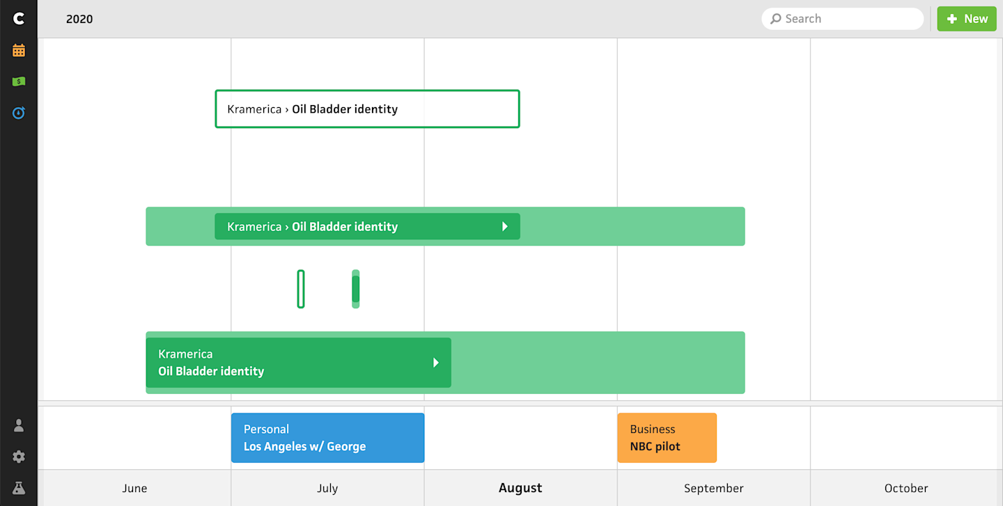
Saving the roughest sketch for last, here’s a fraction of an idea for the “Schedule” section. While I love the look of the current schedule graph with its dots, lines, and arrows, the graph simply isn’t mobile-friendly. There’s also no easy way to make the elements interactive, like I’ve been wanting to do for years with drag and drop. Instead of dots and lines, I’m investigating a block-like approach, similar to the current workloads. The darker blocks span the actual dates while the lighter blocks containing them represent the estimated dates. The arrowhead in the blocks could be an indicator that the project is ongoing. Then, the outlined project at the top could be what a potential project looks like before it starts. At the bottom, I have a separate row for vacations, and in the middle, I spent literally two seconds imagining single-day projects.
Again, this section focuses entirely on the graph while moving the list of projects to their own section. With a more interactive approach, I can get a lot of mileage out of click+dragging to schedule projects and dragging them to quickly reschedule. I’m drawn to this direction overall because it simplifies scheduling. Part of me thinks I made a mistake by introducing workloads because it gave too much detail to scheduling in Cushion. With a day-to-day look at scheduling, too many folks started comparing Cushion to an actual calendar app, and I’m definitely not trying to replace your calendar app. I’d love to bring back the simplicity of the original schedule graph, before I tried to make it do too much.
That’s all I have for now. It feels really good to share these early sketches, albeit nerve-wracking, but I think it’s important. I often look back at old posts where I shared in-progress sketches and I’m always so thankful that I kept a visual journal in addition to solely writing about the work. While some of the older designs are definitely embarrassing beyond belief, the value I get is from witnessing how far Cushion has come. I might feel uncomfortable sharing these sketches now, but I’m sure future me will be glad I did.