Journal
From beta to launch - messaging
In the previous post, I wrote a bit about transitioning Cushion from the beta into launch mode, and I think it’s worthwhile go into more detail about this shift.
The beta gave each user six months to use Cushion, starting from the date they signed up. This means that half of those who signed up prior to launch are actually still riding out their beta. In fact, the very last beta will end sometime in January 2016, and because of this, all of the beta-related logic in Cushion needs to remain intact for those users.
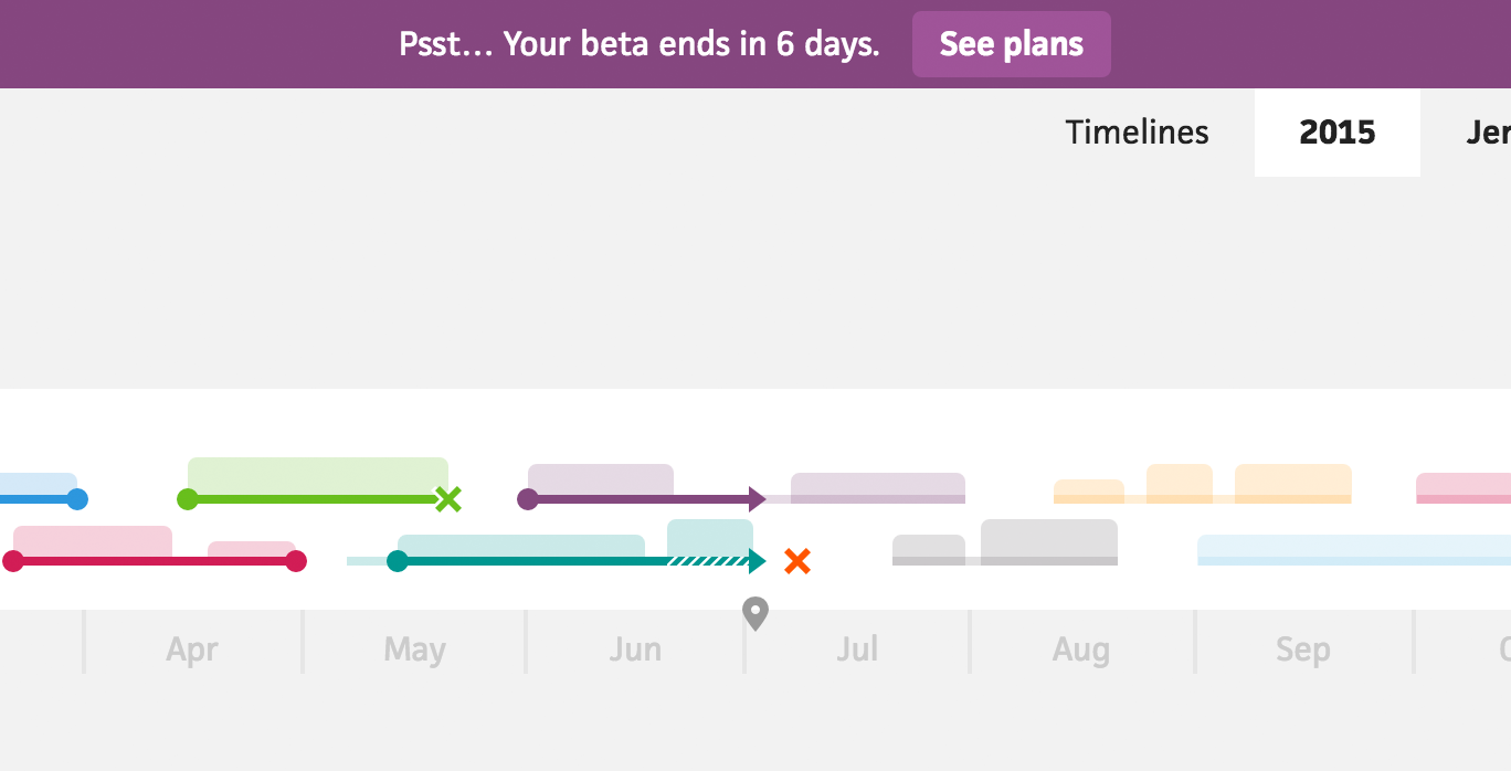
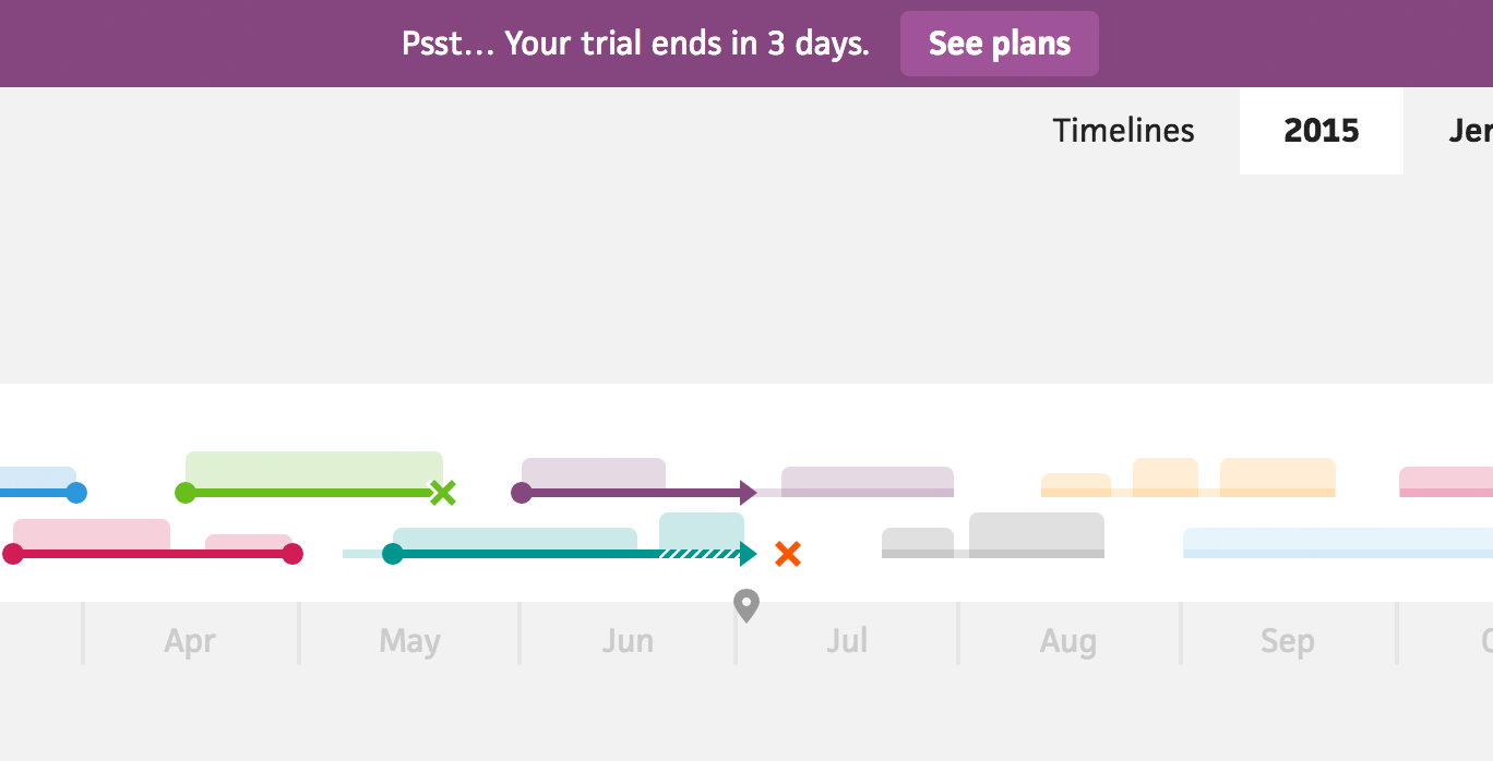
The most obvious part to maintain is messaging. When a user is close to the end of their trial or beta, Cushion sends a heads-up email and displays a banner at the top of the app, inviting them to subscribe. This banner’s main purpose is to coax users to subscribe early, so there’s no gap in their usage of Cushion. It also serves as a backup notification for users who either 1) didn’t receive the heads-up email or 2) spend their days in inbox hell, with thousands of unread emails going unnoticed.

During the beta, this banner will simply say “Your beta will end in X days”. Now that Cushion has 14-day trial periods, the banner needs to swap “beta” with “trial” for only the trial users. Because of this, I needed to implement a way of distinguishing between beta users and trial users, but I wanted to avoid tacking a new boolean column to the user table for every indicator like this.
I decided to make use of the array column type and store any user descriptor in a single tags column. These tags currently include trial, beta, and subscriber, but they can extend to any other tags I might want to add down the road. Instead of checking the true/false on a handful of individual columns, I can now just check if a users has a specific tag.

Along with messaging, the email and banner’s logic needed to be altered based on the user’s status. For the beta, the heads-up email would go out a week before the beta ended. For the 14-day trial, however, a week would land us halfway through the trial. I needed to update the email’s criteria to be delivered only three days before the trial ended if the user had the trial tag or a week before the beta ended if the user had the beta tag.
Because I have two very different relationships between trial users and beta users, I need to send two completely different emails. Beta users are like longtime friends. They paid upfront, investing before Cushion was even ready for launch, and they’ve been using it for half a year by the time their beta is over. Our lengthy conversations throughout the beta helped shape Cushion into what it is today.
Trial users are more like acquaintances. For the vocal ones, I might start to build a good rapport, but by the time their trial ends, our relationship is still pretty fresh. They also haven’t used Cushion long enough to see how it might impact them after months of use. Instead of sending them the same email as beta users, I’ll send one that’s more to-the-point.

In the heads-up email, I include a big button to see available plans for Cushion. If the user clicks the button, they’re directed to the subscriptions tab within the app. Throughout the beta, this page included not only the monthly and yearly plans, but also the beta “plan”, so they could see how much time they have left.

Trial users don’t need to know about the beta, so I swapped the beta with the trial “plan”. It provides the same value of indicating how much time is left on their trial period while maintaining the balance of the page.
I’ll stop here because this post is more of a two-parter. Aside from minor elements within the app, the shift from beta to launch also required a substantial redesign to the signup process and onboarding experience. With all the lessons learned from launch and the careful considerations for the signup redesign, this truly deserves its own post. Until next time!