Journal
Grouping and archiving projects in the schedule timeline
For the past couple weeks, I’ve been redesigning and refactoring Cushion’s schedule timeline based on a recent hunch. It was a ton of work, but yesterday I finally got everything to a place where I’m on the right track and seeing a difference.
For the first step of moving from a stacked layout to a list-based layout, I removed the stacking logic and replacing it was the list. Up until this point, the entire timeline was a single SVG—a straightforward draw-everything-on-one-canvas approach. By introducing a list, however, the right strategy was no longer clear cut. A list on its own would obviously be HTML, but I wasn’t 100% sure about a list directly connected to an SVG timeline.
At first, I actually coded the list to be in the SVG, but this immediately felt like I was trying to use HTML without the benefits of CSS layouts, so I scrapped that idea. Next, I tried using an HTML list alongside the SVG and syncing scrolling between the two. This felt so wrong, like I was opening pandora’s box, so I quickly backtracked on that idea. After thinking it over in the shower (the source of most of my good ideas), I decided to avoid being clever and instead treat a list like a list.
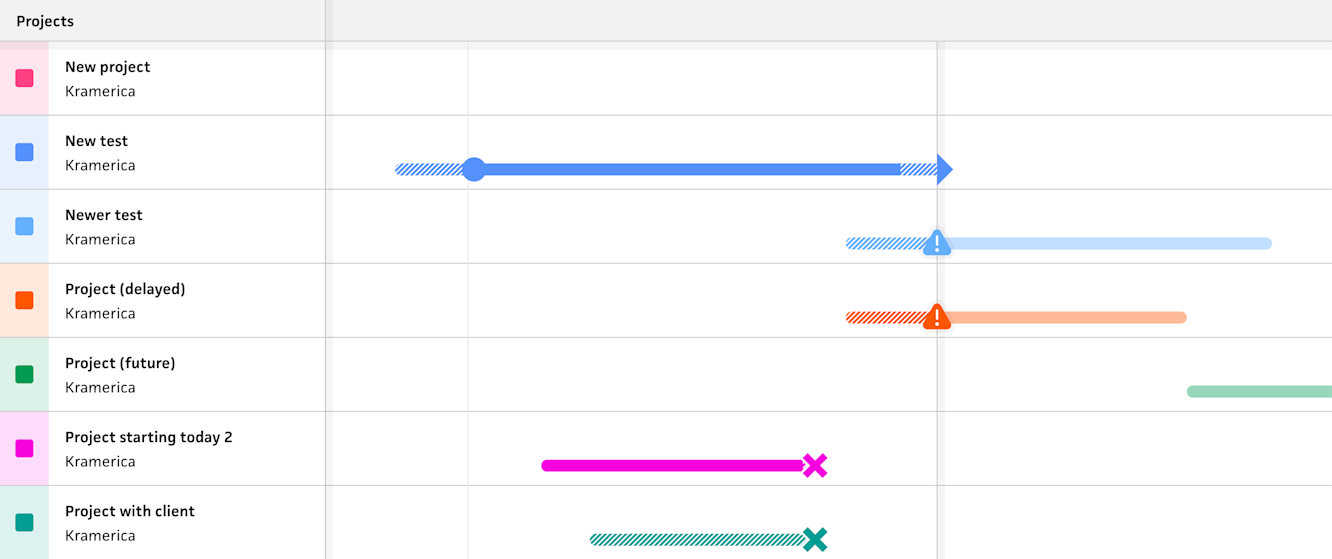
Rather than try to render everything in a single SVG, I would create a single list for the entire page with each row including its own SVG timeline for each project. This would let the browser handle scrolling natively (to avoid releasing any demons from cursed code), and make the entire layout much simple and more composable, as each row would be scoped to its project. As a bonus, this approach makes my future plans for inline editing 10 times easier because I’d be able to toggle a row to switch it into editing mode—but that’s getting ahead of myself.

New list-based timeline
A week ago, I deployed this update and received a warm reception from folks beta testing it—everyone confirmed that the new direction of using a list over stacking better maps to their mental model for timelines. That said, in order to release it sooner than later, I held off on a few things that would’ve made this initial release more buttoned up. Unfortunately for super users with tons of projects who don’t archive them often, they were met with a giant alphabetized list of projects that included ones from years ago. In the existing schedule timeline, you don’t see these old projects because they’re only rendered when you scroll to them in the timeline. In the new layout, however, each project is an item in the list, so every project is visible.

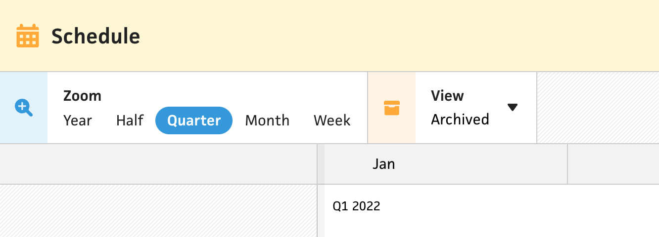
While at first this might’ve felt disheartening, it was actually a great opportunity to tie archiving directly into the timeline as well. Up until now, archiving a project would only hide it from dropdown lists in forms, but now, folks would be encouraged to archive projects to also hide them in the schedule. With this new insight, I added a filter for toggling between archived and active projects, and added the ability to archive projects directly from the timeline.

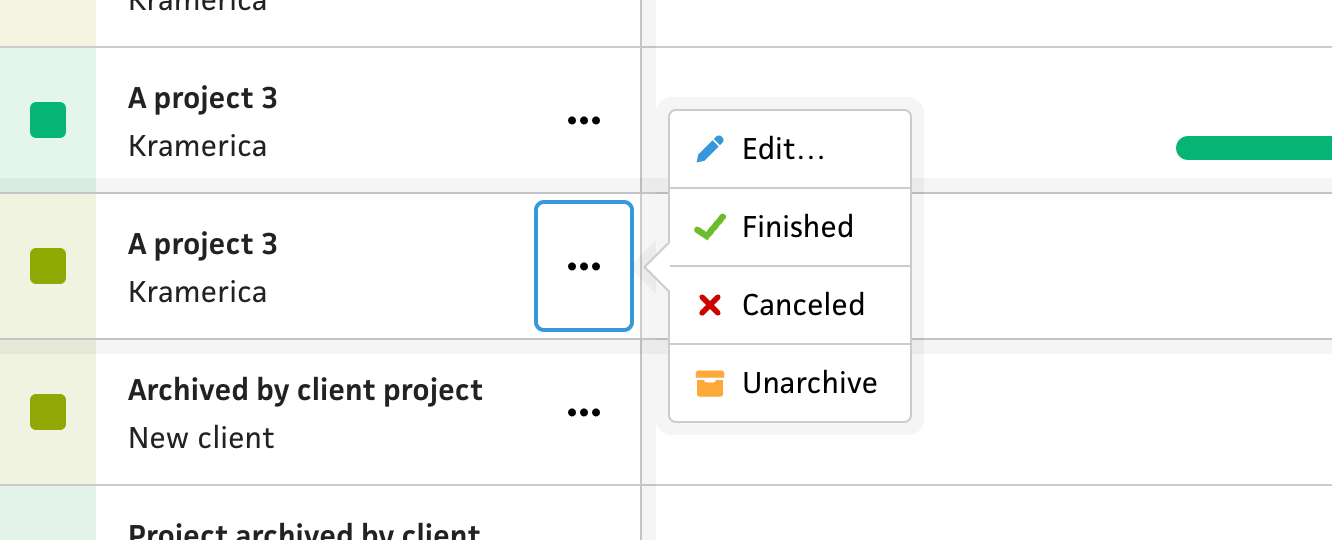
If you’ve been following along with the journal through this schedule timeline saga, you might remember the project actions that I implemented right before changing to a list-based layout. While this felt like the right approach at the time, the new list-based layout opens the doors to a more intuitive and traditional UI—a menu. Similar to other lists in Cushion, I added an ellipsis menu to each project in the list, which includes the project actions, like “Started”, ”Finished”, etc., but also a toggle for archiving. I am somewhat disappointed to lose the inline aspect of the project actions, but a proper menu is definitely more intuitive and saves the inline interaction for more exciting features.

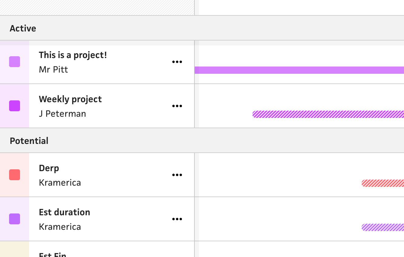
Now that I had archiving wired up, the original long list of projects became way more manageable, but still a single alphabetized list. To organize the projects even more, I took the obvious next step by grouping projects by their list, as in “Active”, “Potential”, “Completed”, etc. In the current schedule view, these lists appear in the tables below the timeline, so it’d only make sense to migrate them into the new timeline as well. This lets folks see their active projects grouped together next to a group of their potential projects, etc. Hopefully this makes the new timeline layout even less wieldy and easier to grok at a glance.
From here, I still have so much to do. Even with this giant release from the past two weeks of work, I’m still (intentionally) missing obvious features for the sake of launching early and often. It’s great that I was able to organize the projects by list, but folks are going to immediately want to reorder the lists or move projects between them. This is technically possible from the edit form, but not nearly as intuitive as a classic drag & drop. That said, I’m absolutely over-the-moon to be making so much progress. With every new release, I get a jolt of inspiration to keep me going.