Journal
The schedule timeline
After a ton of work on the budgeting side of Cushion, I decided to step back and focus on scheduling. I met with a few more fellow freelancers and the verdict seems to be that scheduling is a day-to-day activity, whereas budgeting is done less often—maybe week-to-week. If this is the case, I definitely want to have scheduling from day one, so everyone could get some frequent use out of Cushion. A weekly-used app won’t cut it.

The navigation for switching between the scheduling and budgeting views stumped me for a few days. With the model tabs as an established navigation on the app, I didn’t want to add anything that would compete too much. I decided to scrap the Cushion title in the top-left for now. With UI real estate becoming a premium in this app, that spot is much better suited for the view switcher—it also allows more views in the future.
Along with the positioning of the view tabs, I had difficulty deciding on a URL structure, since this completely flips the current one on its head. With these two views, essentially every page will have two pages—one for scheduling and one for budgeting. If you look at a project page, instead of /projects/:id, it would be /projects/:id/schedule or /projects/:id/budget. This makes complete sense, but for some reason, it didn’t seem like the clear answer at first. I started thinking of what /projects/new would be, since it currently shows the budgeting timeline. Would it now show both scheduling and budgeting, or neither?

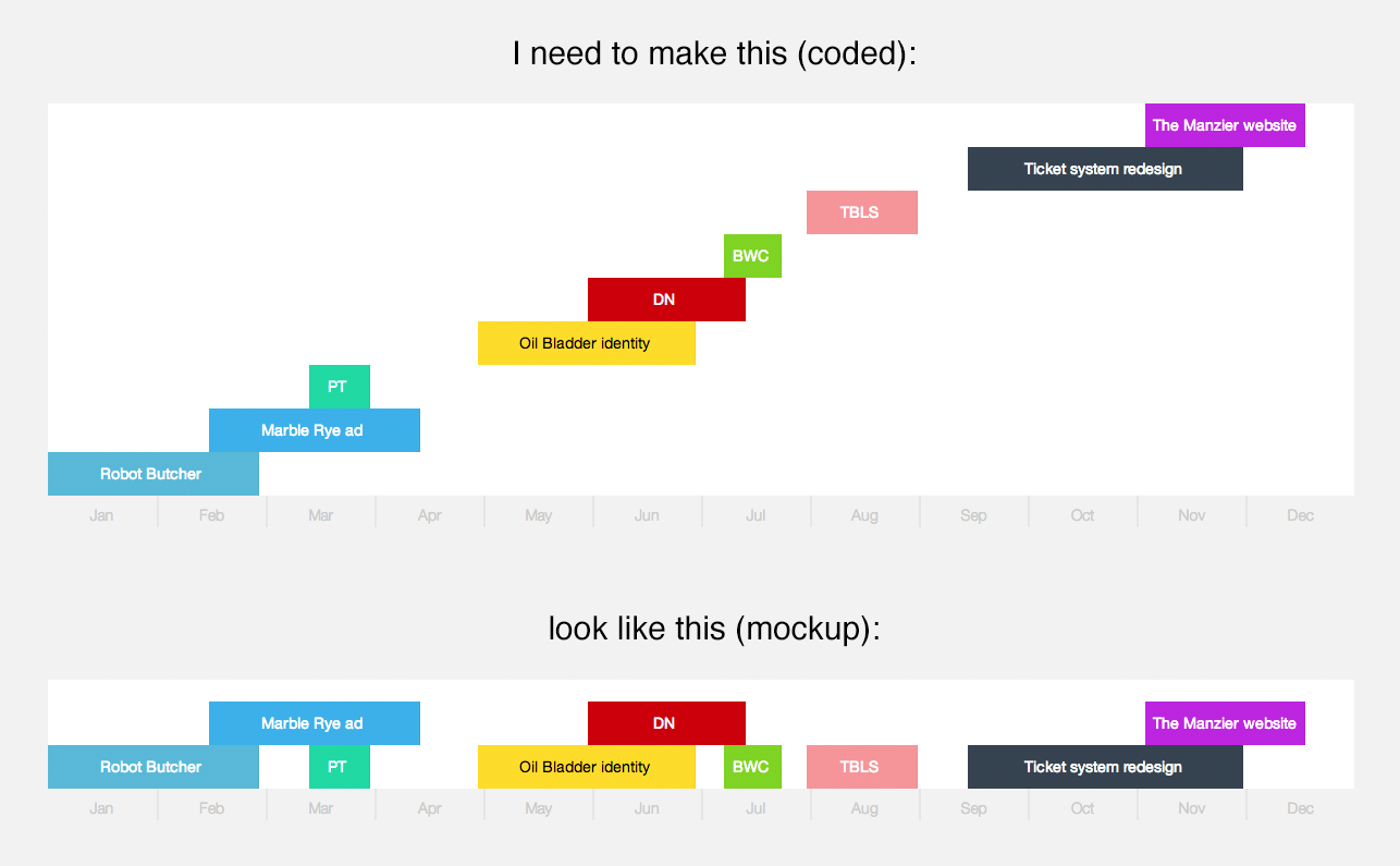
The scheduling timeline layout has been designed from the start of the app, but now that I needed to code it, a new challenge arose. Positioning a bunch of rectangles in a mockup is easy—the positioning logic is executed by the designer. With code, the simplest layout could come with a few hurdles of its own. For the scheduling timeline, all projects should rest on the baseline if they fit. If a project overlaps another project, it should rest above it.

Unfortunately, this can’t be done solely with CSS, like the budgeting timeline. After a few searches describing the layout I was after, I found a chart that depicted the basic idea. It’s called a “swim lane” and is often used in flow charts. Once I saw the code required, I realized that this layout is actually pretty simple. Since I have start and finish dates for each project, I can just check for overlaps with those dates—no need for hit-detection. If a project’s finish date comes after another project’s start date, but its start date comes before that project’s finish date, you have an overlap. Upon finding an overlap, simply use a new “lane” for that item.

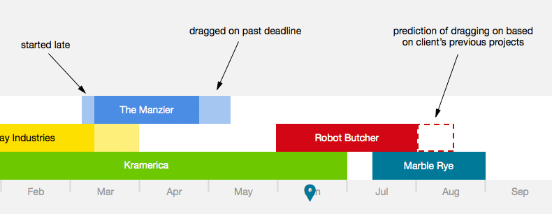
At the moment, I have two dates for each project—started_on and finished_on. These represent the actual dates for when the project started and finished, not their planned dates, which is why I use the past-tense. The next step is to add two more dates for estimated start and finish dates. These will be set upon creating the project and represent the agreed upon dates with the client. When you start a project, you set its started_on date and its finished_on date upon completion, so we have something to diff against. These four dates will let you see which clients are late to start or which ones drag on too long. From there, I can then find trends in specific clients.