Journal
Restructuring the individual project page
In the last post, I wrote about the plan to introduce project blocks—a way to divide projects into smaller segments that could represent phases or show the varying intensity throughout a project. This plan assumed that all the groundwork had been done and I could just implement the feature. Not so fast.

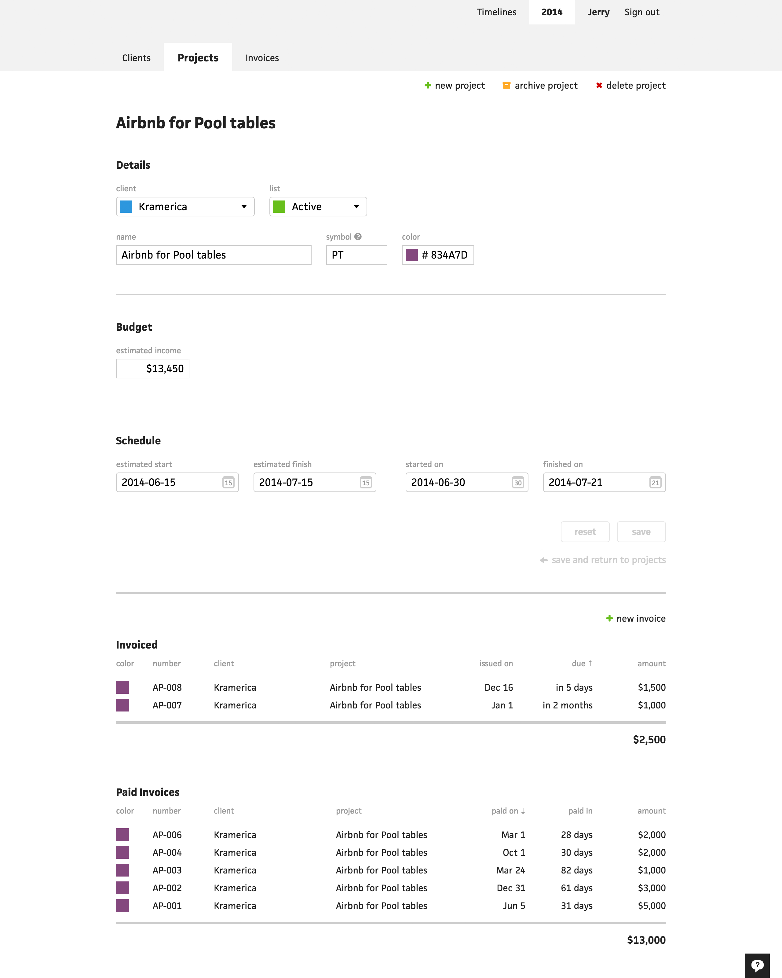
As soon as I finished writing the post and started working on project blocks, I realized that Cushion would need considerable restructuring—specifically, on the individual project page. At the time, clicking a project link would take you directly to the form to edit the project. The project’s invoices were below the form and this always bothered me because I knew that if I ever added one more piece, this page would be too overwhelming to keep as one.
The time had come. With project blocks, I had a new resource to consider, like invoices in the budget view. This association actually introduced a clear direction to take with restructuring. If the budgeting view has invoices, then the scheduling view could have blocks.
Early on, I knew it would be useful to carry the budget/schedule views into individual pages, but the question of how to handle the form always remained the issue. Now that I had more useful information to display, like delay, drag, and estimate difference, I could easily populate a couple more pages and extract the form as its own page.
The structure was crystal clear. Clicking a project link would take you to the project, but maintain the view you are in—schedule or budget. Then, within either of those pages, you could click an “edit project” link, which would take you to the project’s edit page. Even though this is an extra click to edit the project, it’s apparent that the majority of users don’t edit a project much beyond marking it as finished.
Now that I had the structure in place, what would I put in the scheduling and budgeting views? I had a good amount of data to choose from, but really needed to narrow it down. I didn’t want each page to become another overwhelming mess.

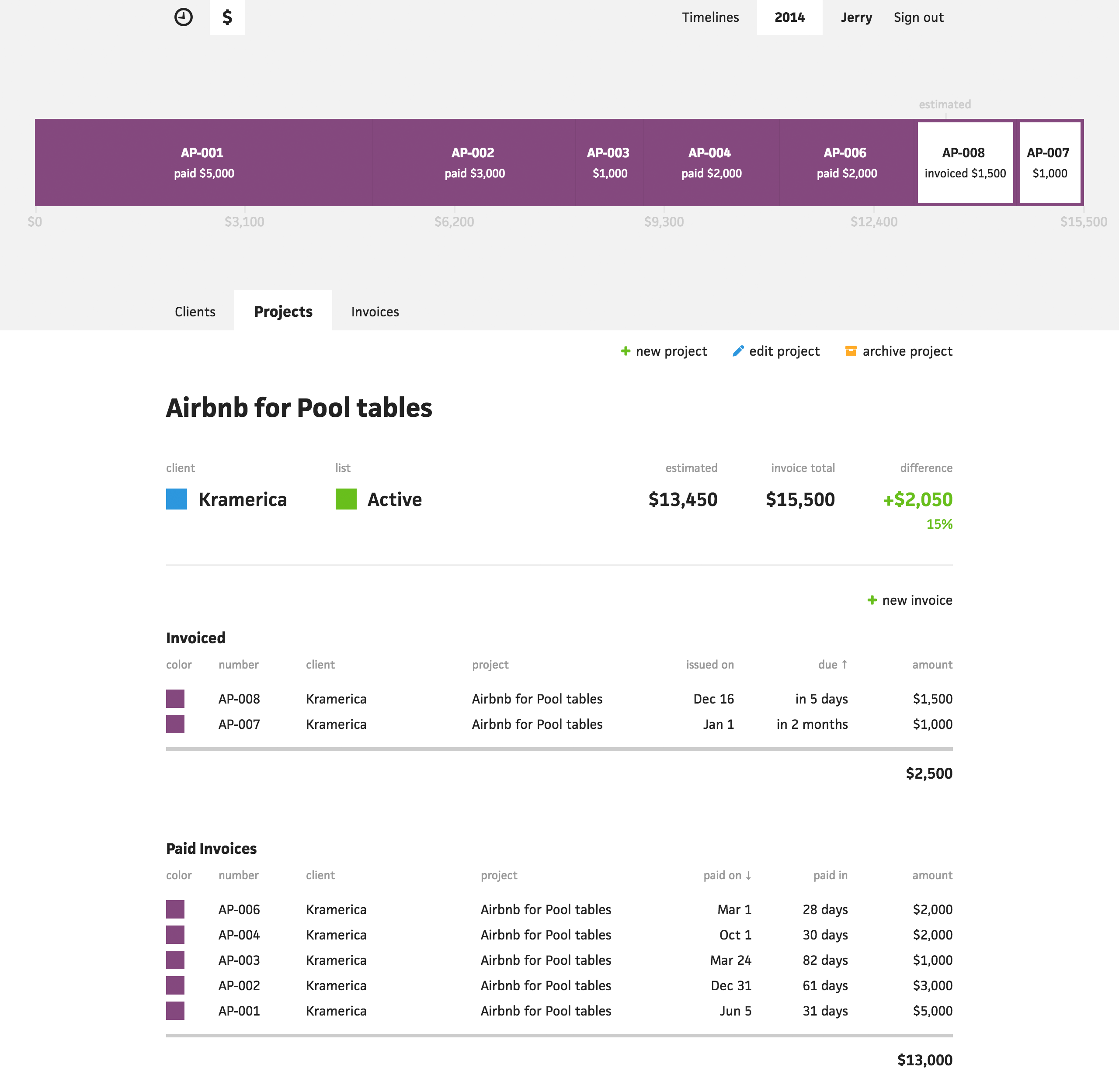
The budget view was easier because I had less data points to work with and they were all currency-based. I could leave the income estimate as-is because it has enough value on its own. For the invoice amounts, I already had the paid total and invoiced total below each invoice table, so an obvious higher-level piece of data would simply be a total of all the invoices. If the user needs to dig deeper, they can just scroll down to the tables.
Lastly, I re-introduced the estimate difference. I previously had this on the projects page, but felt that it detracted from the summary feel—it was too detailed a value to show in a list of projects. With just one project to focus on, however, it’s perfect. This time, I wasn’t limited for room, so I maintained the currency format for the main estimate difference value and calculated its percentage as a less-emphasized value below it.

As for the budget timeline, I realized I could take this opportunity to provide much more value to the user by forgeting the financial goals of the current timeline. Instead, I could use the project’s estimate as the goal and fill up the bar with its individual invoices. This would allow the user to see a more segmented view of the income and click into each invoice if a change were needed. For the timeline labels, I use the invoice number. If one doesn’t exist, I fall back to its date—either the issued date for unpaid invoices or the paid date for paid invoices.

To wrap it all together, above is the final budget view.

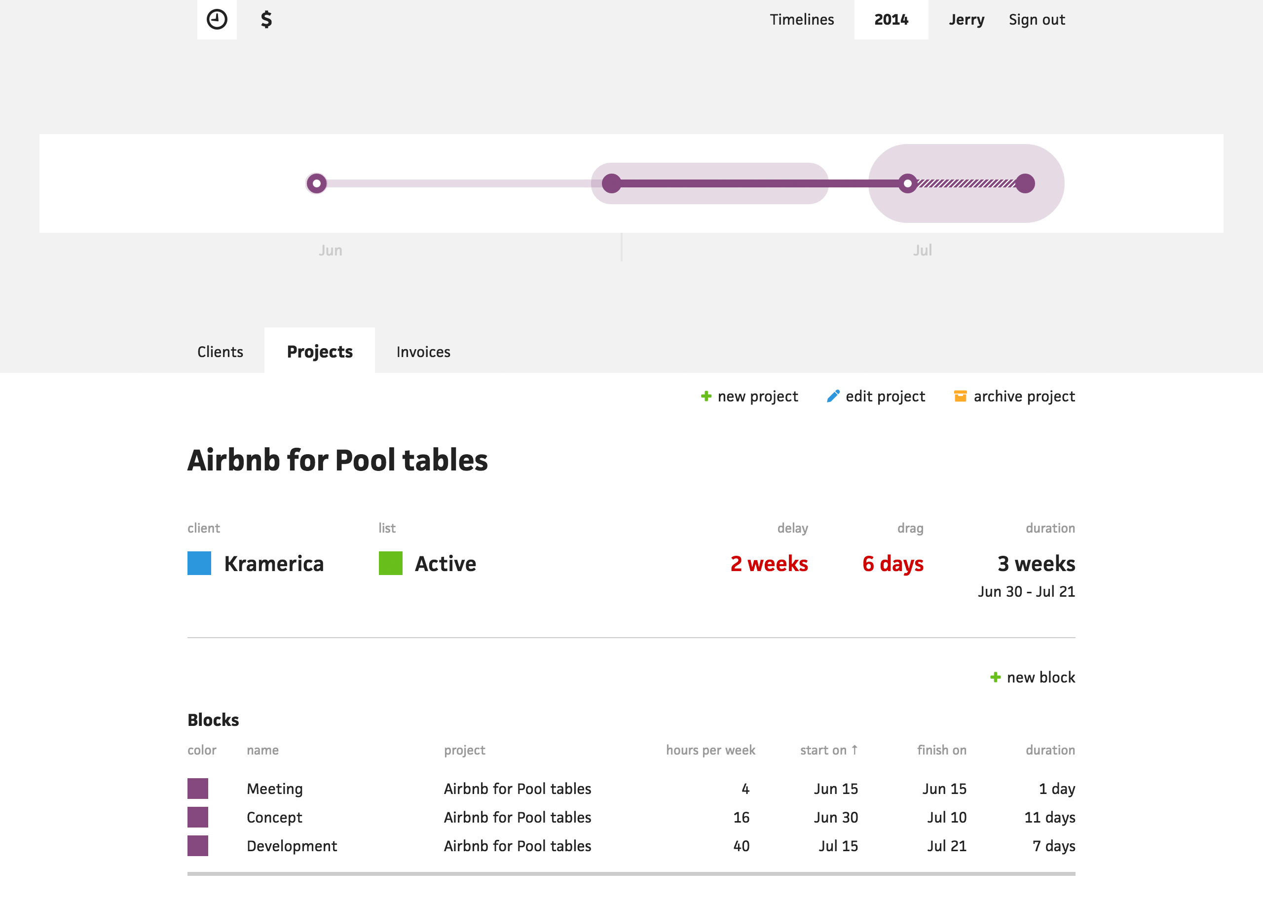
The schedule view wasn’t nearly as easy to lay out, but I knew I had to at least show the delay, drag, and duration. That didn’t leave me with much room for more, so I took advantage of the scenarios when no data existed for these values.

If a project hasn’t started, its delay cannot be calculated, so I leave a dash in its place. Same goes for unfinished projects with drag and duration. Because a dash barely takes up any space, I know for sure I have enough room for an extra column.

The benefit of this extra column makes absolute sense, too—it’s not just a space to shove more data. Considering the column will only appear for unstarted or unfinished projects, I can show the estimated start date for unstarted projects and the estimated finish date for unfinished projects. If I’m waiting on a project to start, I want to know when it might start and if I’m in the thick of things with an existing project, I want to know when it’s expected to wrap up.
With a small last touch, I took advantage of using a secondary value once again to show the date range of a finished project just below its duration. Now a user can look at one place on the screen and see when a project started, when it ended, and how long it took.

As for the schedule timeline, I wanted to show the entirety of the project, but knew the existing design would be humorously small on its own. Luckily, I’ve been working with EMs the whole time, so I was able to double the font size of the timeline and everything scaled perfectly. I also vertically aligned the project, since I knew I wouldn’t need to stack anything on top of it.

Above is the final schedule view along with the upcoming project blocks. I’m not 100% finished, but far enough along that I’m excited to show it off.
If you’re still reading this and interested in participating in the Cushion beta, you can request an invite here.