Journal
Thinking through a new invoice form
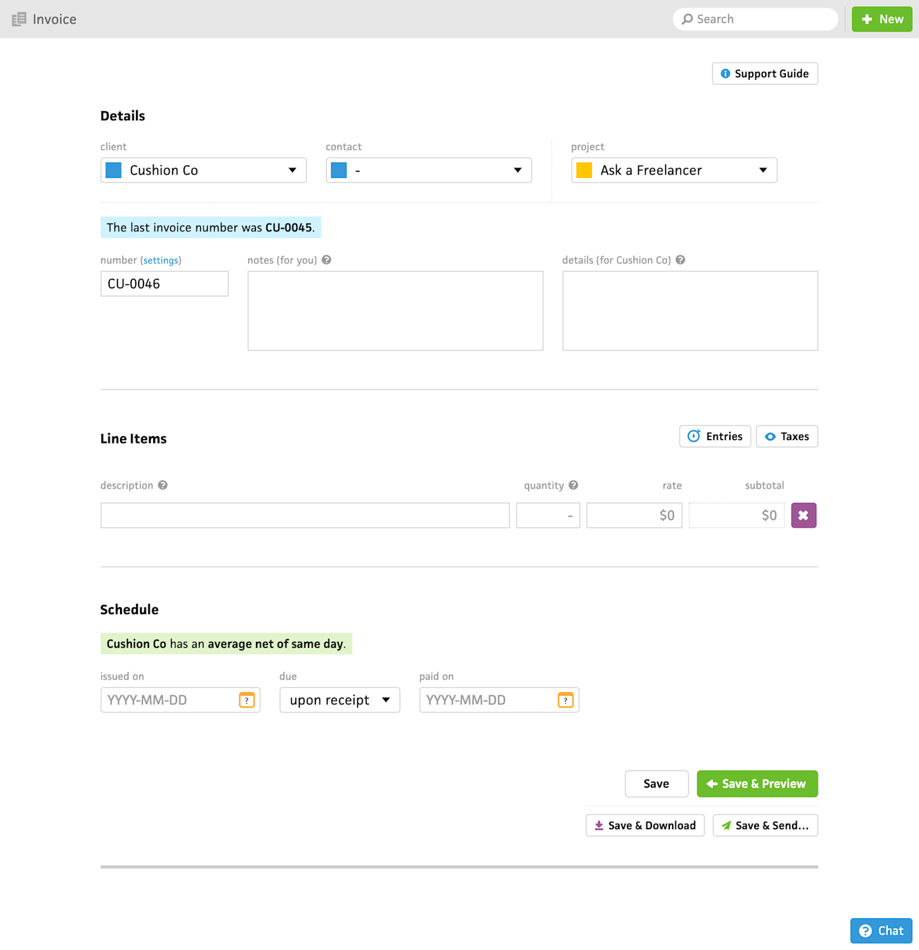
After the previous post, where I described my fork in the road after a long sprint, it only took me a day or two to realize that Cushion’s invoice form should be next. As one of the oldest pieces of code in the codebase, the existing invoice form has limitless room for improvement. On the practical side, it’s another area that is far enough away from the rest of the app that I can redo it in the new system without needing to untangle all the surrounding wires first.

Cushion’s existing invoice form
First, I want to touch on the areas I want to improve. Above all, I want this form to be 100% test and typed. If I ever need to make a change, I want 99.99% confidence that there will be no surprise breakages (leaving 0.01% for Murphy’s Law). Right now, the existing form works, but it was built so early on that I didn’t truly know where I wanted to take Cushion and testing wasn’t as supported with my chosen stack, so I prefer not to touch it and risk anything. This is a real shame for any app, but I’m done living this life with Cushion, so that’s why I’m committed to doing everything the right way from here on out.
Next, by utilizing the new component system, the new invoice form will be able to reflow down to mobile—inching Cushion a little bit closer to “having an iPhone app”. At the very least, I want this “renovation” of Cushion to let folks create invoices and track time on the go as the bare minimum. Everything else is a nice-to-have for mobile, but the two of these are essential for the folks who need them.
As for the form itself, there are a couple fields I’ve been meaning to add for a long time, like a subject line. Currently, Cushion’s invoices only show which projects the invoice pertains to when you specify projects per line item, so a subject line would be an easy way to fill this gap for the invoice as a whole. With regards to actions, duplicating an invoice has been on my to-do list for as long as I can remember. That’s probably the biggest bang-for-your-buck I could provide with this improvement. The most requested feature that I’m determined to bake in is definitely the ability to reposition line items. It’s embarrassing that the existing invoice form doesn’t support this, but that’s what I get for building four apps in one.
There are a handful of other ideas I have in mind that may or may not make their way into the first version. To maintain a sense of place, I want all the form section headers to be sticky as you scroll. For transparency of the invoice’s contents, I want users to be able to see the time entries that are tied to a given line item. Lastly, if the window is wide enough, I want the invoice preview to be side-by-side with the form, so users can see a realtime preview as they edit the invoice.
There’s a ton of work in this list, but by building this the right way, I’m not worried about it. In fact, I’m almost done with getting the new form 1:1 with the existing form, so I have quite the head start. The tricky part will be rolling this out to folks to test it. Since invoicing is such a crucial exchange between users and their clients, I definitely won’t flip a switch for everyone and hope for the best. Instead, I’ll unlock the new form for the early adopter types who volunteer to test it out. I’m beyond excited, though—I’ve been living with these improvements in my head for years and years. Now, I’m finally starting to see them come together.