Journal
Currency inputs, notifications, and invoice nets
I’m so close. I spent this last week putting the finishing touches on Cushion. The majority of them surrounded small UX issues that would’ve definitely arisen out of the beta. I figured I’d rather tackle them now and have a more solid product going into the initial testing.

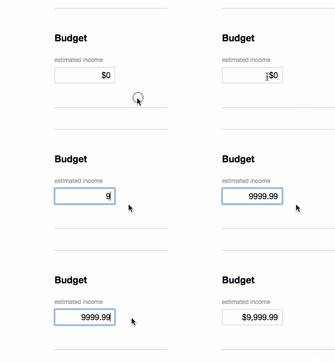
The most overlooked UX issue involved the income input fields. Up until now, it was a simple number-based input. It would balk at any character other than a number (even commas and dollar signs) and there was no currency formatting. With a history of using awful currency-based input fields and pulling my hair out when it’s not perfect for the server, I decided to go out of my way to make this easy. Upon exiting the input field, it’ll run a validation function that strips out any character that doesn’t belong and then reformats it, inserting a dollar sign and any commas if we’re in the thousands. Also, if the amount includes cents, it will format that as well or leave it out if it’s an even dollar amount.

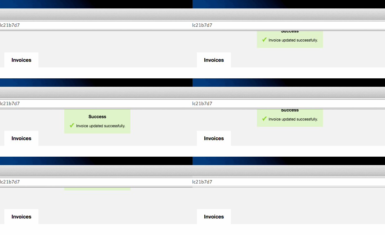
Next, I realized I didn’t show any sort of success message to indicate that a project or invoice was created, updated, or deleted. I started to design a full-width banner that would appear in the form, but decided to take a step back. You should be able to see this message at all times. If you’re scrolled out of the view of the banner area, that doesn’t mean you should miss it. Also, upon creating a new project, you’re taken to the edit view, so this message should carry across views. Because of this, I opted to pin the message at the top. It slides in when needed, remains visible in all scroll positions, and slides out after a couple seconds.

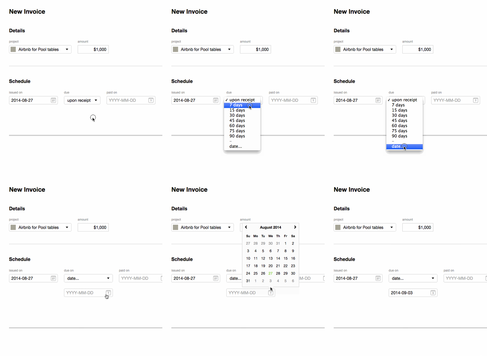
Lastly, I tackled the longest overdue feature—a net option for invoices. I attempted to start on this feature a dozen times, but always gave up after a while to direct my attention elsewhere. The tricky part was positioning the form elements, so it felt like a natural flow from the issue date to due date to paid date. If I placed the custom due date input below the dropdown, it would look completely off, but if that custom input was hidden until selected, it wouldn’t look half-bad. I took a tally for common invoice nets to use, including “upon receipt”, and added the final option for a specific date. Eventually, this will default to your net preference, so you will only need to change it if the client has their own net.