Journal
A freeform scrolling timeline
In the previous post, I wrote about exploring a modern schedule timeline in Cushion, since I recently felt a burst of inspiration in that direction and decided to follow it. Since then, I’ve been narrowing in on a clearer vision for this timeline, which includes a full-page canvas and freeform scrolling.

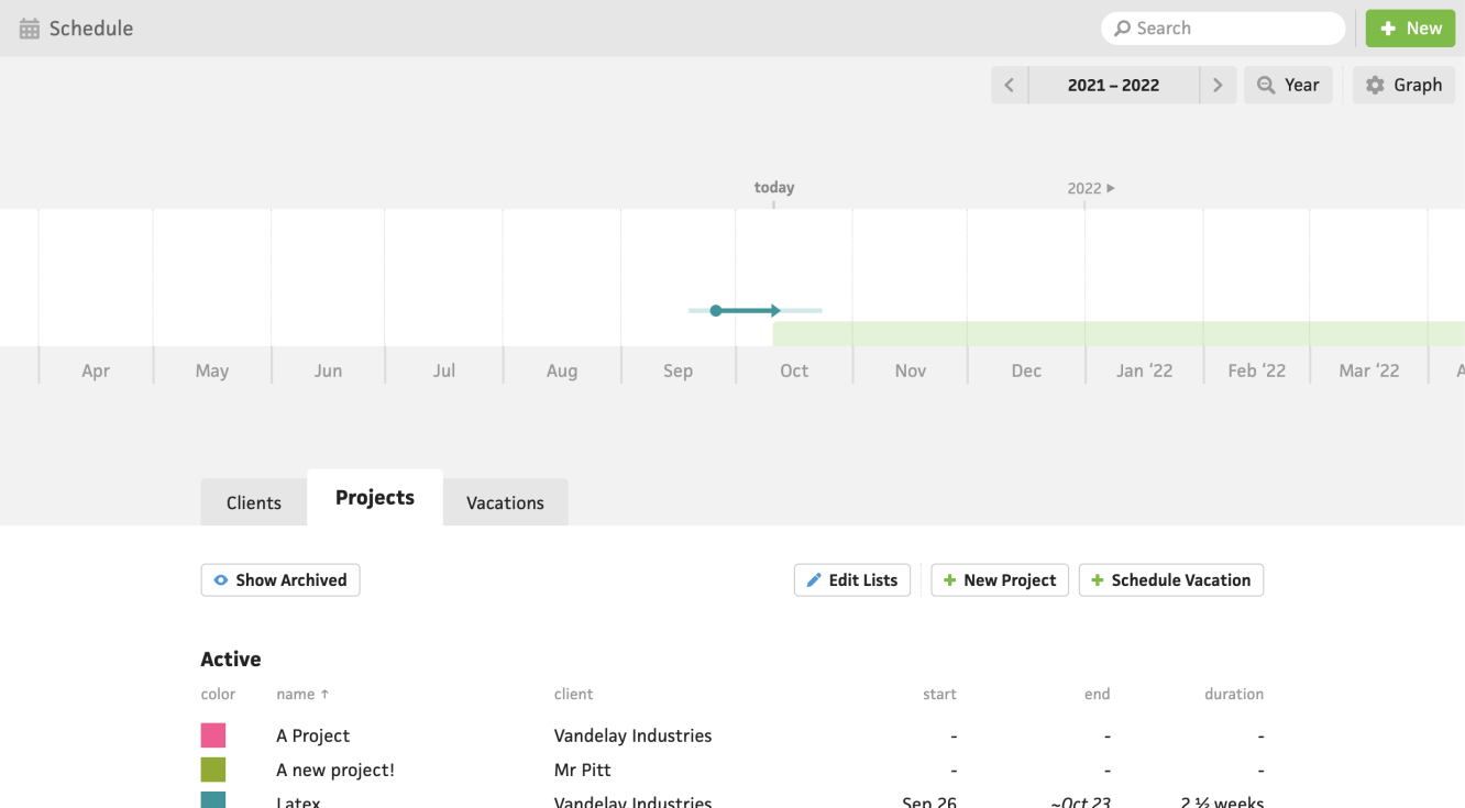
I mentioned previously that the current timeline’s size is tiny because it needs to share the page with the list of projects. This makes it really difficult to build intuitive interactions for the timeline and absolutely impossible to label anything outside of hover. Aside from the benefits of dedicating the entire page to the timeline, I actually believe that both the timeline and the list of projects deserve their own views. With a bigger timeline, I would be able to always show labels for all the projects and open up a new world of interactions because folks would no longer need a microscope if everything’s scaled up.
Along with the limitations of the current schedule timeline’s size, its scrolling feels confined and cumbersome. In order to scroll left or right on the timeline, existing users need to click a left or right arrow, watch the timeline scroll, then wait for the projects to load. This is if they even notice the arrows—and some users don’t. The click-to-scroll interaction feels so ancient to me now (which is okay because the schedule timeline is almost eight years old), so I’ve been dying to “free” the timeline and implement freeform scrolling.
Freeform scrolling is actually pretty simple in this scenario. I already disable overscroll in the new parts of Cushion, using overscroll-behavior: none, so that prevents any chance of swiping right to accidentally navigate back to the previously viewed page. From here, I listen to the deltaX property on the wheel event to figure out which direction and how much to transform/translate the timeline.
I’m absolutely thrilled with the feel of it so far, even though it‘s the earliest of days. I just can’t help but already notice a significant improvement over the existing timeline—this is a great sign! From here, I can start rendering projects and eventually add new direct-manipulation interactions, so the full-page timeline earns its real estate. Just imagine—a project gets rescheduled to next month, so you simply click+drag the project to the right. I can’t wait for this future!