Journal
A return to tabbed navigation
Once an app achieves even the slightest bit of complexity, it’s time to think about navigation. Not only does navigation help the user move throughout the app, but if you pay close attention, it also becomes a complexity meter for your app. As the app starts to grow in scope, if you find yourself rethinking the navigation solely to accommodate new sections that wouldn’t otherwise fit in the current navigation, that’s a warning sign. Unfortunately with Cushion, I flew too close to the sun, ignored the signs, and found myself with a sidebar navigation—one of the clearest indications that an app is trying to do too much.
I still remember this ironic tweet of mine and how I fell right into this hole:
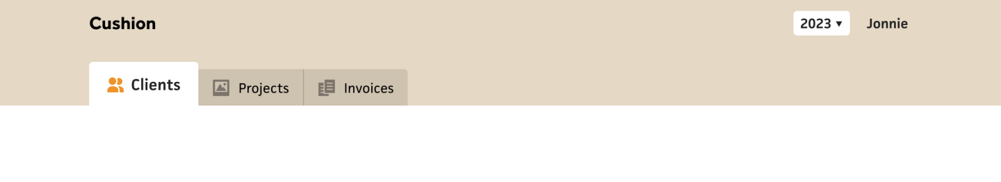
Now that I’m rethinking everything, I’m eager to go back to basics with a navigation that limits—or rather contains—the scope. The original tab-based navigation for Cushion actually fits the bill pretty well, as it’s confined to the max-width of the app, but it’s also influenced by the tab count. Three tabs look great. Four tabs is pushing it. Five tabs?—time for a long look in the mirror. That’s probably an extreme take, but this time around, I’m really aiming for laser focus.

For Cushion, if I want tabs for “Clients”, “Projects”, and “Invoices”, then a few admin tabs, like “Account”, “Preferences”, and “Billing”, I can simply put those in separate views, like I did with the original Cushion—one view for actually using the app and the other for admin. Clicking the user’s name in the header takes them to the admin view and swaps out the tabs for the admin tabs. Then clicking Cushion’s logo follows the standard of returning “home” to the main view of the app, where the feature-focused tabs are shown.

Going back to tab count for a moment, while I do think three is the sweet spot for feature-focused tabs, I actually don’t have a problem with a higher tab count for admin views. The user doesn’t spend nearly as much time there as they do in the actual app, so I’m not bothered by a few extra tabs for clarity—as long as the user can get to where they need to go in two clicks or fewer, I’m happy.
Since I’m looking to return to simpler times while also modernizing and improving Cushion along the way, one consideration I’m thinking about is personalization through color. The existing Cushion is pretty grey, but the original Cushion was very grey. That said, once the user starts filling up the graphs with client colors, the grey fades into the background as a canvas. In any case, I’m toying with the idea of introducing a personalized “theme” color that could be unique between users. Strangely, Cushion has always had a setting for the user’s favorite color, but I never ended up wiring that to anything. While I’m currently focused on the navigation, this might be a good time to tie the theme color to the UI.


By using the background of the top “header” area for the theme color, I could introduce personalization while still maintaining a neutral canvas for the graph below it. The tabs would then need to embrace black or white alpha colors instead of using a greyscale, and I’d need to add logic for determining whether to use black or white text to maintain strong contrast, but that’s easy enough. The real question would be whether I provide a preset color palette to ensure the UI looks good or allow custom colors. The answer to this might be the “why not both?” meme.
I’m off to a good start with this navigation already, and I feel good about its longevity. I am anticipating several edge cases, like clicking into an invoice and how to handle that with tabs, but I’m not worried—there are plenty of best practices to lead the way and I’m not looking to reinvent the wheel.