Journal
Zooming in on the timeline
In the early stages of building Cushion, everything was based upon a year-long timeline view. With one look, you could see a quick and easy-to-digest glimpse of your year. When are you next available? Where do you have pockets of time to fit another project? Wow—that project really took that long? After living with this scale for a while, I wondered what I could do with a more magnified view.

If we zoom in to a specific month on the timeline, we begin to give more meaning to the data. All of a sudden, a 4-day project that was just a blip on the year timeline expands to represent the true weight of those four full days. Zoomed out, it’s easy to see little difference between two lengths of time that are drastically different on the day-to-day scale, like 2 weeks versus 3 weeks, but in a month view, this is huge!
I started to think of ways to actually zoom into the timeline. Of course, the line segments would scale horizontally, but does it really need to scale proportionally on the vertical end as well?—I don’t think so. In my eyes, it looks much better this way and maintains the same timeline height as the year view—allowing the same amount of information to be seen underneath without a jarring effect on the user.
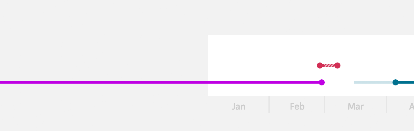
When I first built the timeline view, I added a project that spanned two years and noticed a bug. With the way I coded the view, the knocked-out background of the timeline didn’t expand to account for the line segment. Instead, the line segment ran off the edge of the background, reaching the edge of the window. This wasn’t the intended behavior, but I immediately fell in love with it. The knocked-out background created a distinct boundary to the timeline, but didn’t hide any information beyond this boundary.
Returning to the zoom, this undocumented feature became the perfect tie of consistency between the two scales. When you switch between month and year views, the boundary doesn’t move a pixel.
The problem now was that the timeline labels for the year view, represented by months, needed to be replaced with days in order to be relevant to the new context. However, since I still wanted a dead-simple way to move from month to month, I didn’t want to get rid of the month labels. I went down a dark hole of bad designs, like a second row of labels that pushed the month labels down. It was a awful.
Then, I considered the top of the timeline. At first, I discounted this idea because I just assumed it would clutter the UI. I gave it a shot, though. Sometimes, it’s important to explore directions that you would typically disregard just to say that you tried them. Surprisingly, this direction had legs. It wasn’t perfect at first, but I knew something was there if I just chiseled deep enough.
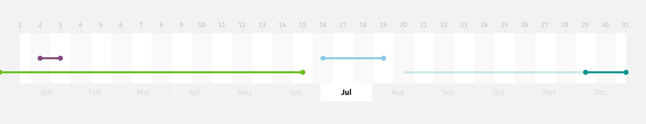
Instead of mimicking the same label design as the months, which represented spans of time, I centered the “tick” to point to the given day. And, because projects don’t factor time of day (yet), I centered the segment dots on each day block, rather than anchoring to an edge. Finally, to better separate each day, I added a slightly greyed background to the even days.
Now, all of this would look great on its own, but the transition of switching between the views should look even better. Luckily, each spot I wanted to animate was as easy as adding a CSS3 transition. The line segments scale based on the number of days in the timeline to the number of days in the selected month, the month labels fade in and pan up from behind the timeline, and the even day backgrounds simply fade in.
Scaling the line segments was the trickiest part, not because of the resizing, but because of the origin point from where to resize. Everything in the timeline is positioned and scaled based on a percentage of its day in the timeline compared to the total days in the timeline. For example, February 1st on a year timeline is located at 8.767%. I chose this route because I wanted the timeline to be able to scale down properly, if Cushion were to be responsive. Fortunately, it made my life so much easier with timeline zooming, too. Instead of scaling each line segment individually, I just need to scale the entire timeline and pan.
The origin point is crucial because if you scale the timeline while panning it and not centering the origin point, the timeline appears to pan before scaling. At first, I thought this was just a side effect of easing two attributes, but even when transitioned linearly, it didn’t look right. Luckily, centering the origin point was a non-issue, so everything came together in the end without needing to include JS for the animation.
I couldn’t be happier with my first stab at timeline zooming. Not only because it turned out well, but also because it opens up the possibility of a few other features I want to implement. The first is simply an in-between view for zooming in on a quarter of the year. The other feature, however, is much more involved. I’ll save it for another post.
If you’re interested in participating in the paid beta, send me your email on Twitter and I’ll send you an invite.