Journal
Project actions in the Schedule timeline beta
Last weekend, I launched an update in Cushion’s new Schedule timeline beta to let users click projects to edit them. While I could keep this interaction as-is, it’s actually a stopgap measure before implementing ”project actions”. For months now, I’ve had a design in mind to click a project, then select an available action for that project. There’s the obvious “Edit” action, but from there it depends on the project status. This past week, I’ve been heads-down bringing this to life, and I’m actually ready to deploy it this weekend—how exciting!

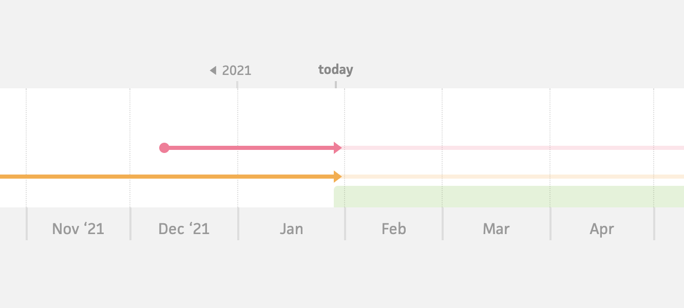
Existing schedule timeline (2014–2021)
Since Cushion’s original schedule timeline was introduced almost eight years ago, I built it before any of the slick direct manipulation interactions in other areas of the app, like click & drag time-tracking. For years, I’ve been itching to bring those same interactions to the schedule timeline. While these project actions aren’t yet the click & drag features I’ve been alluding to lately, they get us halfway there by letting us directly interact with the timeline. Rather than having it so clicking a project redirects you to the project’s page, you’re now presented with relevant actions for that project.

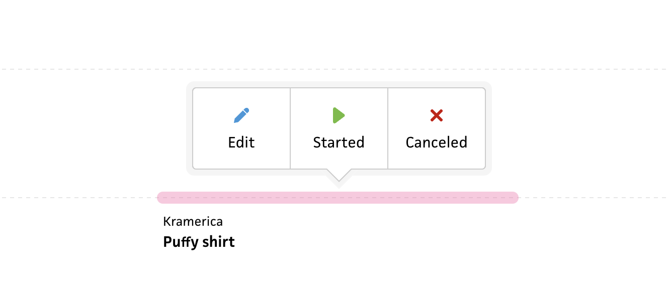
Actions for a project that hasn’t started

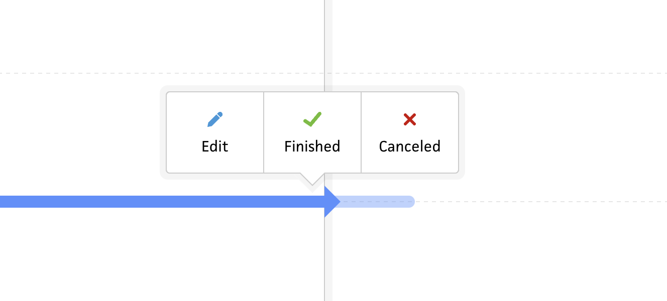
Actions for an active project
The actions that appear for each project are dependent on its status, with the “Edit” action being constant for all projects. If a project hasn’t started yet, users can start or cancel the project. For active projects, users can finish or cancel the project. And, for finished or canceled projects, users will be able to continue a project. I haven’t implemented this last one, so I’m still up in the air about it, but I imagine it might be an action folks would need—I’ll need to ask.

Color picker popover using Vue 3 Teleport
On the technical front, the project actions work by using the same Popover component and teleport functionality I use for components like the color picker and date picker. With Vue 3’s teleport feature, I’m able to mount a popover near the end of the <body> tag, so the popover is always above the other the elements—no matter where the parent component is located. (This feels like magic compared to the old fashioned ways we previously relied on.)
At first, I had the popover appear upon clicking a project, but then I realized I needed to also make the popover disappear when clicking outside of the project. Me from 8 years ago would’ve tried to listen for clicks outside of the component and stop propagation, but 2022 me was able to think of a much better approach that also achieves one of my new Cushion principles of being keyboard-friendly. If I want to make the timeline tabbable, I can’t rely on click events for showing the popover. This does, however, give me a solid clue on how to tackle it—using tabindex and focus & blur events.
I honestly haven’t had a ton of experience with tabindex besides disabling tabbing with tabindex="-1", but I quickly realized that I can make any element tabbable with tabindex="0". (After 25 years of coding, I’m still learning new things.) Using this shockingly newfound knowledge, I added a tabindex to the timeline project component and am now able to tab through projects. While this is very cool indeed, it isn’t the original goal—I need to select on click. Luckily, simply adding listeners for focus and blur events is what lets me indicate which project is selected—and more importantly, which project should show its actions.
The real beauty of this tabindex approach is that it automatically handles my issue of needing to click outside of a project to deselect it—just like clicking outside of an input field escapes its focus. As a dev who always strives to use native behaviors when I can rather than hacking it with JavaScript, this is the way.

Existing start project workflow
From here, I simply needed to wire up the actions to the API. This is actually another area where I’m starting with a stopgap implementation compared to my eventual design. For this weekend’s release, clicking any of the actions will start, finish, or cancel a project using today’s date. Then in the next iteration, I’ll let users adjust the date in case they’re updating their timeline after the fact. Another step in this scenario will also be to update the project’s list based on the user’s settings. For most users, if they start a project, they’ll want it moved to the “Active” list, etc. This can either go hand-in-hand with specifying the date, like how it’s currently handled, or I can consider a potentially better approach—I’ll think about this next week.
At this point, I’m ready to release this first phase of project actions, but as mentioned, there’s still more on the to-do list—especially around tabbing. While it works great with projects within the view, as soon as you start tabbing to projects below the fold, the interface ends up in an undesirable state, with the entire UI scrolling where it shouldn’t and the timeline itself not scrolling. I’m not too worried about this, though. I imagine it’s simply a case of preventing scroll on that part of the UI and updating my timeline scroll logic to focus selected projects.
That’s all for now. If you’re a Cushion user and interested in beta testing the new Schedule timeline, hit me up in the app!