Journal
Flipping the schedule timeline

I’m making a ton of progress on Cushion’s new schedule timeline—enough, in fact, that I expect to have a beta ready sooner than later. I spent a lot of time designing the timeline, but I didn’t cover every aspect of it. As I build new features from their designs, I tend to leave certain decisions until the implementation phase, feel them out as I go, and make adjustments throughout. Rarely do I end up building a feature exactly how I originally designed it.

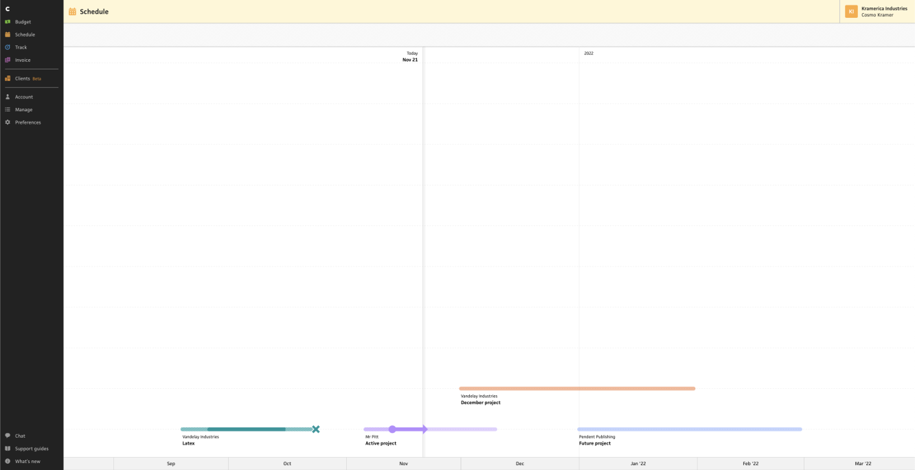
I typically work on Cushion at night, on the couch, on my 13” laptop—an especially small screen, but a solid baseline to use. This past weekend, however, I worked from the 27“ monitor at my desk—a considerable step up in screen real estate. With the window at fullscreen and everything aligned to the bottom of the timeline, I almost didn’t see the projects at first. Cushion’s sidebar and top nav kept my attention to the top left, which put anything near the bottom out of my periphery, including the x-axis that labels the months of the timeline. While the bottom-aligned layout worked well in the existing schedule timeline, when the timeline was near the top of the screen and only 100px tall, it didn’t feel right at all when filling the entire window.
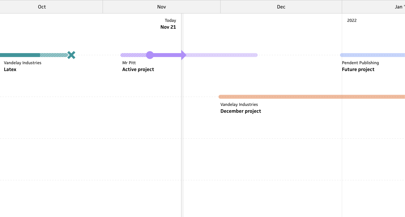
I had a hunch, so I asked my wife if I should consider vertically flipping the timeline so that the projects would stack from the top instead of from the bottom, and she said, “Yeah, probably”—and that was enough for me! Luckily, this change wouldn’t be difficult at all, so I could at least try it out without feeling like I’ve wasted any time if it’s not right. Within half an hour, I had the timeline flipped, and I could immediately feel an improvement. The projects were more visible, and the x-axis felt much more connected to the rest of the timeline—its position right above the “Today” marker and year markers make so much more sense, too.

In the weeks leading up to this change, I didn’t expect to make it, or even consider making it, but I’m glad I did. It’s one of those adjustments that are outside of my own periphery while building the feature, but a short moment of consideration brought it into view. I think this new orientation will make a big difference in the intuitiveness of the timeline, which is the primary focus of the entire redesign. If you’re itching to try out the new schedule timeline, keep an eye out for the upcoming beta!