Journal
Redesigning the homepage
After about 7 months of working on Cushion, I realized I hadn’t updated the homepage since coming up with the idea for the app. It still included a sentence saying “I can’t wait to build this app.” This threw people off because they would see that without seeing any other progress and just assume that it hasn’t been built yet—in their eyes, I just launched that page.
This happens too often—I’m working non-stop on a project, living with it day after day, but completely unaware that maybe not everyone’s dialed in, looking over my shoulder. I assume they’ve seen every tweet and every blog post. This couldn’t be further from the truth. I still have close friends who don’t know I’m freelancing again, let alone working on Cushion.

So, it was time. Instead of focusing all of my attention on the app, I needed to dedicate some time to the outward-facing side of Cushion. Since I still have much to do in the app, I gave myself a limit of one day to spend redesigning the homepage. Now that the app is in working condition, I wanted to get the point across that it’s usable—no longer just an idea or a half-baked, bug-ridden prototype. But, I didn’t want to ditch everything.
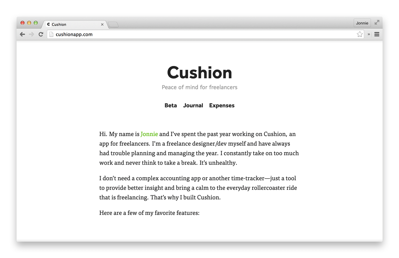
The paragraph describing my unhealthy lifestyle as a freelancer is strong. I’d much prefer someone to read that and relate to me on a personal level than replace it with some witty marketing lingo that makes Cushion just a product that appeared overnight. I pulled out a few of my favorite features and listed them underneath. After months of working on the app and speaking with others who use it, the features were obvious.
The first, project and invoice tracking, is the easy one. This needs to be a feature to even consider using the app. I wanted people to see it and immediately compare it to what they currently use—on a level of both design and functionality. The timeline should look great to them and introduce something that their current app doesn’t have, like an indication that a project has dragged on past its expected due date. This is a problem that all freelancers experience, but most apps don’t make a big deal of it.
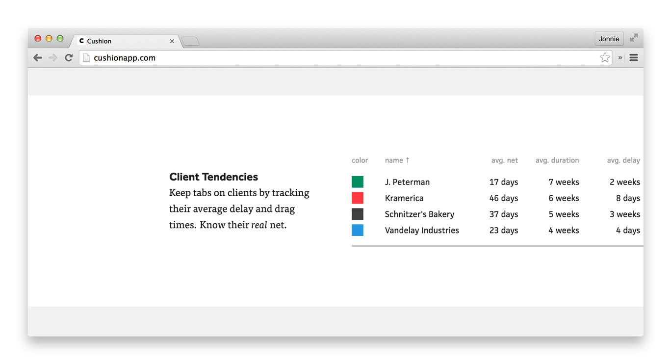
Next, I brought up a feature that is incredibly useful, but not exactly glamorous—client tendencies. You can learn so much about your freelance life with the simplest data. Take invoices as an example. All you need is the issue date and paid date of an invoice to reveal your client’s real net. Sure, a client says they are net 45, but in actuality, they are net 63—this is a client of mine. I never thought it would be that far off if it weren’t for Cushion calculating the exact numbers. In my head, I would just think, “Yeah, I remember them paying late, but it’s probably not too bad.” 18 days late is enough to prevent you from paying your rent that month.
Delay and drag are other client tendencies. When was the last time you had a project that started when it was supposed to or finished on the exact date as planned? The majority of my projects drag on at least a week. It’s not a problem because I get paid for my extra time, but when a projects drags into another project—that’s a problem. All of a sudden, I’m juggling two projects, one of which is probably at its peak because I’m wrapping up all those last-minute details.
Every freelancer should know their clients’ tendencies, so they can be better prepared for unexpected scheduling conflicts and late paychecks. Maybe the data is strong enough that you wouldn’t take that project and find yourself in such a stressful situation.
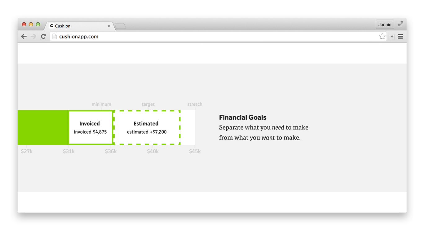
The last feature I focused on is financial goals. When you’re working full-time, you have your salary and that’s that. As a freelancer, however, that number isn’t so matter-of-fact. You have what you absolutely need to make to pay your expenses, but beyond that, you can aim high or just enough to get by. When presented with a bar to fill, there’s extra incentive to fill that bar. Personally, with a month and a half to go in the year, I’m just shy of my target goal and it’s driving me insane. Without this bar, my position is either numbers on a spreadsheet or a general idea in my head. Seeing it visually gives me an instant idea of where I am, if I’m okay, and how close I am to that next goal.
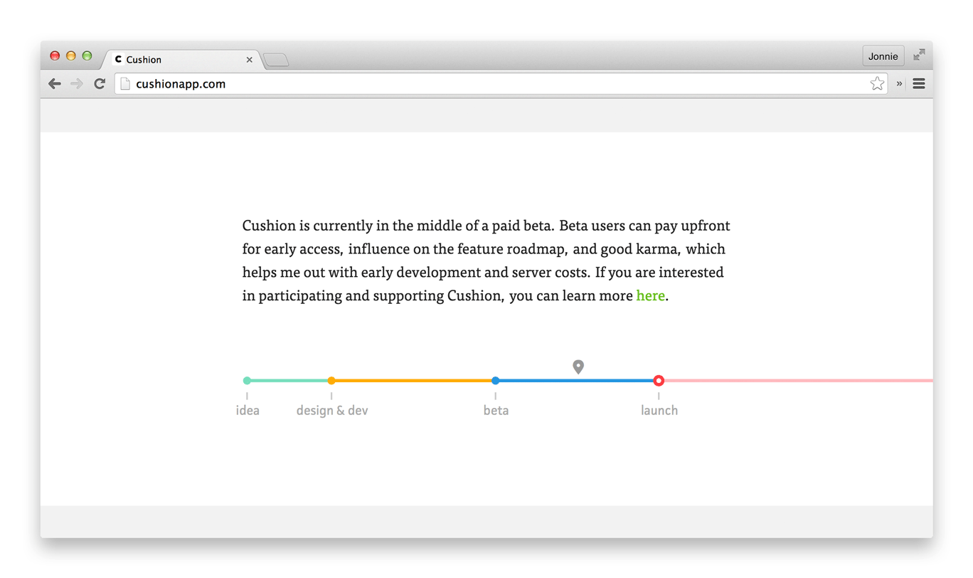
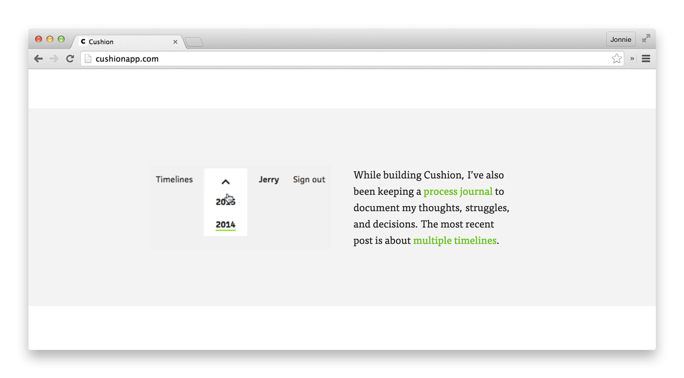
Aside from features, two other areas of the app were really important for me to bring up this time—Cushion’s development timeline and this process journal. When your product is in beta, it’s easy to leave it at that with an open-ended schedule that’s just a blur. Some betas run a few months—others last more than a year. To avoid Cushion staying behind closed doors for too long, I wanted to show a timeline for others, but also for myself. Two months into this 6-month beta, I want it to be clear that we’re roughly halfway through. This tells both myself and others that Cushion will launch and that I have a specific plan for that—not just a seemingly never-ending beta.
With the process journal, I felt it needed to be more than just a link in the site’s navigation. It makes no sense that I would dedicate so much time to writing about the progress than making progress, then just hide it and hope that people find it. Speaking to the journal on the homepage also allows me to keep that section in rotation. Instead of the feature list, which is probably solidified for a few more months, I can update to show the latest post, like this one.
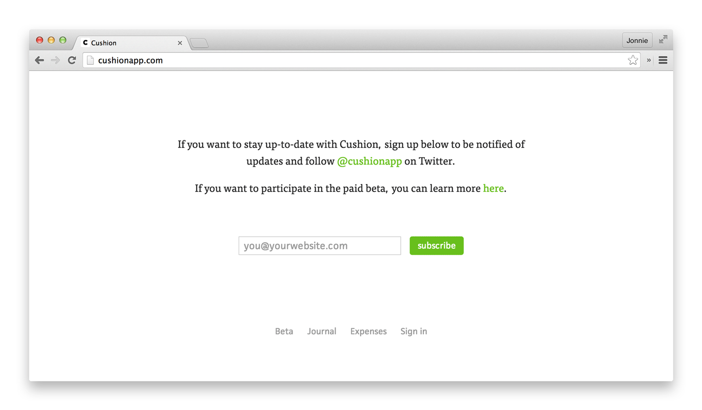
Lastly, I kept the newsletter sign up form, with an added link to the beta page. Shouting on Twitter is easy, but it’s much more effective to speak to those who actually signed up to hear more. I’ve been collecting emails of interested people for months now and after sending my first update email this past week, I realize just how valuable that list is. I love hearing from you and hope I’m doing an okay job of communicating.
A big thanks to Nicole Fenton for editing the homepage and beta copy.