Journal
Editing workloads in the timeline
These past couple weeks, I’ve had to take a break from Cushion, but for good reason—my wife and I bought a new home! After searching for two years, and giving up multiple times, the stars finally aligned and we were able to find our dream home on the exact street we’ve been living on for the past 10 years. Now, we’re finally moved in, but living amongst boxes with a demo’d kitchen that’s making way for a remodel. It wasn’t until this past weekend that I’ve been able to settle in with Cushion and get back to where I left off—workloads!
I feel like I’ve been working on the ability to edit workloads for months now, but it’s actually only been a couple weeks. There’s something about only working nights and weekends that stretches out your mental sense of time. I spent a lot of time thinking about my gripes with the existing timeline. The main issue is the disconnect between the planning view and the schedule view. When you’re creating workloads in the planning view, you don’t see any of the start or finish dates of the projects. Then, when you’re in the schedule view, you can’t edit the workloads inline—you need to exit to the planning view. It’s far from intuitive and frustrating beyond belief.
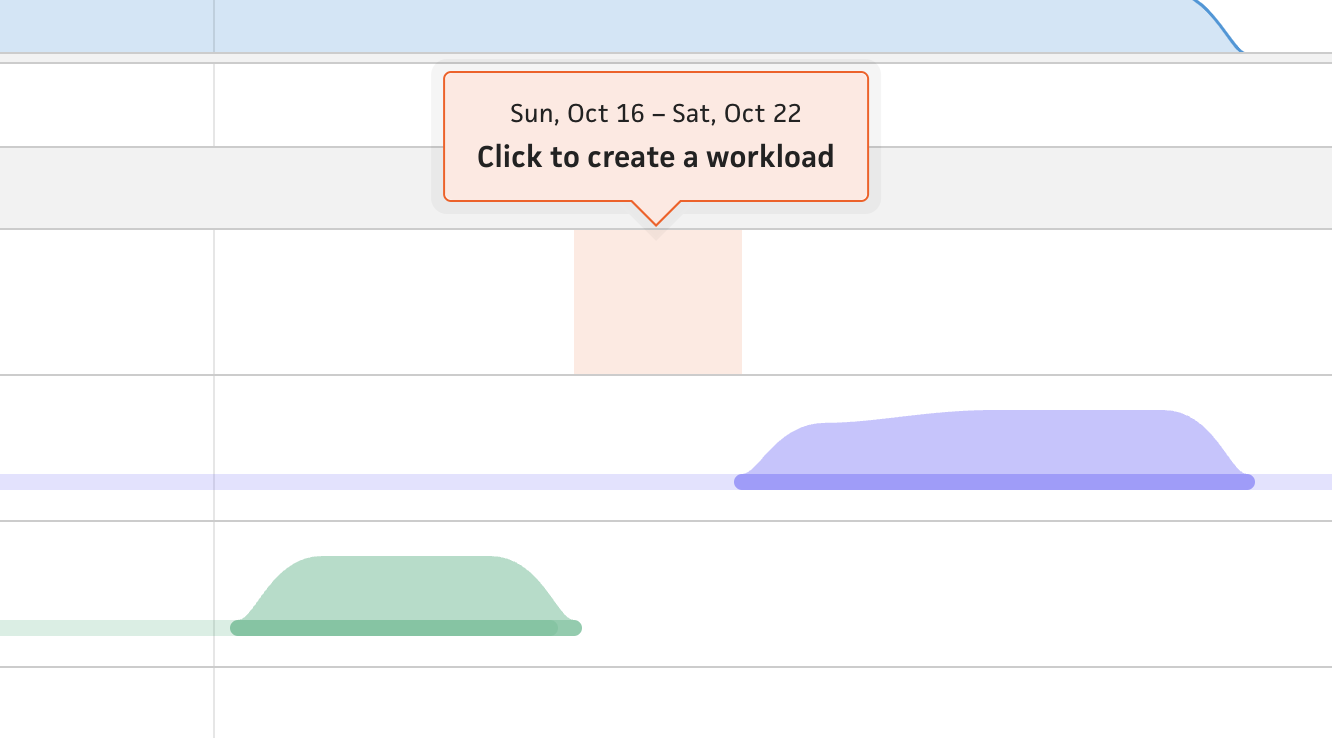
To address this massive UX flaw, I first needed to combine these two views into a single timeline and allow the user to edit workloads inline. Editing workloads in the same view is so much more valuable to the user because they can see their other projects in parallel and move workloads relative to those projects (e.g., if there’s a 2-week gap between a couple projects, the user can see that and place a new workload in that gap). In the existing timeline, the user would spot the gap, but then need to switch to the planning view and try to find the gap again before returning to the schedule view. It’s a hassle and certainly wears on users over time.
For the inline aspect, I sampled the “flip” transition I currently use when switching between a duration and a finish date for a project. This swaps out the field when toggling the deadline checkbox, but by using a flipping transition, the visual clearly indicates that the fields are being swapped. When using an entire timeline row with the flip transition, all of a sudden, I’ve open up the doors to multiple “mini-timelines” without cluttering the timeline at all. Flipping the row will enter an “edit mode”, which treats the row like a modal—with the other project rows dimmed. Folks can then exit the editing mode by clicking outside of the focused area, like they would with a modal.
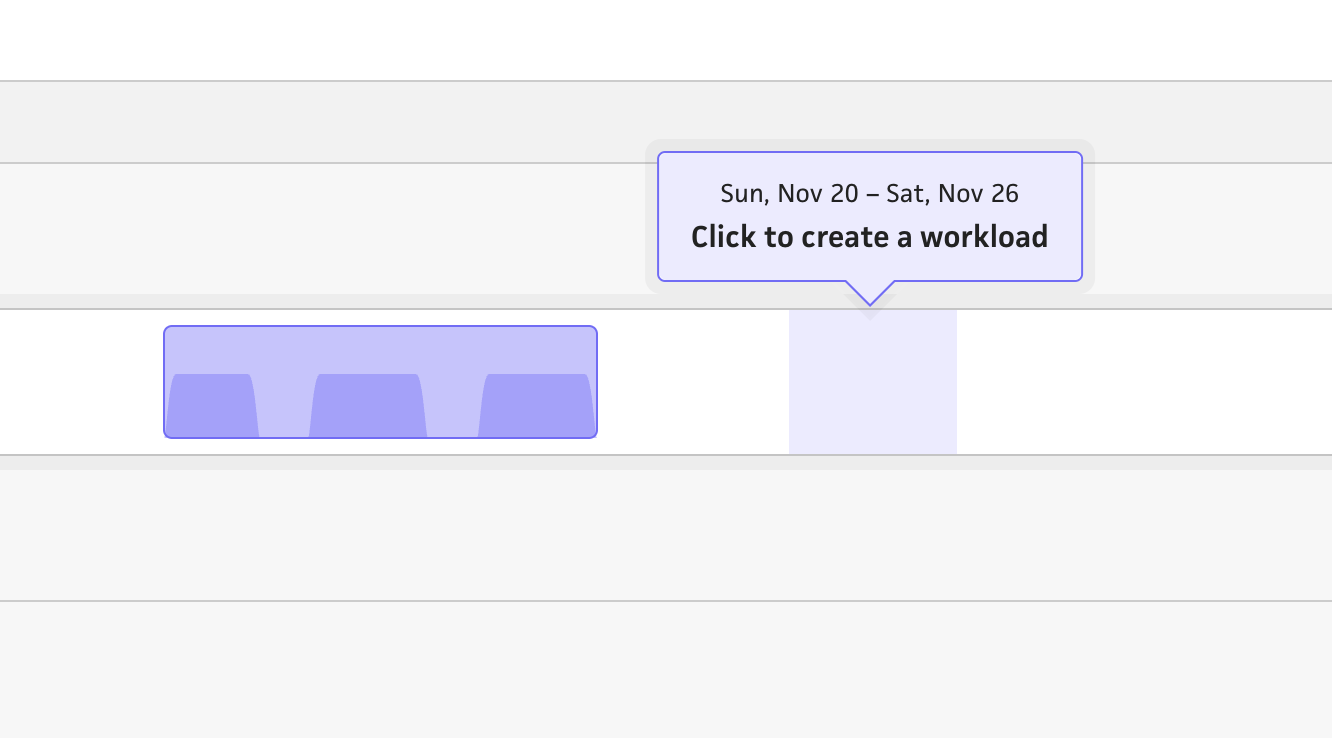
Once the user is in edit mode, the highlighted date range now indicates where you intend to create a workload—simply click and Cushion will open a form to specify the details of the workload. Again, I’m starting with a basic interaction of clicking the timeline to create a workload, then following up with the ability to also click+drag for a more custom date range. I want to make sure that this no-frills flow works first before diving too deep into the fancy UX.
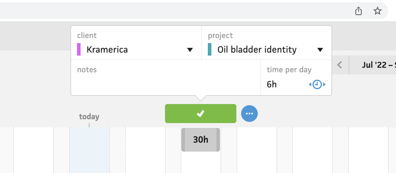
Old workload form (2018)
I spun my wheels on the form for the workload, since the existing timeline’s workload form is inline. I didn’t want to carry that decision over without giving it a second thought, so I took a beat and considered the use-cases. If a user can simply click+drag to create a workload, I want the form to be where they can fine-tune if necessary.
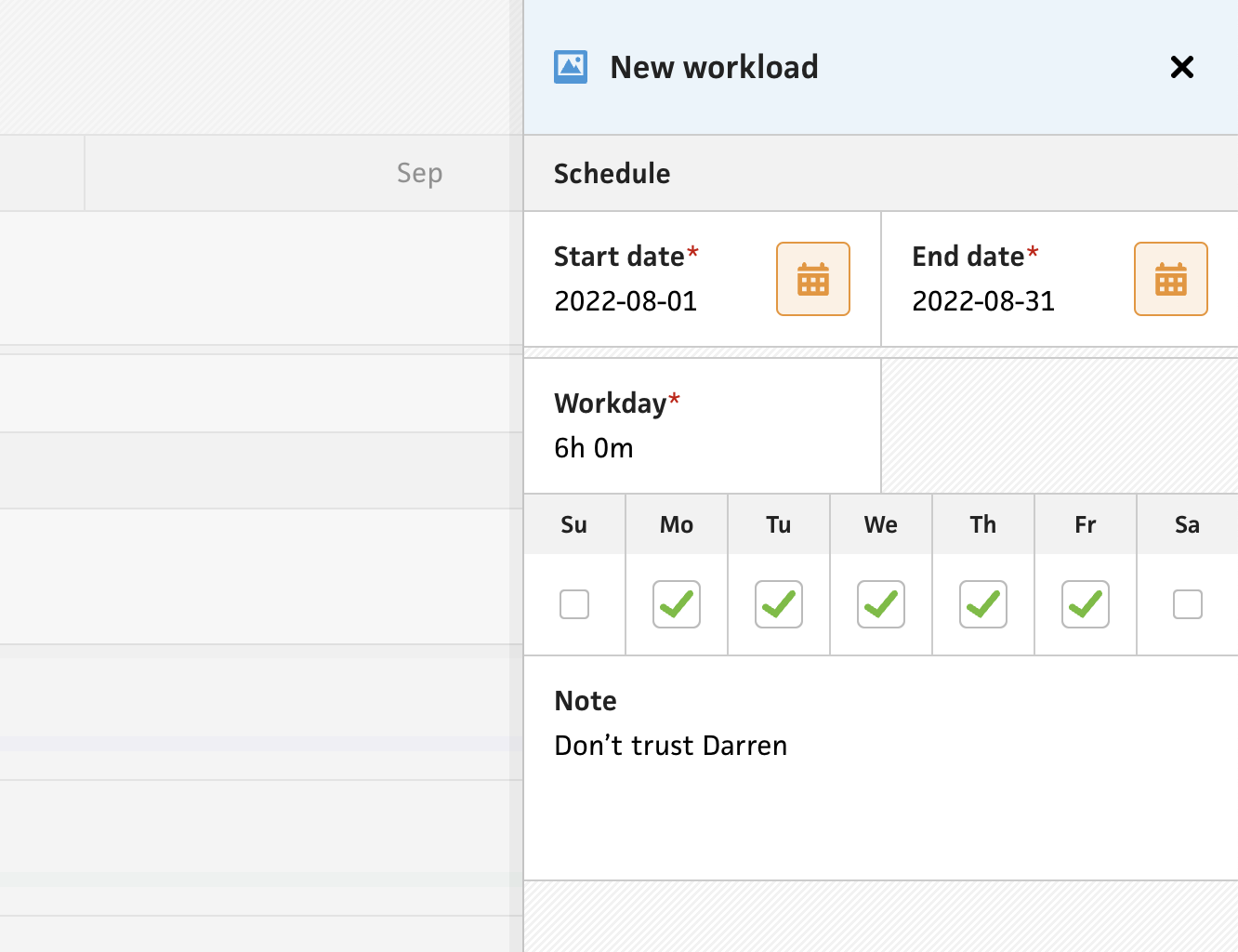
Since I already have the drawer-style modal as a pattern in the timeline, I decided to continue using it for the workload. This lets me include additional fields without worrying about cluttering the UI too much. Without this limitation, I was able to sneak in the checkboxes for the days of the week, which was previously hard to find in the existing timeline. While these are currently only checkboxes, I see an opportunity to let folks assign specific hours for each day of the week. This would avoid the need to “hack” the system with multiple overlapping workloads.
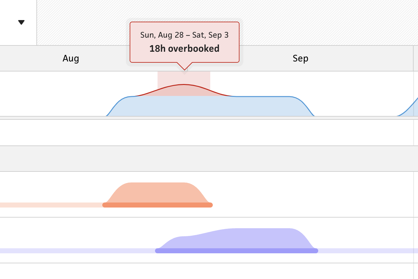
Lastly, when a user creates the new workload, their overall workload updates to reflect the change. They can immediately see how much availability they still have or whether they’ve just overbooked themselves. At the moment, this is an instant change without any sort of transition, but I definitely plan to spend some dedicated time to make this more impactful and noticeable. When a user fills their availability, I want the UI to celebrate it. When a user overbook themselves, I want the UI to warn them and stress caution. These are the touches that will make a massive difference.