Journal
Revisiting the UX for client notes

Continuing my work on Cushion’s new Clients section, I’ve reached the point where I’ve established a solid base, and now I’m steadily adding the remaining necessities. In Cushion, each item type (clients, projects, invoices, etc.) has a field for “notes”. This can be used for anything, as it’s essentially a freeform textfield. Oddly enough, this simple field has become incredibly valuable for a lot of users. Some use it to jot down notes about potential clients while others use it to keep a log throughout a project. Whatever the use-case, the current Cushion doesn’t really give notes the attention it deserves. Because of this, I’ve decided to hoist notes into their own column in the Clients table.

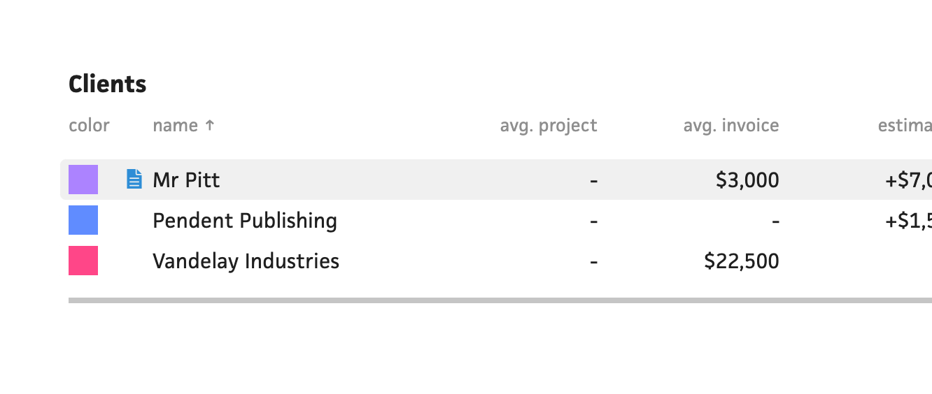
While this sounds like a new approach for Cushion, it’s not. As a matter of fact, one of Cushion’s oldest table implementations (still living in the budget section) has its own notes column when you hover a table row. When I rebuilt that table for the schedule section to have drag-and-drop functionality between lists, I left out the notes column. People noticed, but I never got around to updating it. I did, however, realize how useful it was to have a quick way to access an item’s notes.

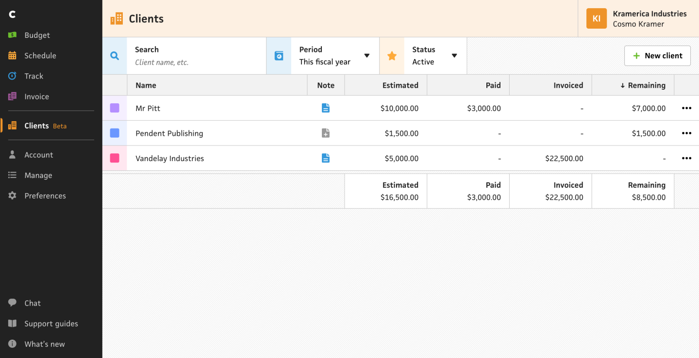
In the new Clients table, I included a proper column for notes (instead of squishing the icons between columns without labeling). Also, similar to the old implementation, the icon is if a note exists for a given client, but the icon itself changes from a “+” to lines representing written text. The combination of these changes make for a much better experience for the user. Because the user will now always see the note icon, it’s instantly discoverable for new users, and folks no longer need to hover to see that a client has a note attached to it. Also, as a proper column, the notes column automatically inherits sorting, so users can easily sort clients by which ones have notes.

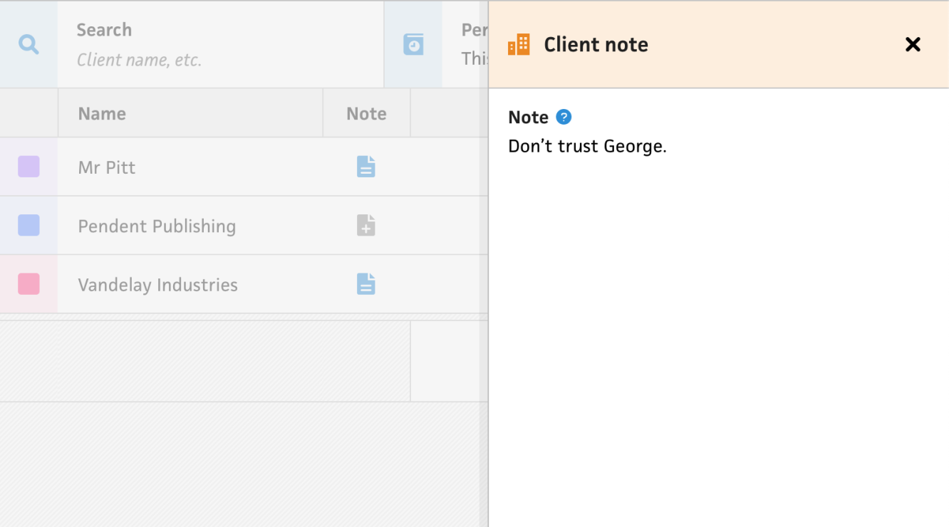
I made use of the modal that slides in from the right when a user clicks a note icon—I call this a “Stacked Modal” (despite not having an instance where these modals can currently stack… yet). The modal is dead simple, but gives the user the entire modal as a text area to both view and edit their clients’ notes.

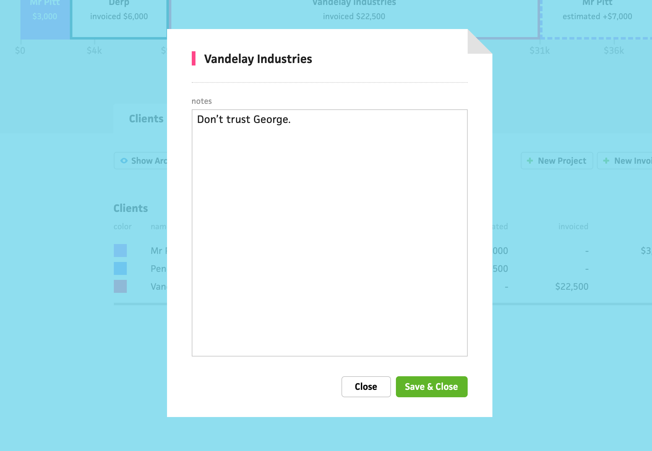
In the current version of Cushion, I (embarrassingly) used a centered modal that has a folded corner to represent a real piece of paper. While it feels embarrassing to see now ( since there are no other design treatments like this in Cushion), it was fine for its time. Now, however, I prefer to use the stacked modal, and reserve centered modals for prompts, like deleting your account.
Next up, I’m leaning towards giving the individual client view more love. It would be a massive win in the codebase (and UX) if I could simplify that page. I’m both nervous and excited!