Journal
Vacations in the timeline
This past week (or two?) I’ve been working on a feature to bring the new timeline closer to parity with the existing schedule view in Cushion—vacations. This is one of those features that doesn’t seem too important, but is actually super useful (which is why a few beta users asked when it’d be available).
When considering availability, it’s important to know when you can take on new work in parallel with other work, but more importantly, you need to know when you’re not working. In the case of taking a (real) vacation, being able to block out a span of time is the difference between an accurate or inaccurate forecast of your schedule.

From the get-go, I had a pretty good idea of how I planned to lay out vacations in the new timeline. Since I have the top portion with total availability and total tracked time, the spot right below it would be perfect to keep vacations top-of-mind and close to the availability—to show how vacations affect it. Once I had the layout in place, I needed to determine the size and look of the vacations.

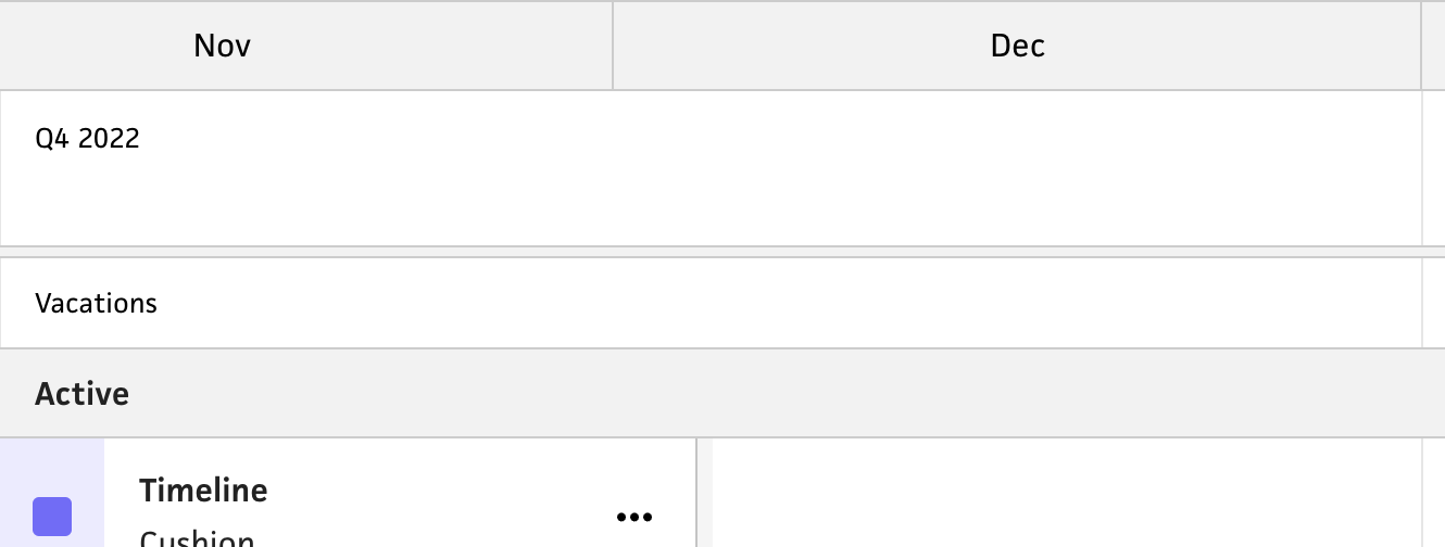
Since vacations are a secondary element of the timeline (with projects and availability being the priority), I didn’t want vacations to compete too much in terms of scale. Because of this, I reduced the height of the vacation area to roughly half of the project and availability rows. They also don’t deserve the same row-per-instance real estate that projects have, so I decided to keep the vacations in a single row, which meant labeling them inline.

At first, I didn’t love the idea of potentially cropping labels, but because the vacations are secondary, this seemed like a reasonable concession. I did, however, label the row “Vacations” to make it crystal clear that this row is designated for vacations—whether or not the user has created a vacation yet. In addition to the label, I decided to include an icon on each vacation to further indicate the purpose of these date ranges. Part of this is to anticipate a future where there might be other spans of time, but the other part is to bring some character to the timeline. At the end of the day, I want it to be cute, friendly, and playful, because I can.

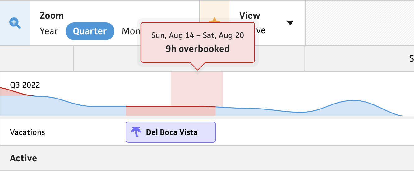
Now that I had the layout and rendering in place, I needed to bring out the vacations’ real value—how they affect your availability. I love thinking about this feature because it feels simple, smart, and considerate. If I’m trying to help freelancers become a better freelancer, I truly want to help them protect their time and actually take time off. In the existing schedule view, I only hide availability for the date ranges of a vacation, but in the new timeline, I really wanted to drive the message home. To accomplish this, I treat any estimated time during a vacation the same as overbooking yourself—the availability path is highlighted red and the tooltip shows how many hours you overbooked. I truly hope this steers folks from booking work when they should be resetting.

In addition to vacations, I included the “type” field with the option to designate a vacation as a “business” trip. The main difference here is that vacations that are business-related won’t affect your availability. I’m still very much on the fence here with regards to naming and presentation here, but functionally it works for now. I definitely realize that these are more “business trips” than “vacations”, but I haven’t narrowed in on the right wording. Part of me even wonders if I should include the context of “business”, but instead have a checkbox for whether or not to factor it into your availability—because I’ve definitely had vacations where I took them knowing I’d need to work.

The last part I’ll touch on is a little design detail that I’m probably too excited about. Since the labels for vacations are inline, there’s a chance of the label being cut off if the date range is short—or if you’re zoomed all the way out. I did add tooltips to show the date range of a vacation and include the label in case the inline label is cropped, but I found an opportunity to make this smarter. When a vacation is long enough not to crop the inline label, it looks repetitive to include the label in the tooltip as well, so I added some logic to only include the label in the tooltip if the inline label is cropped.
That’s all for now. Next up, I’ll add the ability to create and delete vacations. Since the existing schedule view has the ability to create vacations, this felt like a good milestone to ship. I’m excited about this next step because it’ll be the timeline’s first instance of click-and-drag, which I plan to also use for workloads.