Journal
From beta to launch - sign up
I originally intended for the “From Beta to Launch” post to be a single post, but I quickly realized that I have so much more to say. So, I decided to extend this topic into a series. In the first part, I wrote about the messaging changes needed to handle both beta and trial users. In this post, I’ll walk through the sign up redesign and why I’m still kicking myself for not redesigning it before launch.
The entire time I’ve worked on Cushion, I’ve focused on taking small steps when making changes. Instead of rethinking an entire portion of the app, I’ll tweak it, little by little, to make it work with the new addition. This approach has worked out really well, until recently, when I opened Cushion up to trial users.
Small steps worked in the past because the paid beta users were the constant. Because they were literally invested in the app, I could count on them sticking around for the duration of the beta. This allowed me to design the sign up process in a very specific way.
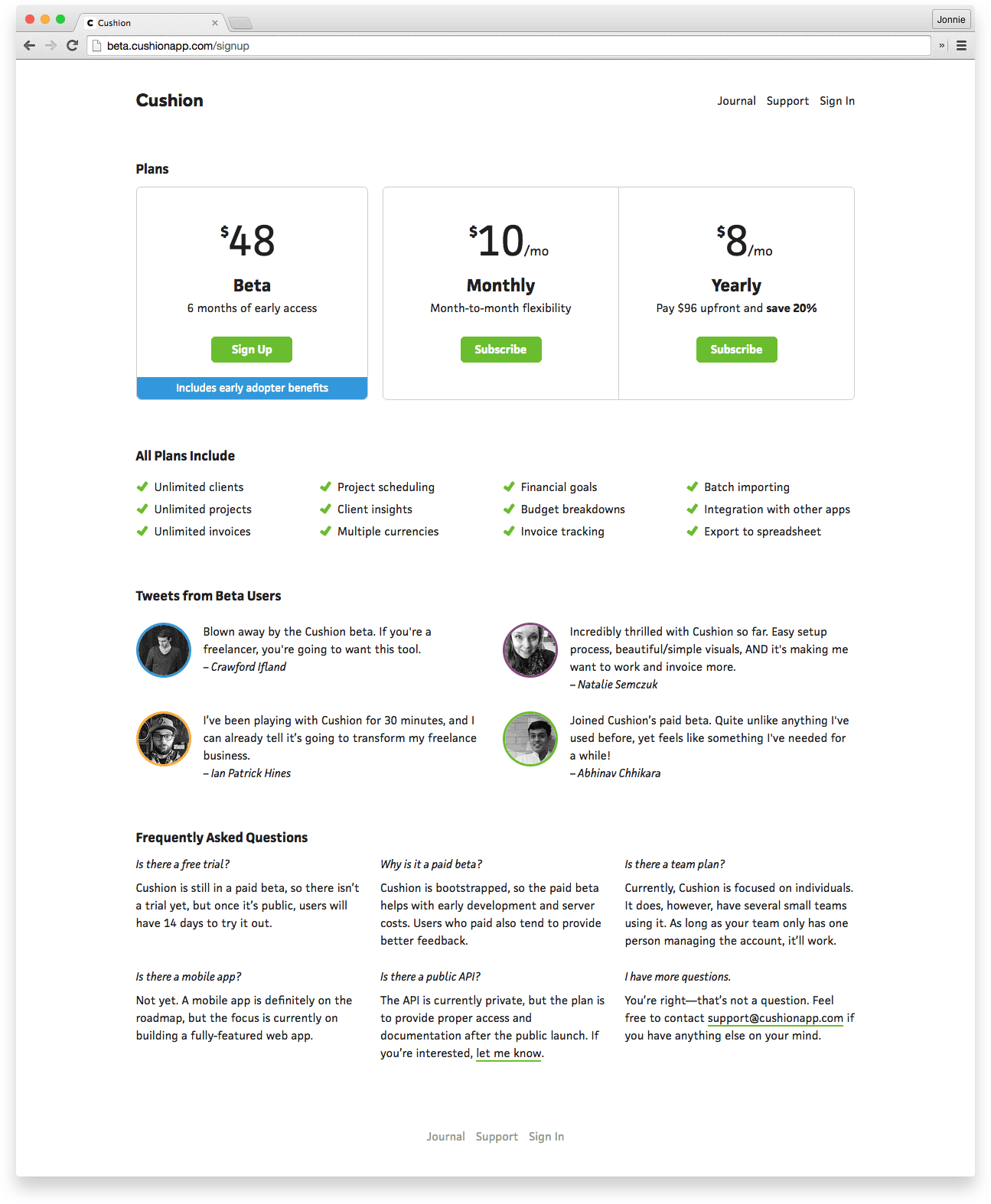
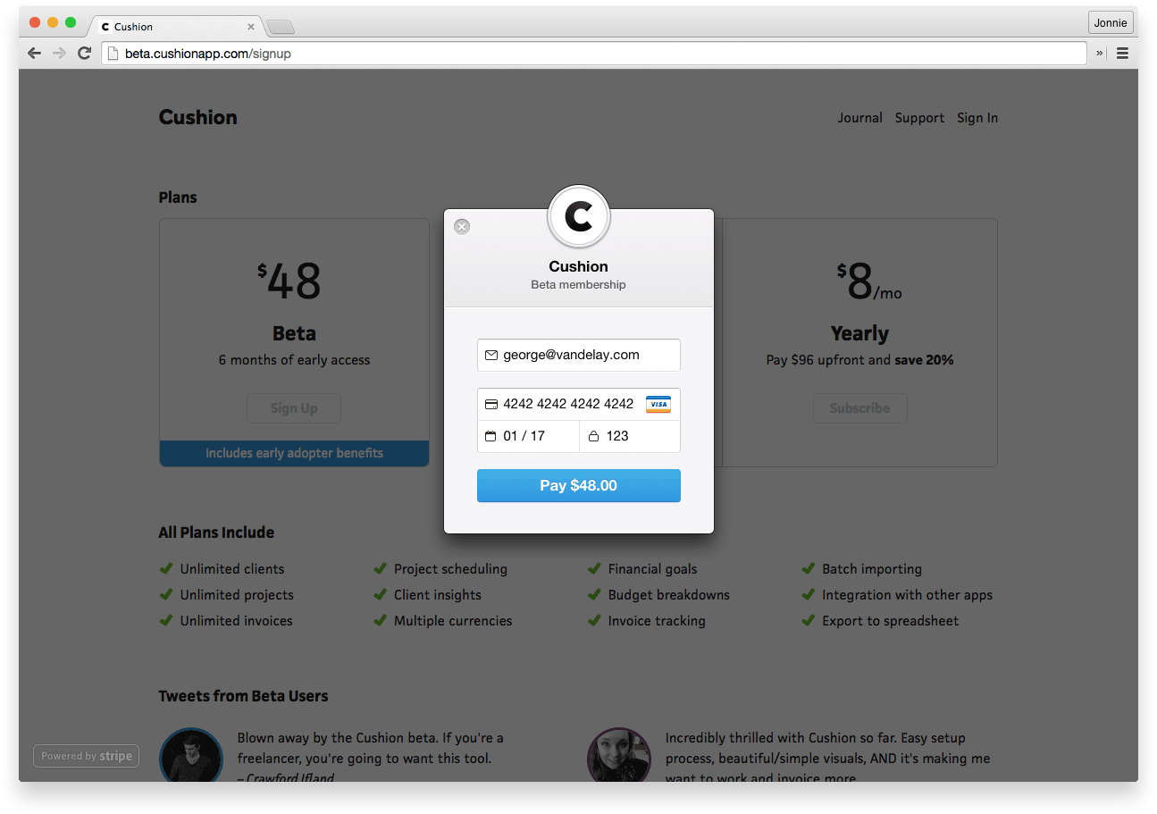
Potential users would arrive on a page with beta details and pricing. This page included features, testimonials, and frequently asked questions—everything they’d need to know before signing up. Using Stripe Checkout, they could even pay for the beta from this page.
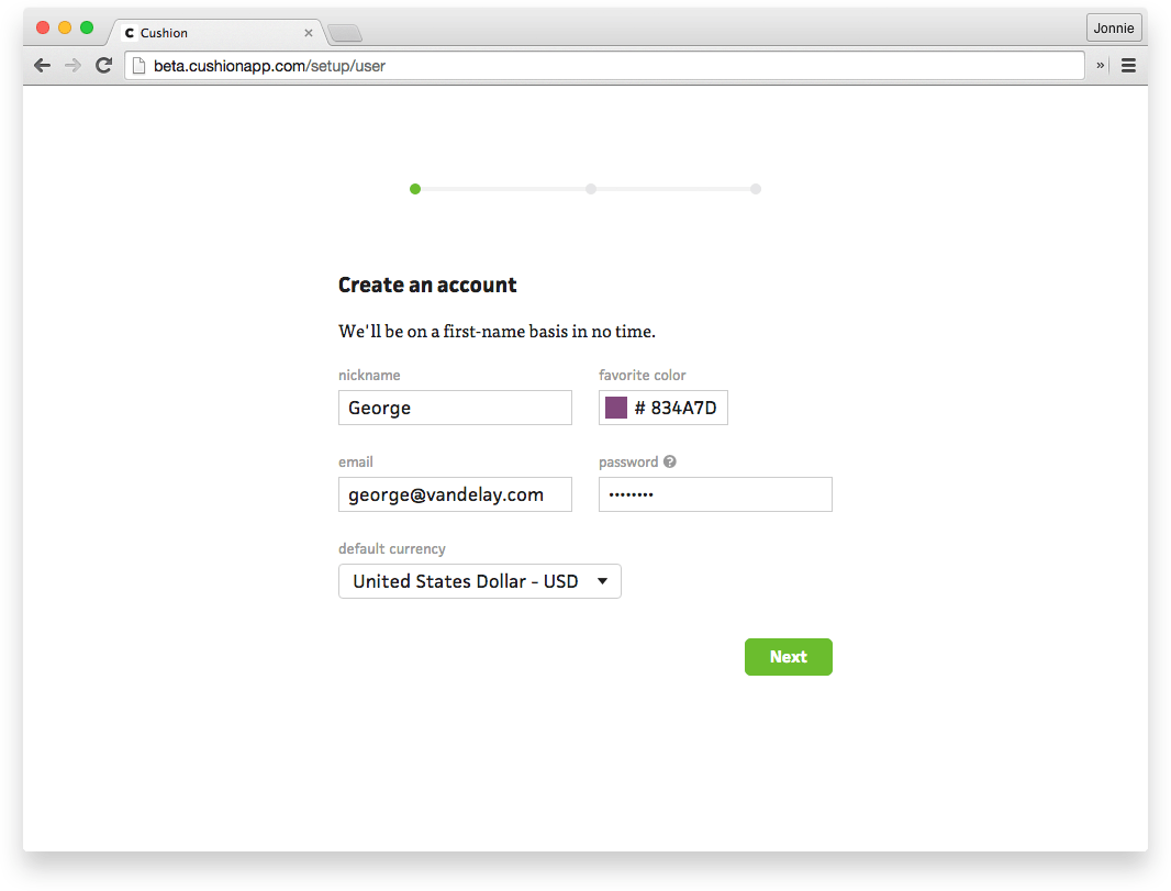
If the person decides to join the beta, they’re greeted with the first step in the onboarding flow—creating an account. At the top of the onboarding page, a trail of breadcrumbs indicate the user’s progress, repurposing the schedule timeline’s elements and establishing the visual tone of the app. These breadcrumbs hint to the user that setting up their account will only take three short steps.
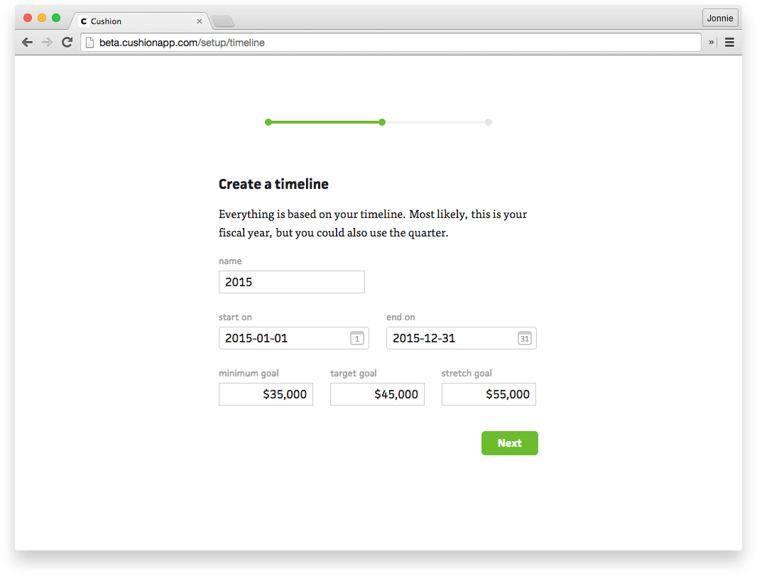
Next, the user creates their timeline. By default, I start them with the current year and a few financial goals. They can change anything if they want or just click “next”.
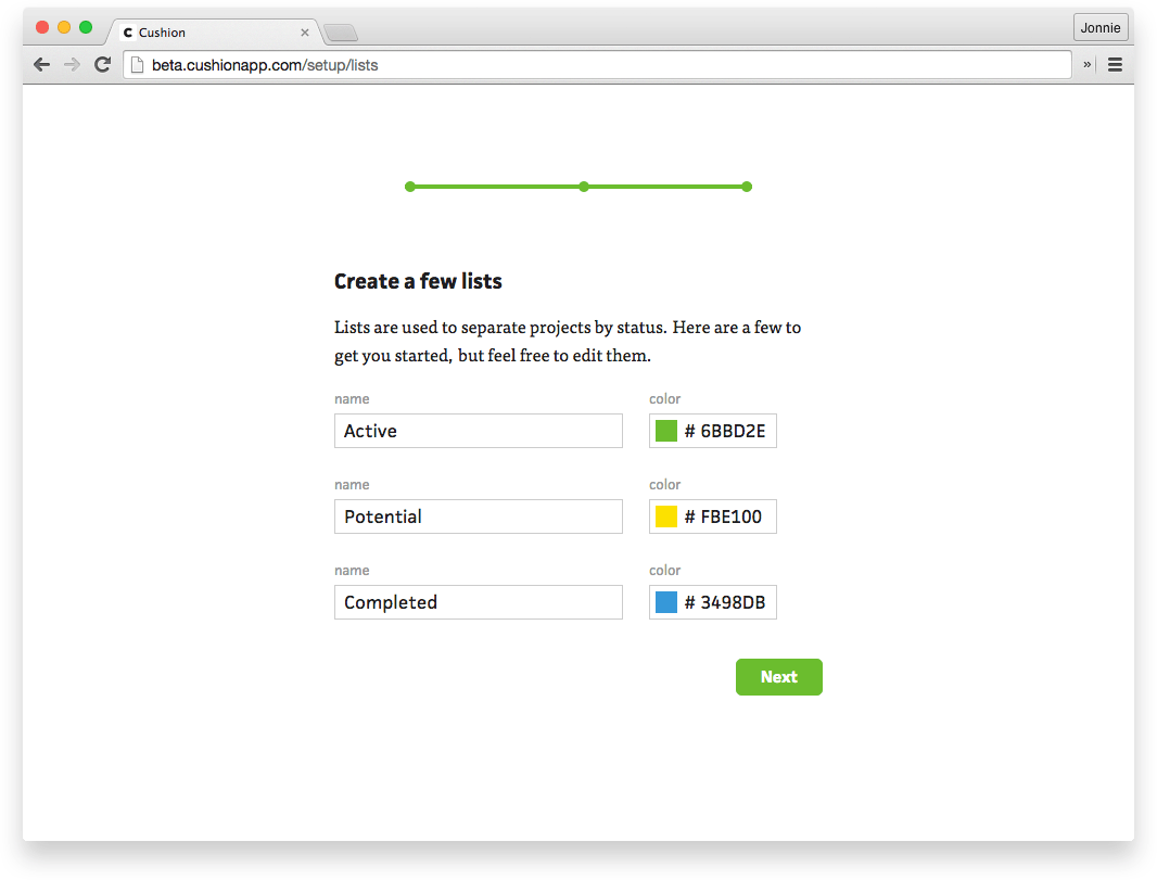
The “final” step lets the user create a few lists. By default, I suggest several lists to start, with the list names hinting at their intended purpose.
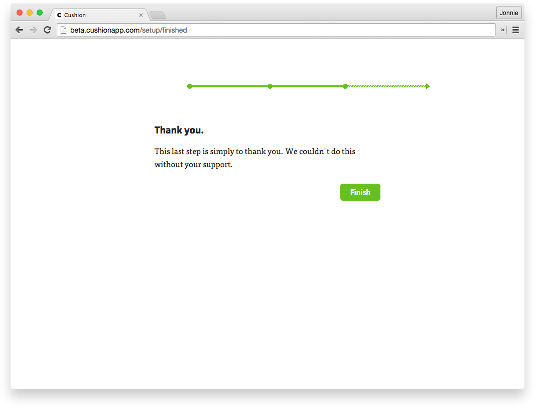
As a surprise “feel-good” move, I inserted a hidden step to simply thank them for supporting Cushion. Think about it—they invested upfront without ever using the app. This is quite a leap of faith and not something to take for granted.
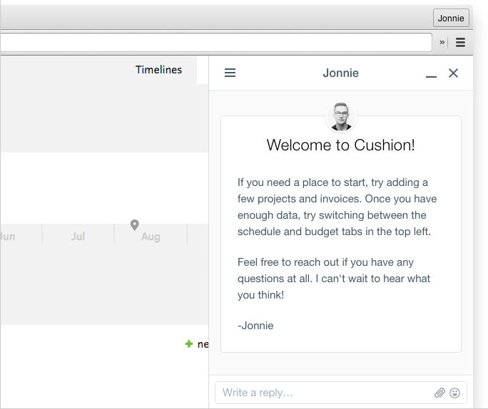
Once the user clicks “finish”, Cushion redirects them to the app. An automated message then appears from me, personally greeting them and suggesting they start by creating a few projects and invoices.
That was the sign up process throughout the beta. It received a solid response from beta users and I felt good about it. The surprise “thank you” was a big hit.
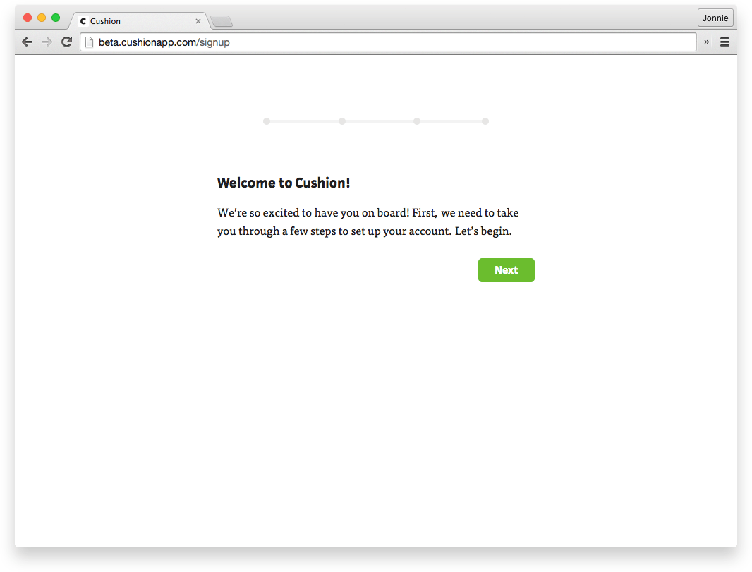
In preparation for launch, I made a few small tweaks to the sign up process to handle trial users. The users were greeted with a welcome screen to prime them for the next few steps.
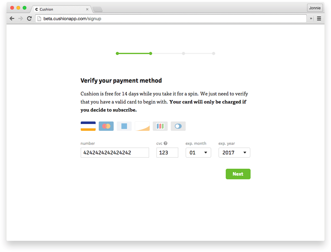
Creating their account remained the first step, but in-between this and the timeline step, I inserted a new step for payment information. I know what you’re thinking—big mistake.
With a lot of launches, a good number of people sign up with no intention of using the app—they simply want to kick the tires because it’s a new app. That’s fine for an app supported by a team, but for a solo dev, it’s tough. I can’t afford a wave of users who know they won’t use the app, so I decided to require payment info upfront. I still think this was the right move, but I realize now that I went about it in the worst way possible—as an unexpected surprise.
By taking small steps to tweak the sign up design, I never took a big step back to reassess everything. I never considered that maybe the sign up process needs more than a few tweaks—maybe it needs a complete overhaul. I simply refashioned what I had, so it would work with trial users.
When the beta users were the constant, this onboarding flow worked, but with trial users, I failed to consider a few things: 1) Trial users aren’t invested in the app. 2) Trial users might not even know anything about it. 3) Trial users don’t need to follow through with the trial—they can bail at any moment.
I should’ve taken the time to factor in these differences.
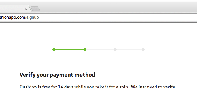
In addition to the surprise payment form, those once-useful breadcrumbs became a daunting list of chores—and payment information was step 2 of 4! To a fresh pair of eyes, what could possibly come after payment information? The onboarding flow that I was once so proud of had become an eerie river of red flags and obstacles. I was mortified when I finally took a step back. Redesigning the sign up process became my top priority.
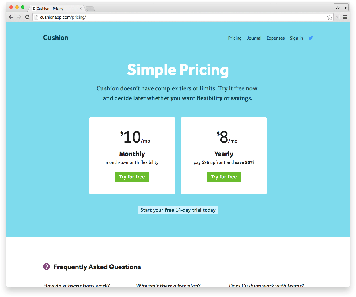
I started by revisiting the new marketing website—its bright colors are so friendly and inviting. The sign up page, on the other hand, feels like a cold white room. By extending the design of the marketing site to the sign up page, I could smooth the transition and make a more welcoming first impression.
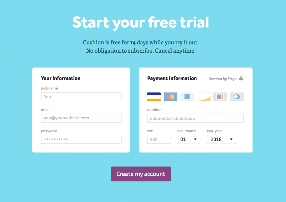
First, I tried a side-by-side layout. Visually, it felt consistent with the pricing page, but the zig-zag path interfered with the form’s natural flow. Instead of following a single direction, the user would need to move left-to-right, then down.
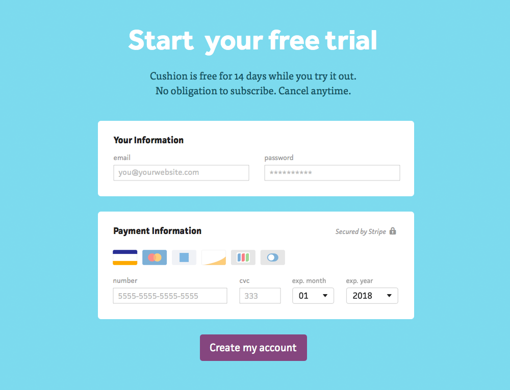
I then tried a stacked layout with a clear vertical direction. At first, it bothered me that the page continued below the fold on smaller screens, but this is definitely a better approach than the zig-zag. If the user needs to scroll a bit, that’s fine.
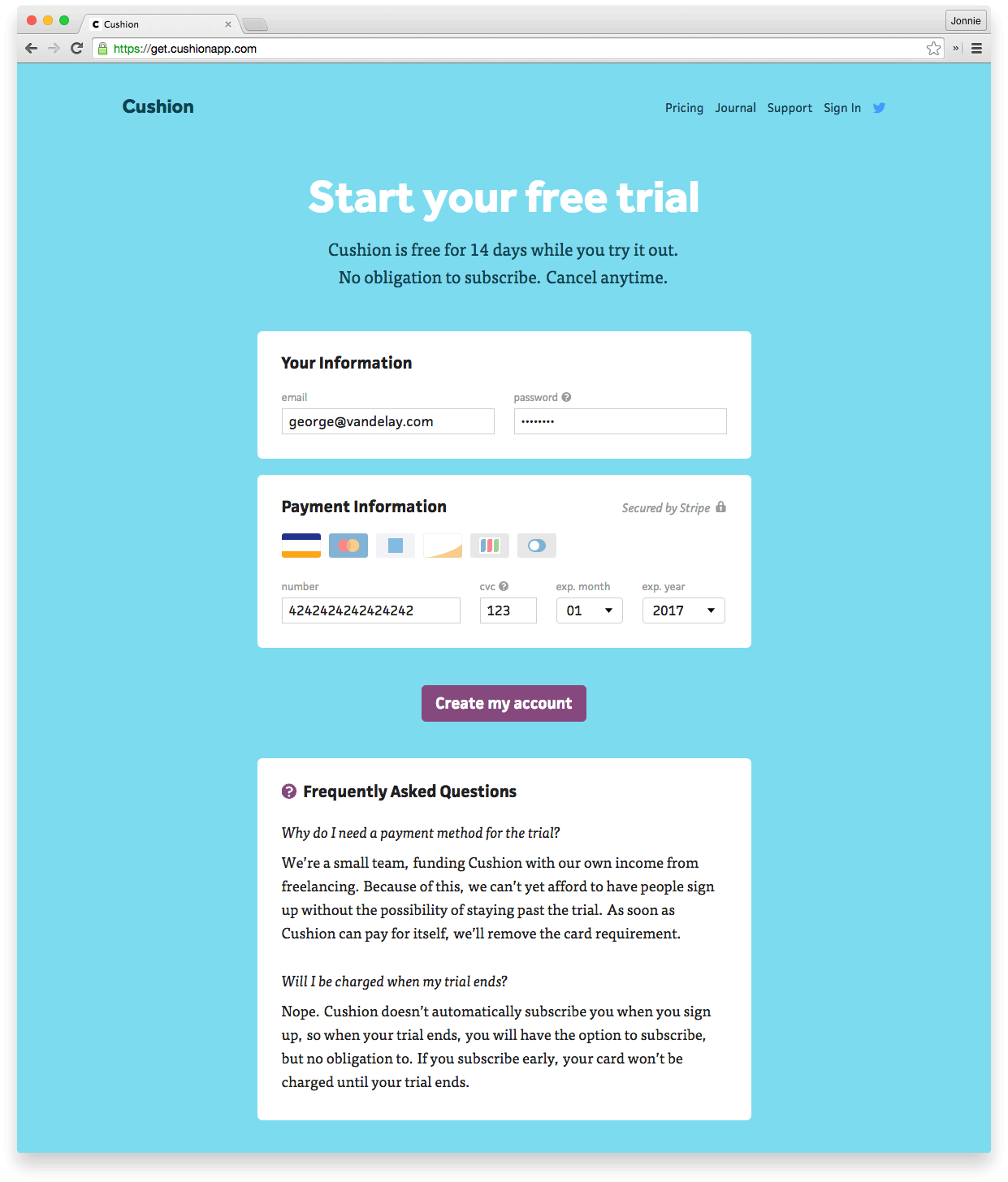
In addition to the user and payment info, I decided to include a couple answers to frequently asked questions from launch. I learned from the first design that a lot of people think Cushion is just another startup with millions of funding in the bank. Complaints about the sign up process were directed at “you guys” and “the team”. As soon as I’d respond with a hint that it’s just me, they’d drop the aggressive tone and even apologize at times. I knew that an explanation for the payment form would go a long way in softening the complaints.
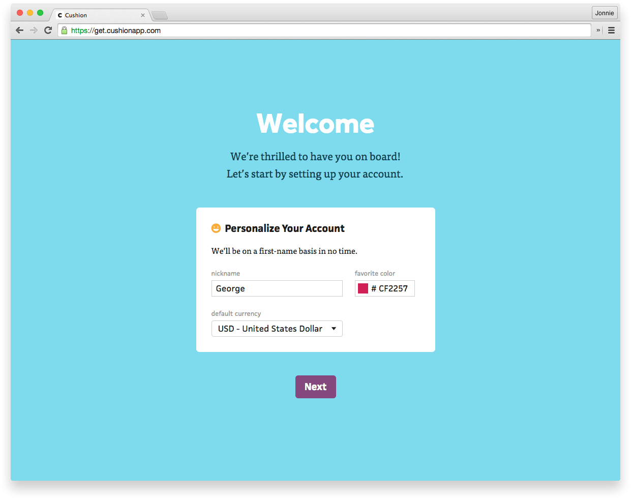
The other onboarding steps remained pretty much the same, but with the new design applied. The colors and icons really helped in carrying the playfulness over from the marketing site.
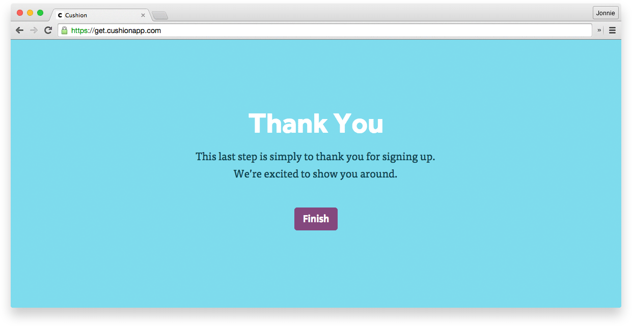
I also kept the surprise “thank you”, but reworded it to make sense for trial users. Now, when a new user makes their way through the sign up process, they’re left with a more pleasant taste in their mouth, instead of the black licorice of the previous design. I’m back to being proud instead of embarrassed, and I haven’t received a single complaint since.
Next up, migrating from the beta.cushionapp.com subdomain.