Journal
Improving readability with bigger fonts and higher contrast
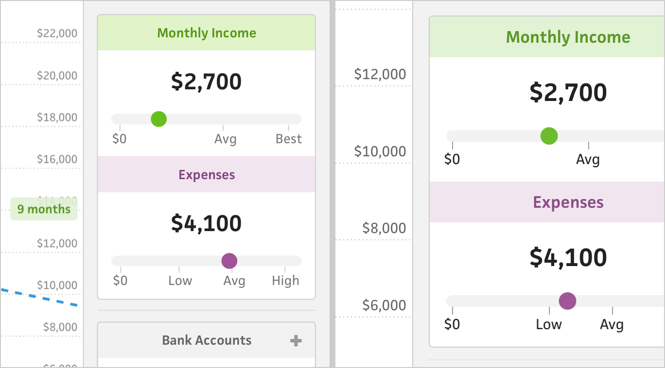
The title of this post should include a “duh”, but hear me out. A few weeks ago, something hit me—our fonts are too small. By accident, I hit cmd+plus in the browser, which bumped our fonts to 110%, and everything felt better. I was instantly able to read more easily and the interface seemed to fit the window better. Maybe my eyes are aging, or maybe I’m maturing as a designer, but a 2px bump to our fonts made such an immediate difference that I needed to write about it.
Growing up as a dev in the 800x600 age, before EMs, REMs, or media queries, I’ve always been accustomed to 14px as a base font. 14px felt like a natural default. Even now, most web apps tend to revolve around 14px or even smaller. After my “coming of age” moment with font sizes, I started noticing that other web apps are too small, too. I found myself zooming a few of them to 110% indefinitely. I no longer need to squint at Google Sheets.
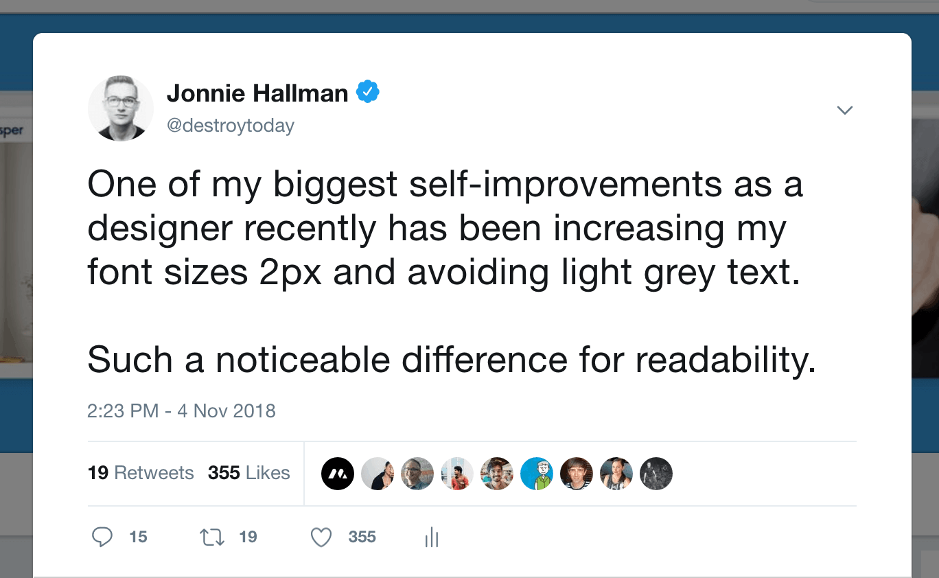
I tweeted about my discovery and was blown away by how much it resonated with others. One person talked about their coworker with significant eyesight issues. Another shared their team’s experience sitting down with visually-impaired people and watching them use their components. Someone else gave a tip that “any value below 1rem is deliberately setting a font-size below the user’s preferred size.” Bumping font sizes goes a long way to improve accessibility, too. (duh)
To coincide with the benefits for viewers, increasing our font sizes also helped guide me in designing the UI for our upcoming beta. With bigger fonts, we’re challenged with the constraint of having less space to work with, but we also have fewer excuses for squeezing unnecessary things into the UI. The shortage of design real estate stops me before I even suggest a questionable decision.
Along with increasing font sizes, I started avoiding light grey text. For years, I used light grey text to deemphasize labels or sub-headers. It felt like a smooth way of softly establishing hierarchy in addition to font sizes. As soon as I tried a darker font where I’d normally use light grey, the text felt easier to read without standing out too much.
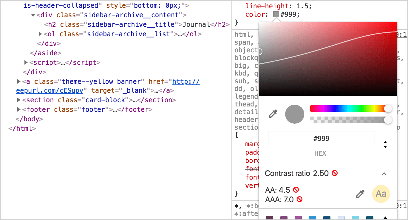
While updating colors, I even discovered that Chrome’s Dev Tools indicate whether an element’s color combo are AA or AAA compliant, which is unbelievable helpful to both reference and learn from.
I know these improvements aren’t news to most people, but it took me a while to come around. As someone who’d always push back when asked to use bigger fonts or higher contrast color, I’m glad I finally see the obvious importance and benefits. I feel like I have a new set of design eyes that will benefit users in ways I don’t yet realize.