Journal
Calculating in the database and revealing tendencies
This last week, I focused primarily on the Cushion backend. In working locally on the app, I realized that it was becoming sluggish—especially on pages with a lot of content. I’ve been building this app with progress in mind, so I haven’t been as considerate as I should be. I query the database far too often and calculate the results in Ruby when it could all be done in the database. Because of this, performance issues are apparent.
For example, a single request to retrieve a list of projects uses a single query for the projects, but then three additional queries for each project to grab the sum of its invoices. With my current personal data, this resulted in nearly 150 queries just to pull down my projects! Not good.
I knew this would happen when I wrote the code because, at the time, I just needed it to work. I’m being a responsible dev and using test-driven development for the backend, so in order for the tests to pass, they just need the correct result. Now that I’m further along, however, I also need the code to perform well. Luckily, I can go back and fine-tune the code, knowing that my tests are in place to double-check that it still works.
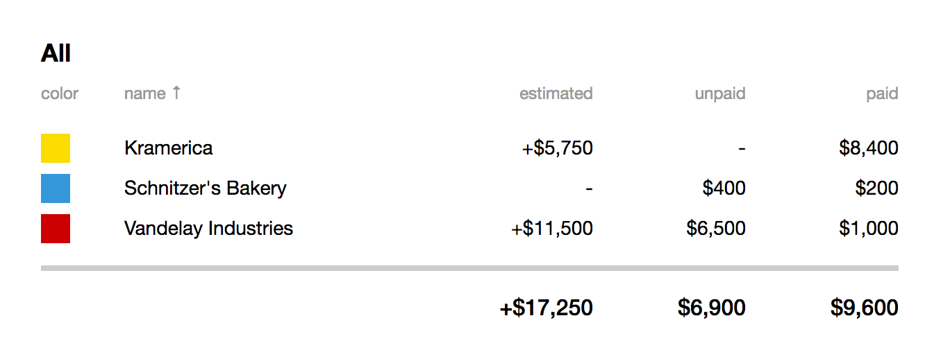
After getting up to speed with PostgreSQL, I realized just how much I could do in the database rather than in Ruby—apparently, much more than I imagined. I started by focusing on those invoices sums—paid income, unpaid income, and relative estimated income. The first two are straightforward—just paid invoices and unpaid invoices—but the last one is trickier.
Every project has an estimated income, which is a ballpark amount that this project could potentially bring in. It’s not a guarantee that you’ll reach that amount, nor is it a guarantee that it will only bring in that amount. It’s just a figure to give you an idea. With this figure, however, we can do some interesting things, like seeing how close or far off you were.
If we take the estimated income for a project and subtract the sum of its invoices, we can see the actual income relative to the estimated amount. As you’re working on the project, this can be useful for seeing how much is potentially remaining, if it’s capped-off at that amount. Or, if you’re working hourly without a cap, you can see how much more you’ve made than originally anticipated. Hopefully, you fall in the latter end of this example.

I wrapped up projects and moved up the chain to clients. For clients, I have these sums of income as well, but on a wider scale, combining the sums of each client’s projects. This is useful in seeing which clients bring in the most (in case you need to spread out your income streams) and which clients owe you the most (revealing a red flag going forward).
We also have a lot of data to play with in regards to scheduling. Since every project has both estimated and actual start dates and end dates, I’ve been able reveal projects that start late or drag on too long. This is useful enough on the project level, but if we take a step back and group the projects by client, we can learn a lot about client tendencies.

Now, instead of sums, we can calculate averages. The three main columns represent the average duration, delay and drag of clients. With them, we can expose a lot. If a client consistently feeds you only small scope projects, you can know with confidence whether you can fit them in an open slot in your schedule. On the cautionary side, we can use average delay and drag to question whether you should still work with this client or just account for the delay and drag when planning the next gig with them.

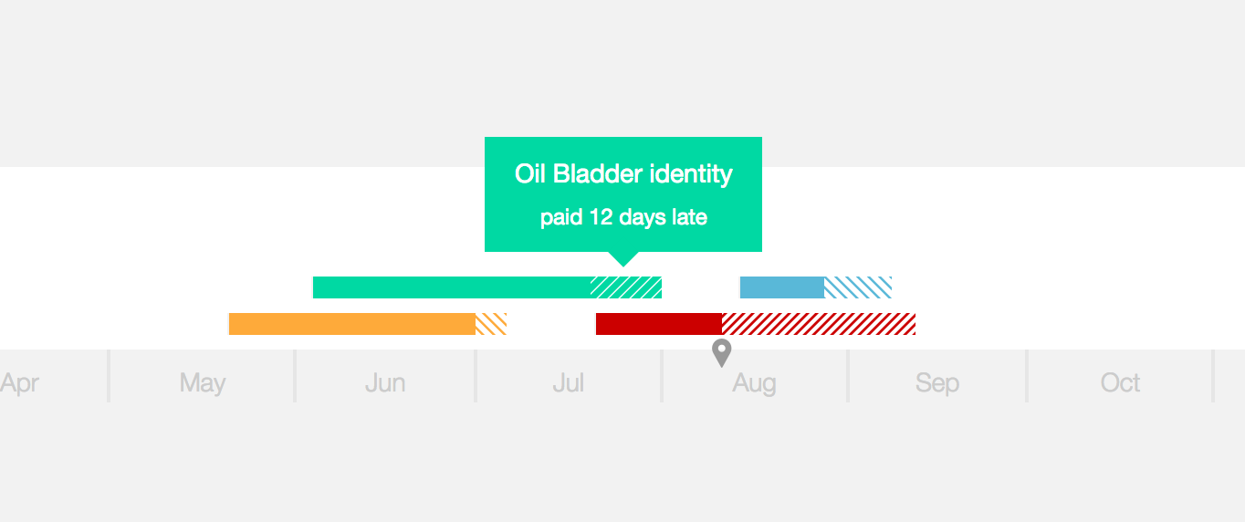
I also improved the schedule tooltip to provide written details of what you’re looking at rather than forcing you to do the math—you can now point to a specific segment of a bar and see what it represents. For clients and projects, these segments include the delay, drag, duration and estimated duration.
Under invoices, using the dates assigned to each (issued, due, and paid), the segments represent how early an invoice was paid, how late an invoice was paid (more realistic), how long an invoice took to get paid, and how long until an invoice is due.
With these new tooltips in place, I feel like I’m going in a really good direction—taking useful data and making it easily accessible. Being able to see the data in table form is easy, but I’d rather provide the ability to interact with data in context.