Journal
The date picker component
This past weekend’s agenda included the date picker and color picker components. I’m only going to focus on the date picker component in this post, since a good friend of mine—who often provides me with a solid outsider opinion—mentioned that the previous post on components could’ve benefited from being several easier-to-digest posts. Great point! Strangely, part of me just really wanted to write a long post simply to write one—especially since most of mine are often the same 5-7 paragraph length. The shorter ones do let me publish more consistently, which is a big goal of mine, so let’s get back to it.

Date pickers are really fun to build. I’ve lost count of how many I’ve built over the years—whether it was in JavaScript, PHP, or even my beloved ActionScript 3—but I never get bored of building new ones. I’m not sure what exactly interests me so much about date pickers, but I think it’s the endless opportunities to improve the UX. Calendars in general can be really complex, but they can also be incredibly simple. With each date picker I build, I try to add at least one little improvement over the last one. This time is no different.

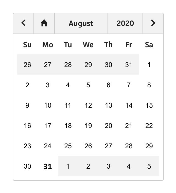
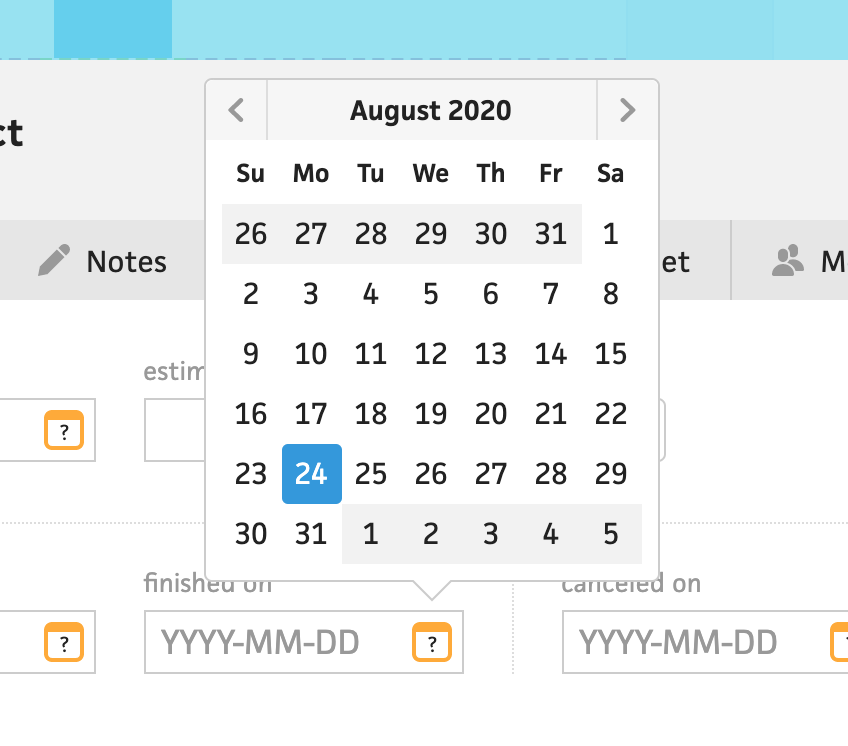
Looking at the existing date picker in Cushion, I didn’t want to stray too far from it, but instead improve a few small areas. The most noticeable difference in the new one is the size. Because I’m determined to make Cushion more mobile-friendly (or just mobile-friendly, period), any part of the UI that a user might interact with needs to be big enough to be tapped by a finger. The existing component’s date are currently 24px in size, which is way too small for mobile. Apple recommends 44px, but since I’m determined to stay true to the 8px grid, the OCD in me just can’t. For now, I’m settling with 40px, compared to 48px, which would just look silly on desktop, and when I get to mobile, I can easily include a media query to bump it to 48px if 40px is still too narrow.

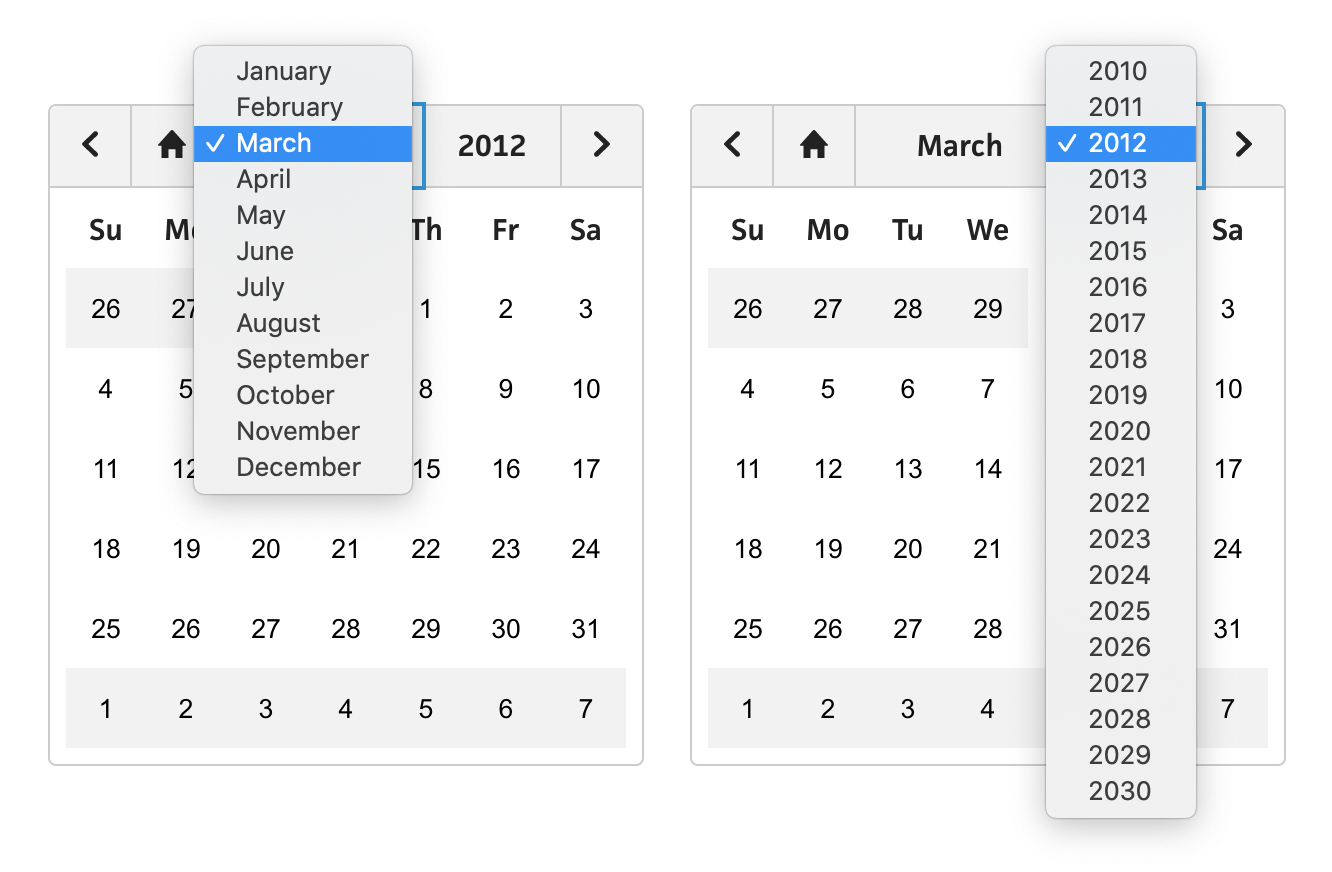
Next, I wanted to make a UX improvement that’s been screaming my name for years. Let’s say you want to navigate to a date several years ago. In the current date picker, this means clicking the left arrow button several dozen times. It’s like that scene in You’ve Got Mail when Tom Hanks deletes an entire paragraph by repeatedly tapping the backspace key. Instead of only providing arrow buttons for navigation, users should be able to instantly jump to the exact month or year they want to go. This is easily achievable by turning the month/year label into two separate <select> dropdown menus.
The last improvement I’ll mention is keyboard navigation. Like all the other components I’m building right now, I’m determined to maintain accurate keyboard navigation between them all. Honestly, most of the work is automatically done for you if you use semantic HTML, and I’d wager that it even makes your code better to think in terms of keyboard navigation from the start—you’ll definitely find yourself avoiding the off-ramp to <div> city. My favorite byproduct of committing to keyboard navigation is the consistent focus ring that makes Cushion’s new components feel like even more of a cohesive system. While up until recently, I would naively include outline: none as part of my CSS reset, I’m all for the focus ring now—as long as it doesn’t glow.
Considering all of Cushion’s date picker needs, like date ranges and highlighted dates, this component is far from done, but I feel great about this v1. On top of its appearance, simply knowing that it’s typed, fully tested, and has 100% coverage makes me so confident to use it and update it. I can’t wait to get this date picker into Cushion.