Journal
Keeping API requests simple
While working on the modern Cushion prototype, I’ve kept a potential guiding principle in the back of my mind—“keep API requests simple”. The prototype doesn’t use the API yet, but when it does, I’m hoping to avoid an issue that currently slows down the existing Cushion.
When I started Cushion, I remember either watching a talk or reading an article by someone who said that each view in your app should only make one request to the API. At the time, it made sense, and I found it reasonable, fearing the thought of waiting for multiple requests to finish before rendering a view. What I didn’t think about was how complex and slow this principle could make those single requests while also restricting their reusability and making them more difficult to test. I ended up naively following the advice and built most of Cushion’s views to only need a single API request.

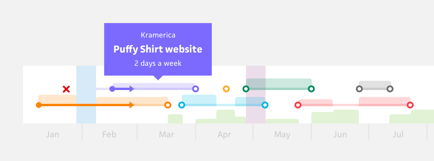
If the view itself was simple, it wasn’t really an issue, but when you take a view like the schedule, where both the graph and the tables share the same data, you end up with a complex request that should’ve been broken down into several simpler ones.
This request alone fetches:
projects with their calculated schedules
workloads and vacations for the graph
clients for tooltip and table metadata
all project lists for grouping the data tables
calculated availabilities and overbookings
It’s no wonder this is one of Cushion’s heaviest API requests. If I didn’t follow this blanket notion that all views should have a single API request, I could’ve broken this API request into several simpler ones that would definitely load quicker than the single heavy one. Whereas before, I was a young, glossy-eyed, glass-half-full kind of dev who takes everyone’s word for it, now, the always-suspicious dev in me would’ve taken a minute to consider how complex views can get. There’s no way an app with a paneled dashboard relies on a single API request. That thought alone should’ve instantly shut down this concept.
Looking at this schedule view as an example, I could start by separating the graph from the tables. This on its own would help me avoid fetching all the lists each time. From there, I could keep availabilities, overbookings, and vacations as their own simple requests, especially since they’re only needed in the graph. These elements can actually be toggled in the graph settings, so there’s a good chance Cushion is loading data that users never use if they’re hidden. Also, these models are so lightweight that simply fetching them on their own would be near-instant. I might be better off grouping availabilities and overbookings, since they work hand-in-hand, but I’d at least start with individual requests. Remember—don’t optimize too early.
When I look into simplifying the clients and projects, I could probably cut out the client list entirely and just include the client id, name, and color on the project payload because that’s all I really need. This is actually an optimization that could benefit several other areas of the app. When I look at the projects, however, I don’t think there’s much room for improvement. The view simply calls for a bunch of schedule data and calculations from the projects. In this case, the complexity of the API request itself should’ve clued me into an issue with the view—maybe the view is too complex. Considering both the graph and the tables, they’re essentially two different views. Sure, it’s nice to navigate them in parallel, but the more I think about it, the more I realize that having a graph-only view would really help resolve the request issue along with several other usability issues.
I know I’m departing from the topic of API requests here, but this is worth mentioning…
Early on, I remember a user mentioning that they’d love to be able to see the project names on the schedule graph without needing to hover. At the time, I recall thinking, “how hard is hovering?” (Again, this was glossy-eyed Jonnie). Aside from accessibility issues, this should’ve made me consider a graph-only view that wouldn’t force me to rely on including tables as well. Could there be a graph view that provides enough value and functionality, so Cushion wouldn’t need both in parallel? A table view could still exist, but more for admin/managing mode than analyzing the graph. As an added benefit, always seeing relevant data in the graph without hovering would actually make the graph usable on touch devices.
Back to API requests...
As I continue exploring a modern Cushion, I’m going to aim to keep API requests simple and consider their complexity when designing the views themselves. If I feel like a view demands a complex API request, I’ll take a step back and ask, “why?” I’m bound to find way to improve it, so I can keep API requests lean. If a part of me worries about potentially having API requests finish loading at separate times, then I should also factor that into the design—do all requests need to load before showing anything or could I design the view in a way that appears sequentially if necessary? When building an app, you really need to think about both sides of the code and how they interact with each other. If I can make a view’s requests simpler, and faster because of that, the front-end experience will be benefit from it, too.