Journal
The evolution of a tooltip design
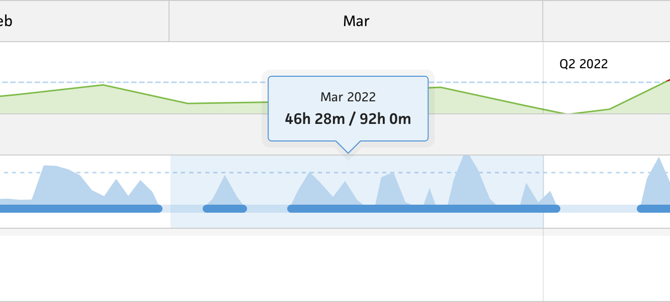
Over the holiday weekend, I focused on improving Cushion’s tooltip for the timeline beta. Since I recently finished visualizing tracked time and estimated time in the timeline, I built a tooltip that simply displays the tracked time and estimated time totals with a slash separating them. This was a stop-gap until I could spend more time designing a tooltip that’s both useful and easy to digest.

My immediate plan was to include a progress bar to compare tracked time against estimated time. This would provide a visual in addition to the text-based data. Folks could hover a date range, or narrow in on a date, and instantly tally the number of hours they both worked and estimated. Would this be useful? Well, sure!—it’s more information that people can use for whatever they’d like.

As I built the tooltip, I personally found it confusing as to which number referred to what. Because of this, I added labels for the numbers. The number on the left would be labeled “Tracked” and the number on the right would be “Estimated”. That would make these numbers crystal clear. While building this out, I realized that not all dates would have estimated time, so I needed to fill that spot with some sort of useful data (of course). I decided to use the “workday” preference, which is a set of hours that the person works. Is it useful to see the workday when there’s no estimated time? It should be!—and it fills out the design, so we’re good to go.

Now that I had a couple more labels in the tooltip, the hierarchy of the type felt disorderly. I can’t have a header stacked on labels without anything in-between, so I’d need to separate the header into its own header “bar”. This would draw a clear line between the date range header and the data below it. Should the date range be the “title” of this content? I mean, it could be! And it fits the design, so that makes it work.

At this point, I climbed out of my rabbit hole, and shared the tooltip on Twitter. While I did feel like I was getting somewhere, I also had a spidey sense feeling that the design wasn’t right. The whole tooltip itself felt like a lot. Luckily, a handful of folks gave me their feedback and reiterated my concern. It’s too much.
Using data to fill a design is the exact pitfall I used to fall into with the previous iteration of Cushion. I’d think to myself that someone will find this data useful, and that’s why it’s okay to include it. More often that not, however, this data obscures the real value of what you’re trying to convey. If I show all the time data for a given date range, and the user only wants to see their availability, now they need to do the mental math to calculate that and filter out the rest. Instead, I could be a better designer and design a tooltip that highlights the data they’re most likely interested in.

I decided to go full circle and return the original design, but use the data that’s most relevant given the context of the date range. If a user is hovering a date in the past, Cushion will tally the tracked time. If they’re hovering a date on a project in the future, Cushion will show the estimated time. Or, if the person is hovering a date in the future at the top, Cushion will indicate their availability.

All of this data is incredibly useful for different reasons, but it’s even more useful when simplified, easy to digest, and specific to the context. People don’t need to see their tracked time in the future or their availability in the past. I, the designer, can use these facts to design a smarter tooltip that’s still simple. One might think that the overloaded tooltip with the progress bar and labels is the smarter UI, but more often than not, it‘s not. The UI that tells you exactly what you want to know, when you want to know it, is the smart one—even if it’s two lines of text.