Journal
Death to modals

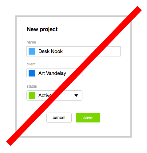
I made a lot of progress this weekend regarding the overall feel of Cushion. The change I’m happiest with is the move away from modals. At first, I used modals for the project creation view. I did this because I didn’t have enough data, at the time, to warrant an entire page—bad design reasoning, I know. A benefit of the modal, however, is to keep the user in the projects view, so you can add a several projects and see them populate the tables. After using Cushion more, I realized this wouldn’t be a common interaction, unless a user adds all of their projects upfront.

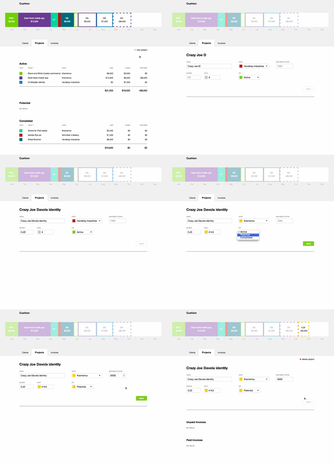
I moved the new project view to its own page and everything started coming together. The form is the same as the one in the edit view, so I can simply reuse that code. The beauty of the change, though, is that transition from creating a new project to its project page—it’s seamless. Since the layout is pretty much the same, the invoice tables simply appear below the form and we’re good to go. A next step would be to add a button for creating invoices. Eventually, I’d like to add the option to point your project to your invoicing service of choice, so it automatically pulls in invoices.

Regarding transitions, the timeline now fades between views, so you can see how each view relates to the previous one. The current timeline views all share a similar structure, exposing more detail as you move from invoices to clients to projects. Then, when you click into a project, the unrelated projects will fade to make the selected one more prominent (hat tip to Allen Tan for the suggestion).
From here, I’m going to build out all of the create, edit, and delete views for the other models and have a pretty usable version by the end of the week. Regarding the schedule, I’m way ahead of my goal of a beta by the end of the month. I’m certain there will be a ton of last-minute items to tackle before I can share Cushion, but I like where we are.