Journal
The individual project page
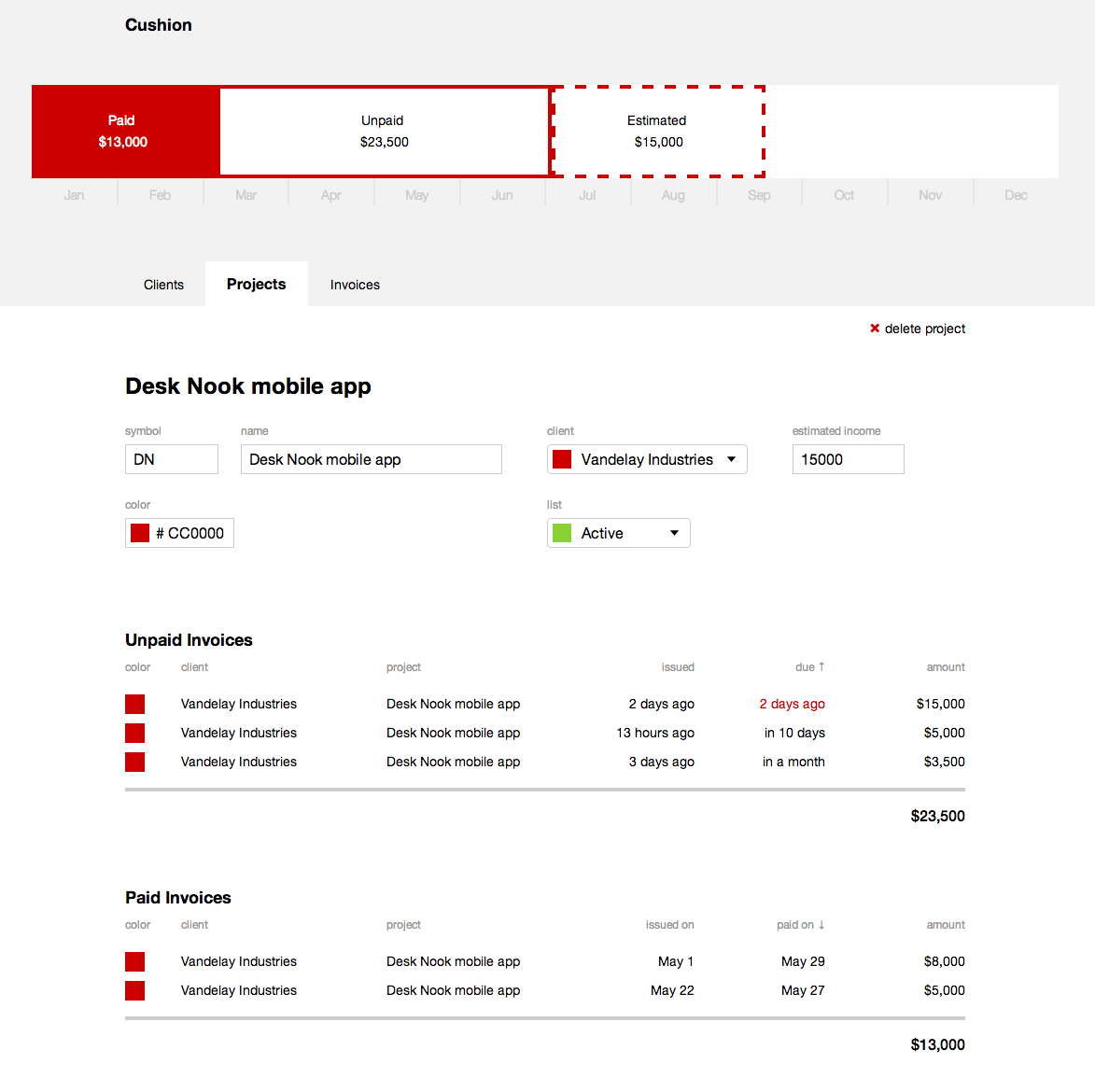
I spent the majority of the day working on the individual project page for Cushion. At first, I was on the fence about whether to show a form for editing the project’s fields or just display its details with the option to edit. I went with the former because I hate extra steps. If a user clicks into a project, they probably don’t want to just see the same info they’ve seen elsewhere—they want to edit it.

Along with the form, I added two tables for that project’s paid and unpaid invoices. With this, the project page is essentially a filter of the other views. The user can focus on that one project without being distracted by all the other projects they might have going on. The timeline is also filtered to only show that project’s incomes and how they apply to the year.

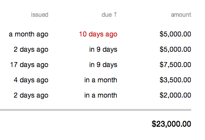
I also took a break from this page to add a small detail to the invoice table—a red highlight for late invoices. This will be very useful for being aware of them without the need of a scary, jarring alert.

In the timeline, I revisited the label view, adding a bit more logic to switch between showing a project’s symbol or its full name. If there’s not enough room for either, I hide both and rely on a hover if the user really needs to see the name. For the money, I’m considering reducing them from something like “$5,000” to “$5k” when narrower, but not entirely convinced—it could get messy.