Journal
Designing project blocks
Back in December, I wrote about the initial concept of “project blocks”. To summarize, this feature would be a first step towards a more detailed view in Cushion. At the time, projects only had a start and finish date, but with blocks, you’d be able to know what’s happening throughout a project. When is it most intense? When is it at a standstill? When is it focused on sketches or revisions? These are the questions I wanted to answer with project blocks.
With an established design for the schedule timeline in place, I started to think about how to best integrate project blocks while staying consistent with the other visual elements. I wanted to emphasize a project’s workload when it was heavy and de-emphasize it when it barely affected my week. This lead me to pursue scale as a method for differentiating these two kinds of scenarios and everything in-between.

Looking at the timeline, I had a lot of negative space. I had room between rows where I could utilize blocks. When a specific region of the timeline was piled high with intense projects, I wanted this area to feel congested. It should look overwhelming, so you feel more inclined to try to avoid those situations. I use this same approach with late invoices—animating the line with distracting movement to encourage users to seek closure.

Since project blocks are still an approximation, using start/end dates instead of hours, the visual shouldn’t be as exact as a hard edge. I initially worked with transparent “blobs” around projects. These gave a really good sense of intensity for a project and certainly overwhelmed me when seeing it applied to the month that caused me to start working on Cushion. This felt really good for a few days until I realized it just wasn’t right.
The first clue emerged from thinking about how users would resize project blocks in the timeline. At first, I thought I’d be able to reuse the same date input fields from the project form. I thought wrong. Instantly, I felt the burden of adjusting a block. Since these are elements you’d want to tweak occasionally based on estimated date ranges, specifying exact dates made no sense. The user should be able to easily resize them by eye, through a more “hands-on” interaction, like drag and drop. This made me second-guess using blobs because...where do you drag? How do you know to drag? This blob shape made more sense as a static highlight—not an interactive element.
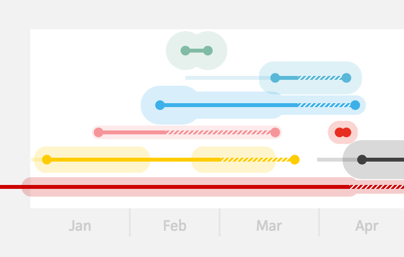
The second, and more important, clue deterring me from using blobs was that they were too encroaching on the horizontal space. On longterm projects, blobs looked great, but shorter projects were deceiving. For a one-day project, the blob would be a full circle, which appears to span a week on a year-long timeline. That initial decision to avoid a hard edge resulted in a bigger problem—inaccuracy. I’d much rather have an accurate visual than a better-looking lie.
Since the first beta accounts were coming to an end soon, I decided to shelve project blocks for a few weeks while I worked on subscriptions. When I returned, I had a much clearer idea for approaching project blocks—using a rectangular “block” shape. It was a “duh” moment for sure, but a block shape fixed all of the existing issues.

With a hard edge, the blocks now represent an accurate date range. And, I was able to avoid an overly rigid look by rounding the corners a tad.
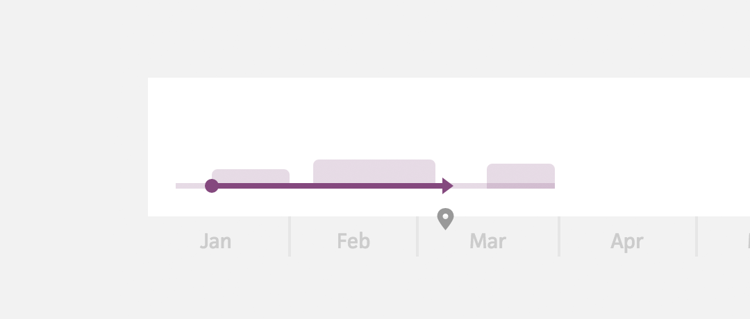
Along with the horizontal issues, the blob shapes spanned both directions on the vertical axis, so similar block intensities were more difficult to distinguish from each other. Since these new blocks rested on the lines of the projects and grew in a single direction, they were much easier to compare.
Moving from visuals to interaction, I worried about the drag and drop. Before actually working on the drag and drop, I was unsure how to approach it. I knew I wanted to be able to resize the edges and drag the entire block, but I also knew there’d be a slew of hurdles along the way. As soon as I started implementing it, however, the hurdles shrunk in scale. One after another, the problems I anticipated ended up much less significant than I initially imagined.
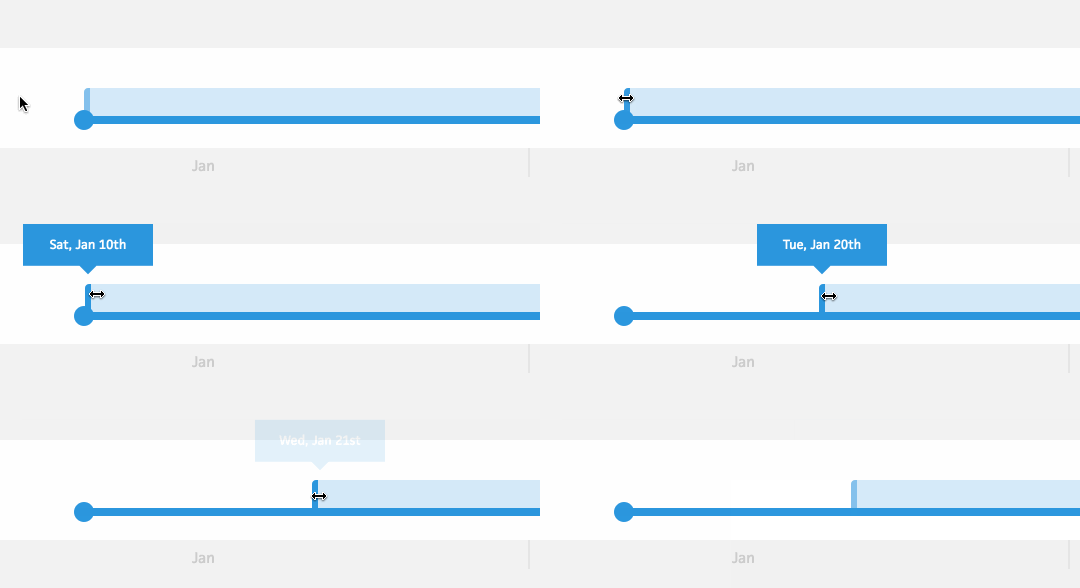
The issue of indicating to the user that they can resize a block was as easy as darkening the edges. This suggested that the edges of the block were different from the rest of it. Upon hovering the edge, the cursor changes to the horizontal resize icon, revealing to the user that they can interact with the block. Then, as they drag an edge, a small tooltip appears, marking the date that the edge represents.
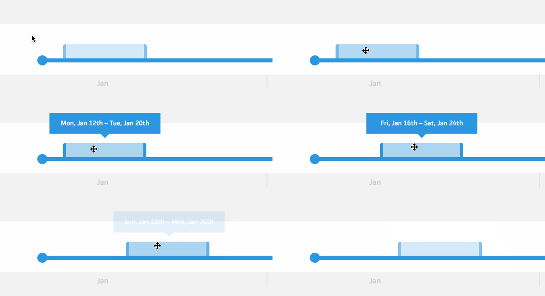
Repositioning a block follows the same flow. Hovering the draggable area of the block switches the cursor to the drag icon, and upon dragging, a tooltip appears, marking the range of the block. For an extra touch, I added an ease to the edge positions, so whenever you release the block from resizing or repositioning, it will smoothly snap into place.
Up until this point, I’ve been focusing mostly on the horizontal aspect of the blocks, but the vertical intensity is just as important. Luckily, this was much more straightforward. I figured draggable resizing of the height would be overkill because the height ranges only ~40px. Because of this, I decided to rely on the form for vertically resizing a block.
Since the height of a block is directly tied to its intensity, it makes sense to use units that most freelancers are familiar with—hours and days per week. For the hourly freelancers, you can choose from 1, 4, 8, 16, 24, 32, and 40+. And for the freelancers who work on a day-rate, like myself, you can choose from 1 hour, half day, 1 day, 2 days, 3 days, 4 days, and 5+ days. I also offer a preference to use both, in case you switch based on the type of project.
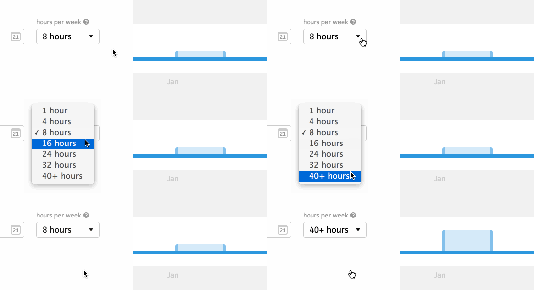
While adding the dropdown, I realized I would need to reflect a change in the timeline upon selecting a different value, so I wired the timeline to the form and animated the height of the block when updating the intensity.
One piece still remained—phases. If I were to stop now, project blocks could work pretty well for most freelancers. The ability to indicate the intensity of a project goes a long way, but there’s another type of freelancer who works in terms of phases. They might start with sketches, then move onto designs, and lastly work on revisions until arriving at the final deliverable. With blocks, this is as easy as adding a label.
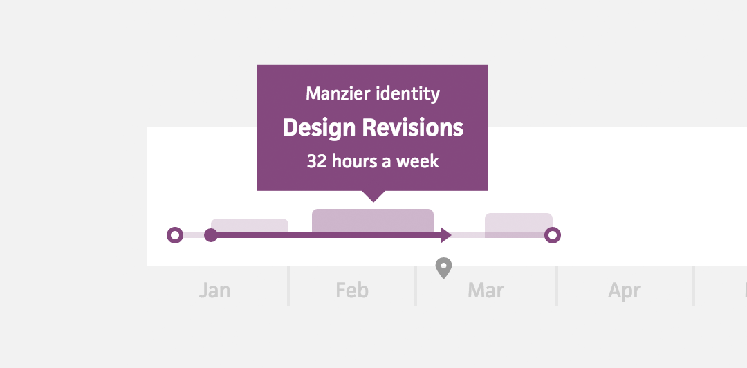
In the form, I added an optional input field to label the block. Upon hovering the block in the schedule view, a tooltip appears, displaying the name of the block along with its intensity.
With project blocks, Cushion adds another level of detail to your schedule—break projects into phases, differentiate a heavy project from a light one, or account for that few-month lull in the middle of that longterm project. Thinking ahead, I have a few more ideas for blocks. I won’t go into them now, but if project blocks are for visualizing estimated intensities of a project, imagine integrating them with time-trackers to measure the actual intensity. Interesting, indeed!